ProDon:Web Form Customization Configuration
Contents
[hide]Introduction
The Online Donation Module allows donors to make donations directly through the Web.
In order for the donors to make donations, a website must first be created and configured. The creation on an online donation website includes the configuration of the home page, as well as the creation of different Web forms. Each Web form is attached to a donation occasion, which ensures that Internet users can register online to the fundraising activities of an organization, or make a donation online directly.
Moreover, when an Internet user makes a donation or registers to an activity through a Web form, ProDon automatically adds him or her to the database during the import.
It is also possible to obtain very precise pieces of information from the clients by creating customizations.
Customization Configuration
To configure customizations, first go to the "Web form management".
|
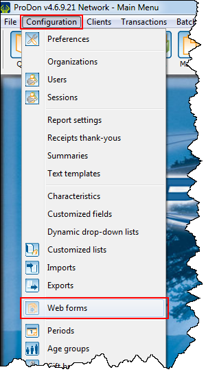
To do so, click on the "Configuration" menu, then select the "Web forms" option. | |
 |
|
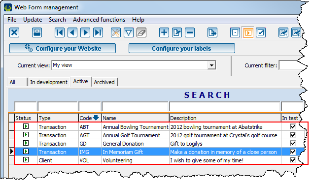
After clicking on "Web forms", this window opens. | |
 | |
|
Double-click on the line of the form for which the customizations must be added. |
Customization Configuration
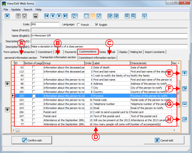
There are 3 sections for customizations: the Personal information section, the Transaction information section and the Commitment information section.
The following examples have been created in the "Transaction information section", but the same types of customizations are also available in the 2 other sections.
When creating a customization, it is necessary to have previously created characteristics, or to create some from the customization addition window.
Adding a Customization
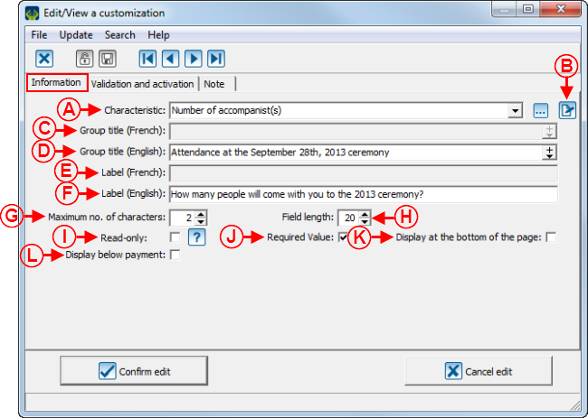
The options of the customization addition or modification window change according to the chosen type of characteristic. There are 7 types of characteristics::
 | |
|
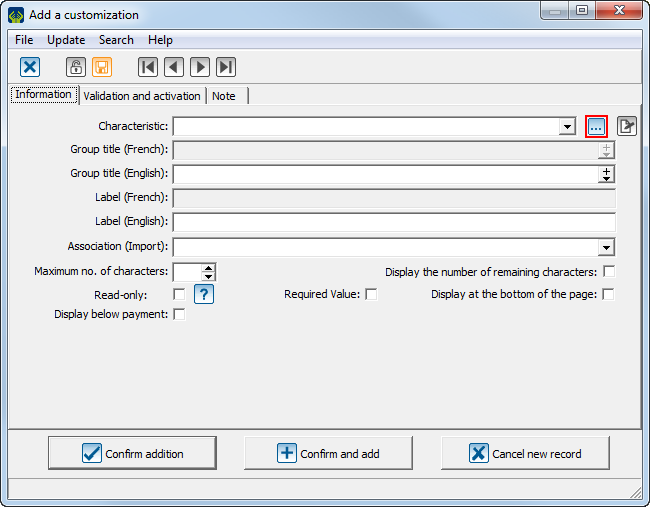
Click on the |
 | |
|
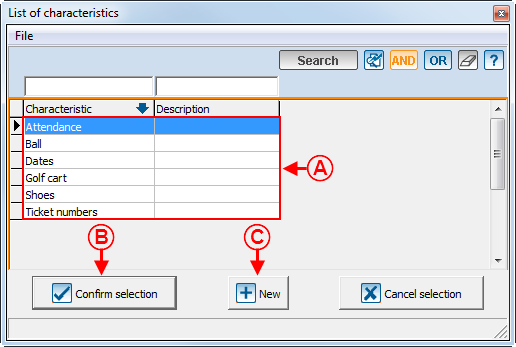
A: This is the list of transactional characteristics that already exist in the "Characteristic management". NOTE: The characteristics that have already been added to the modifying form appear in this list. |
B: After selecting a characteristic at A, click on the " |
|
C: It is possible to create a new characteristic by clicking on the " |
|
Text Type Customization
A text type customization has no predefined format. It is presented in the form of a text and can contain a maximum of 250 alphanumeric characters.
However, it is possible to assign a specific format to certain types of field: email, province, postal code, country or phone number. To learn how to configure the format of these fields, see points A to E of the "Validation and activation" tab.
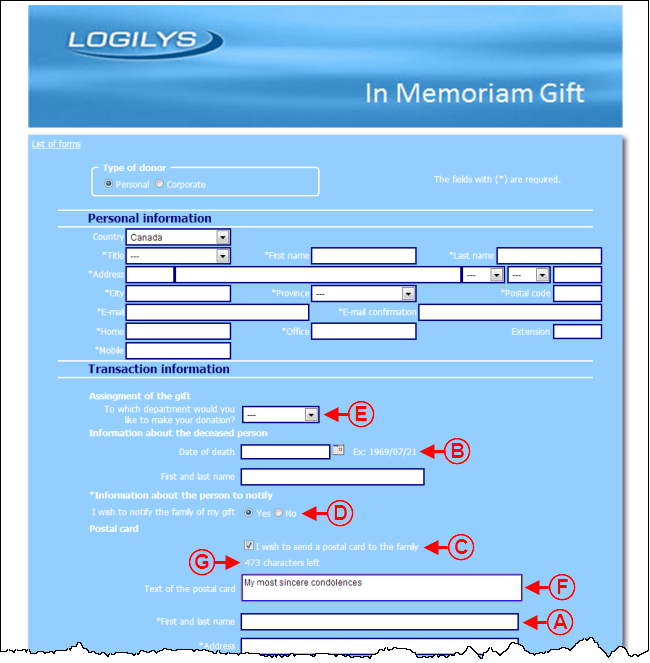
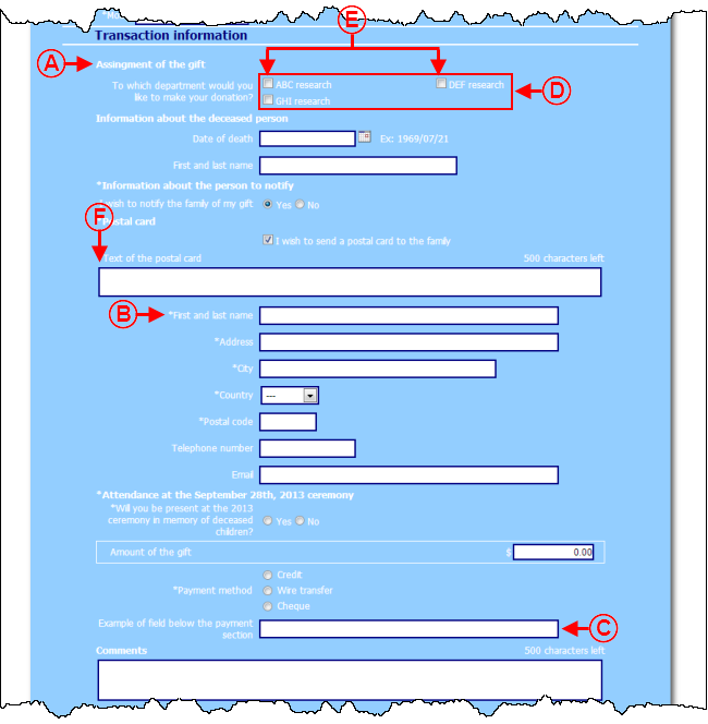
To view an example of a text type customization, see point A of the "Customization Example 1" section.
|
After clicking on the | |
| |
|
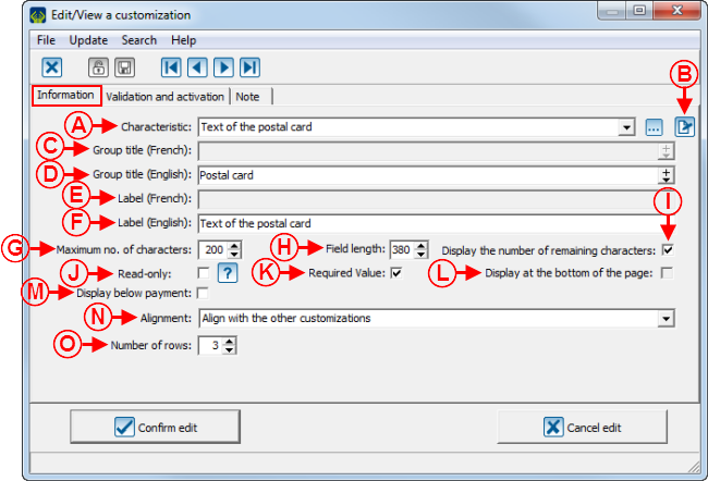
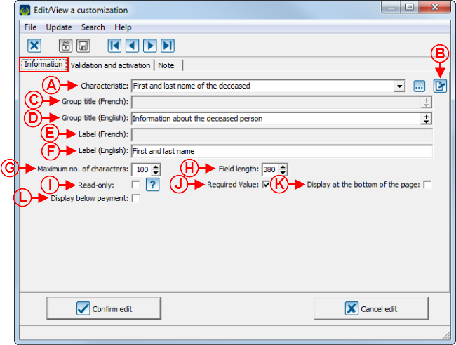
A: Allows you to assign a characteristic to the customization. To select an existing characteristic, click on the drop-down list. The |
B: The |
|
C: Allows you to add the customization to a group of French customizations. Select, using the drop-down arrow, an existing group title or create a new one to add to the drop-down list. |
D: Allows you to add the customization to a group of English customizations. Select, using the drop-down arrow, an existing group title or to create a new one to add to the drop-down list. To view an example of group title, see point A of the "Customization Example 3" section. |
|
E: Allows you to give a French name to the customization. |
F: Allows you to give an English name to the customization. |
|
G: Allows you to specify a maximum nuber of characters. In this example, donors will not be able to enter a name containing more than 100 characters in the "First and last name" field. |
H: Allows you to specify the size of the box. NOTE: The size of the box corresponding to the maximum number of characters is automatically entered after filling out the field at G. Nonetheless, it is possible to modify it, if desired. |
|
I: Allows you to display the field in read-only on the form. The field will be visible, but donors will not be able to modify it. |
J: Allows you to make the field compulsory. When donors will complete the form, he or she will not be able to save the form as long as the field is not filled. To view an example of required field, see point B of the "Customization Example 3" section. |
|
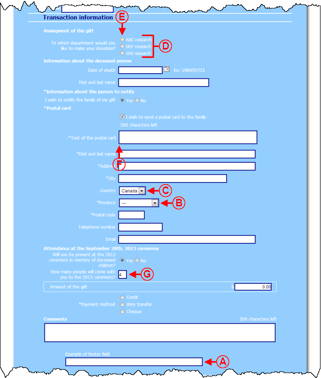
K: Allows you to display the field at the bottom of the page. To view an example of field at the bottom of the page, see point A of the "Customization Example 2" section. |
L: Allows you to display the field below the payment section. To view an example of field below the payment section, see point C of the "Customization Example 3" section. |
| |
|
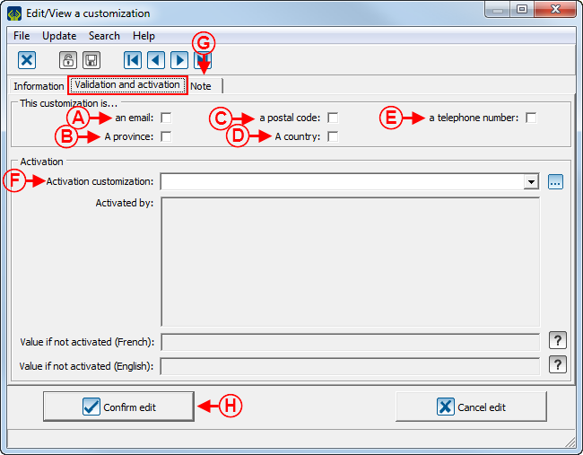
A: Allows you to specify if the text type characteristic is an email address. If this checkbox is checked and the donor does not enter a valid email address in the field, he or she will not be able to save the form. NOTE: If the email address is not valid, a warning window will show. To view this warning window, see the "Text Type Field Warning Window for an Email" section. |
B: Allows you to specify if the text type characteristic is a province. If the checkbox is checked, a drop-down list containing all the provinces available in ProDon will appear on the form, rather than a text field. To view an example of text type customization for provinces, see point B of the "Customization Example 2" section. |
|
C: Allows you to specify if the text type characteristic is a postal code. If the checkbox is checked and the donor does not enter a valid postal code in this field, he or she will not be able to save the form. NOTE: If the postal code is not valid, a warning window will show. To view this warning window, see the "Text Type Warning Window for a Postal Code" section. |
D: Allows you to specify if the text type characteristic is a country. If the checkbox is checked, a "Country" tab will be added in this window. To learn how to configure a text type customization for countries, click here. |
|
E: Allows you to specify if the text type characteristic is a phone number. If the checkbox is checked and the donor does not enter a valid phone number in the field, he or she will not be able to save the form. NOTE: If the phone number is not valid, a warning window will show. To view this warning window, see the "Text Type Warning Window for a Phone Number" section. |
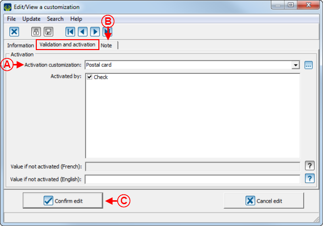
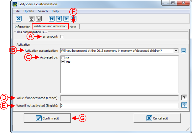
F: Allows you to display the customization on the form, based on the answer of another customization. Select, using the drop-down arrow, depending on the customization, it will show or not. In this example, the field will always be visible. To learn how to fill out the activation section, see points B, C, D and E of the second image of the "Numeric Type Customization" section. |
|
G: The "Note" tab allows you to add a note below the customization on the form. To learn how to add a note from this tab, see the "Notes" Tab" section of the "Creating a Web Form" document. |
H: After completing all tabs, click on the " NOTE: If it is an addition, the name of the button will be " |
List of Options for Countries
It is possible to create an option list containing the countries available in ProDon with a text type customization.
To view an example of text type customization for countries, see point C of the "Customization Example 2" section.
|
After clicking on the | |
 | |
|
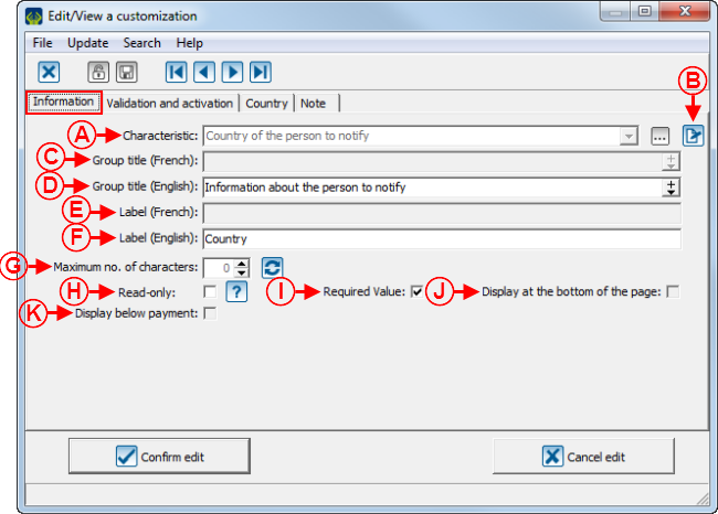
A: Allows you to assign a characteristic to the customization. To select an existing characteristic, click on the drop-down list. The |
B: The |
|
C: Allows you to add a customization to a group of French customizations. Select, using the drop-down arrow, an existing group title or enter a new one to add it to the drop-down list. <span style="color: rgb(255, 0, 0);" /> |
D: Allows you to add the customization to a group of English customizations. Select, using the drop-down arrow, an existing group title or enter a new one to add it to the drop-down list. To view an example of group title, see point A of the "Customization Example 3" section. |
|
E: Allows you to give a French name to the customization. |
F: Allows you to give an English name to the customization. |
|
G: Allows you to specify the maximum number of characters. In this example, since these are predefined options, the number of characters of the longest predefined option is entered by default and it is not possible to modify it. |
H: Allows you to display the field in read-only on teh form. The field will be visible, but donors will not be able to modify it. |
|
I: Allows you to make the field compulsory. When donors will complete the form, he or she will not be able to save the form as long as the field is not filled out. To view an example of required field, see point B of the "Customization Example 3" section. |
J: Allows you to display the field at the bottom of the page. To view an example of field at the bottom of teh page, see point A of the "Customization Example 2" section. |
|
K: Allows you to display the field below the payment section. To view an example of field below the payment section, see point C of the "Customization Example 3" section. |
|
 | |
|
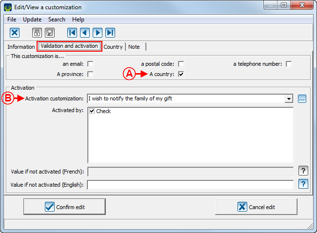
A: Allows you to specify if the text type characteristic is a country. If the checkbox is checked, the "Country" tab will be added in this window. |
B: Allows you to display the customization on the form, based on the response to another customization. Select, using the drop-down arrow, the customization from which customization this one will show or not. In this example, the field will be displayed based on the response to the customization chosen here. To learn how to complete the activation section, see points B, C, D and E of the second image of the "Numeric Type Customization" section. |
 | |
|
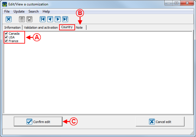
A: This is the list of the countries available in ProDon. Check the ones that have to be among the options available to donors when they fill out the form. |
B: The "Note" tab allows you to add a note below the customization on the form. To learn how to add a note from this tab, see the "Notes" Tab" section of the "Creating a Web Form" document. |
|
C: After completing all tabs, click on the " NOTE: If this is an addition, the name of the button is " |
|
Date Type Customization
A date and time type characteristic may contain only a date, a time, or both.
CAUTION: Only the characteristics having only a date can be used in a Web form. It is not possible to use a date and time characteristic nor a time characterisic.
In a Web form, it is possible to enter the date manually or to choose the date using a calendar.
To view an example of date type customization, see point B of the "Customization Example 1" section.
|
After clicking on the | |
 | |
|
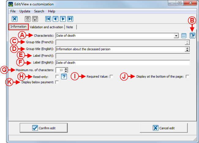
A: Allows you to assign a characteristic to the customization. To select an existing characteristic, click on the drop-down list. The |
B: The |
|
C: Allows you to add a customization to a group of French customizations. Select, using the drop-down arrow, an existing group title or enter a new one to add it to the drop-down list. <span style="color: rgb(255, 0, 0);" /> |
D: Allows you to add a customization to a group of English customizations. Select, using the drop-down arrow, an existing group title to add it to the drop-down list. To view an example of group title, see point A of the "Customization Example 3" section. |
|
E: Allows you to give a French name to the customization. |
F: Allows you to give an English name to the customization. |
|
G: Allows you to specify a maximum number of characters. In this example, since a date always has the same number of characters, the number of characters is entered automatically and it is not possible to modify it. |
H: Allows you to display the field in read-only on the form. The field will be visible, but donors will not be able to modify it. |
|
I: Allows you to make the field compulsory. When donors will complete the form, they will not be able to save the form as long as the field is not filled out. To view an example of required field, see point B of the "Customization Example 3" section. |
J: Allows you to display the field at the bottom of the page. To view an example of field at the bottom of the page, see point A of the "Customization Example 2" section. |
|
K: Allows you to display the field below the payment section. To view an example of field below the payment section, see point C of the "Customization Example 3" section. |
|
 | |
|
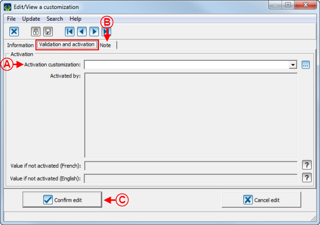
A: Allows you to display the customization on the form based on a response to another customization. Select, using the drop-down list, the characteristic from which this customization will show or not. In this example, the field is always visible. To learn how to fill out the activation section, see points B, C, D and E of the second image of the "Numeric Type Customization" section. |
B: The "Note" tab allows you to add a note below the customization on the form. To learn how to add a note from this tab, see the "Notes" Tab" section of the "Creating a Web Form" document. |
|
C: After completing all the tabs, click on the " NOTE: If it is an addition, the name of the button would be " |
|
Checkbox Type Customization
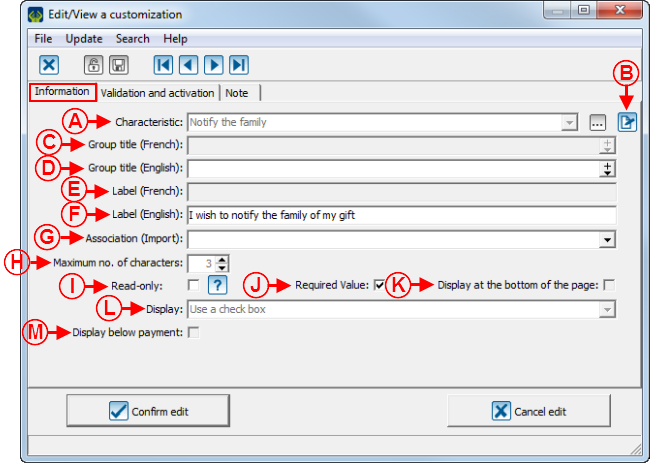
A checkbox type characteristic present itself in the form of checkbox or radio buttons.
To view an example of checkbox for a checkbox type of customization, see point C of the "Customization Example 1" section.
To view an example of radio buttons for a checkbox type of customization, see point D of the "Customization Example 1" section.
|
After clicking on the | |
 | |
|
A: Allows you to assign a characteristic to the customization. To select an existing characteristis, click on the drop-down list. The |
B: The |
|
C: Allows you to add the customization to a group of French customizations. Select, using the drop-down arrow, an existing group title or enter a new one to add it to the drop-down list. <span style="color: rgb(255, 0, 0);" /> |
D: Allows you to add the customization to a group of English customizations. Select, using the drop-down arrow, an existing group or enter a new one to add it to the drop-down list. To view an example of group title, see point A of the "Customization Example 3" section. |
|
E: Allows you to give a French name to the customization. |
F: Allows you to give an English name to the customization. |
|
G: Two options are available in this field. The "TrxAnonymous" option allows you to ask if the client wants to keep the transaction anonymous and the "TrxAnnualReceipt" option allows you to ask if the client wants to get a receipt for this transaction. |
H: Allows you to specify a maximum number of characters. In this example, since the texts of the checkboxes are already predefined, the number of characters of the longest text ofthe checkboxes is entered by default and it is not possible to modify it. |
|
I: Allows you to display the field in read-only on the form. The field will be visible, but donors will not be able to modify it. |
J: Allows you to make the filed compulsory. When donors will complete the form, they will not be able to save as long as the field is not filled out. To view an exampleof required field, see point B of the "Customization Example 3" section. |
|
K: Allows you to display the field at the bottom of the page. To view an example of field at the bottom of the page, see point A of the "Customization Example 2" section. |
L: Allows you to choose the checkbox type customization that is going to be displayed in the form of checkbox or radio buttons. |
|
M: Allows you to display the field below the payment section. To view an example of field below the payment section, see point C of the "Customization Example 3" section. |
|
 | |
|
A: Allows you to display the customization on the form based on the response to another customization. Select, using teh drop-down arrow, based on the the customization from which it will show or not. in this example, the field is always visible. To learn how to fill out the activation section, see points B, C, D and E of the second image of the "Numeric Type Customization" section. |
B: The "Notes" tab allows you to add a note below the customization on the form. To learn how to add a note from this tab, see the "Notes" Tab" section of the "Creating a Web Form" document. |
|
C: After completing all the tabs, click on the " NOTE: If it is an addition, the name of the button will be " |
|
List of Options/Predefined List of Options Type Customization
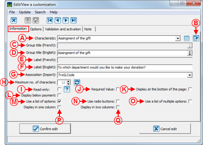
An option list or predefined option list characteristic is presented in the form of a drop-down list. radio buttons or checkboxes.
The difference between the option list and the predefined option list is the display order. For an option list, the options are displayed in alphabetical order and it is not possible to modify the order, whereas for a predefined option list, it is possible to modify the order.
To view an example of a drop-down list for an option list customization, see point E of the "Customization Example 1" section.
To view an example of radio buttons for an option list customization, see point D of the "Customization Example 2" section.
To view an example of checkbox for an option list customization, see point D of the "Customization Example 3" section.
|
After clicking on the | |
 | |
|
A: Allows you to assign a characteristic to the customization. To select an existing characteristic, click on the drop-down list. The |
B: The |
|
C: Allows you to add the customization to a group of French customizations. Select, using the drop-down arrow, an existing group title or enter a new one to add it to the drop-down list. |
D: Allows you to add the customization to a group of English customizations. Select, using the drop-down arrow, an existing group title or enter a new one to add it to the drop-down list. To view an example of group title, see point A of the "Customization Example 3" section. |
|
E: Allows you to give a French name to the customization. |
F: Allows you to give an English name to the customization. |
|
G: Two options are available in this field. The "TrxGLCode" option allows you to associate the transaction to a particular General Ledger code and the "TrxCanvasserCode" option allows you to associate the transaction to a canvasser in particular. NOTE: The General Ledger code and the canvasser must be specified in the option addition window from the "Options" tab. |
H: Allows you to specify a maximum number of characters. In this example, since these are predefined options, the largest number of characters is entered by default and it is not possible to modify it. |
|
I: Allows you to display the field in read-only on the from. The field will be visible, but donors will not be able to modify it. |
J: Allows you to make the field compulsory. When donors complete the form, they will not be able to save the form as long as the field is not filled out. To view an example of required field, see point B of the "Customization Example 3" section. |
|
K: Allows you to display the field at the bottom of the page. To view an example of field at the bottom of the page, see point A of the "Customization Example 2" section. |
L: Allows you to display the field below the payment section. To view an example of field below the payment section, see point C of the "Customization Example 3" section. |
|
M: Allows you to use a drop-down list of options to display the options. To view an example of drop-down list, see point E of the "Customization Example 1" section. NOTE: This option does not allow donors to select more than one option. |
N: Allows you to use radio buttons to display the options. To view an example of radio buttons, see point D of the "Customization Example 2" section. NOTE: This option does not allow donors to select more than one option. |
|
O: Allows you to use checkboxes to display the options. To view an example of checkboxes, see point D of the "Customization Example 3" section. NOTE: This option allows donors to select more than one option. |
P: Allows you to display the options in a single column. To view an example of options displayed in a single column, see point E of the "Customization Example 2" section. NOTE: This option is only available if the checkboxes at N or at O are checked. |
|
Q: Allows you to display the options in two columns. To view an example of options displayed in two columns, see point E of the "Customization Example 3" section. NOTE: This option is only available if the checkboxes at N or at O are checked and if more than one value per record can be selected. |
|
 | |
|
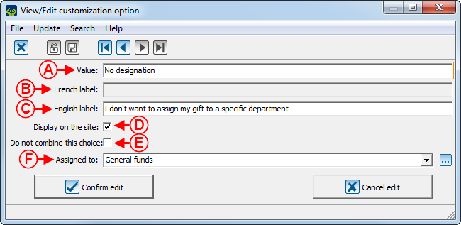
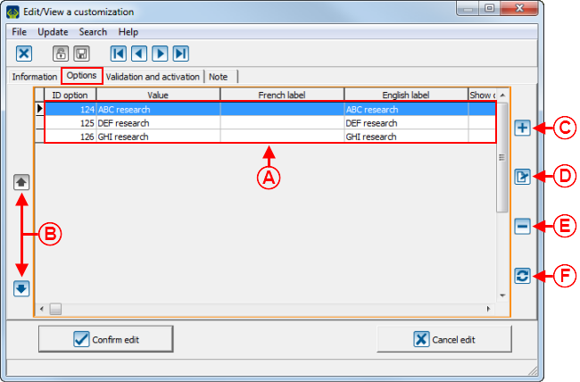
A: This is the list of options donors can choose from when they will complete the form. |
B: Allows you to modify the order of the options at A. To do so, select the option at A, then click on the NOTE: For an option list, these buttons are not available. The options will be placed in alphabetical order. |
|
C: The NOTE: After clicking on that button, this window opens. |
D: Allows you to modify an option from the list at A. To do so, select the option to modify at A, then click on the NOTE: After clicking on that button, this window opens. |
|
E: Allows you to remove an option from the list at A. To do so, select the option to modify at A, then click on the |
F: Allows you to update the options at A. NOTE: If a characteristic is used in more than one form and an option is added, the options will have to be updated in all the forms in which that characteristic is used. |
 | |
|
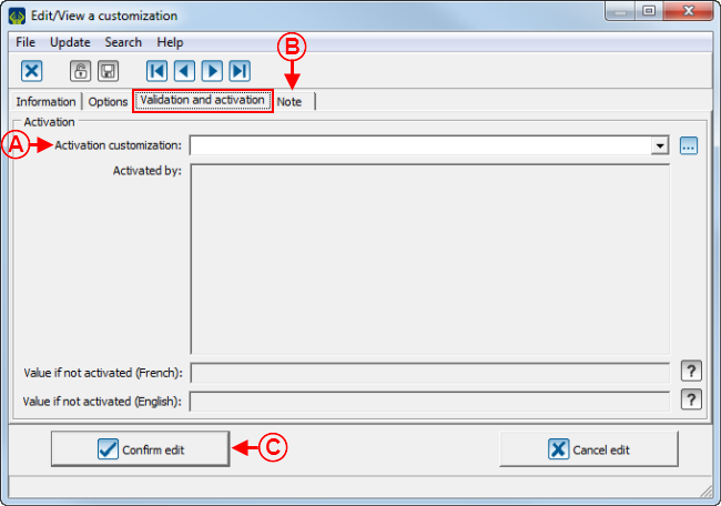
A: Allows you to display the customizationon the form, based on the response to another customization. Select, using the drop-down arrow, from which customization it will show or not. In this example, the field is always visible. To learn how to fill out the activation section, see points B, C, D and E of the second image of the "Numeric Type Customization" section. |
B: The "Note" tab allows you to add a note below the customization on the form. To learn how to add a note from this tab, see the "Notes" Tab" section of the "Creating a Web Form" document. |
|
C: After completing all the tabs, click on the NOTE: If it is an addition, the name of the button would be " |
|
Text Long Type Customization
A text long type customization has no predefined format. It is presented in the form of a text and may contain a maximum of 500 alphanumeric characters.
To view an example of text long type customization, see point F of the "Customization Example 1" section.
Numeric Type Customization
A numeric type customization may contain digits only.
To view an example of numeric type customization, see point G of the "Customization Example 2" section.
NOTE: If a character other than numeric is entered in the field, a warning window will show. To view this warning window, see the "Warning Window for a Numeric Type Field" section.
Examples of Customizations
Customization Example 1
Customization Example 2
Customization Example 3
Warning Window Examples
Text Type Field Warning Window for an Email
 | |
|
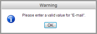
This window opens when an invalid e-mail address is entered in a text type field for which the "E-mail" checkbox has been checked. |
Text Type Field Warning Window for a Postal Code
 | |
|
This window opens when an invalid postal code is entered in a text type field for which the "Postal code" checkbox has been checked. |
Text Type Field Warning Window for a Phone Number
 | |
|
This window opens when an invalid phone number is entered in a text type field for which the "Phone number" checkbox has been checked. |
Numeric Type Field Warning Window
 | |
|
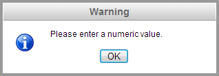
This window opens when a character other than numeric is entered in a numeric type field. |
Document name: ProDon:Web Form Customization Configuration
