Difference between revisions of "ProDon:Characteristic Management"
| Line 250: | Line 250: | ||
==== "Groups containing this characteristic" Tab ==== | ==== "Groups containing this characteristic" Tab ==== | ||
| − | {| | + | {| cellspacing="1" cellpadding="1" border="1" class="wikitable" style="width: 608px; height: 417px;" |
|- | |- | ||
| colspan="2" | | | colspan="2" | | ||
| + | A group of characteristics must be created prior to attaching a characteristic to the group. To learn how to do this, click here. | ||
| + | |||
|- | |- | ||
| − | | colspan="2" | | + | | colspan="2" | [[Image:Characteristic_Management_008.png]] |
|- | |- | ||
| width="50%" | | | width="50%" | | ||
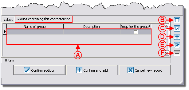
| + | '''<span style="color: rgb(255, 0, 0);">A: </span>'''It is the list of the characteristics available in the different groups of characteristics. For more information concerning groups of characteristics, consult the "Add / Edit a Group of Characteristics" section. | ||
| + | |||
| width="50%" | | | width="50%" | | ||
| + | '''<span style="color: rgb(255, 0, 0);">B: </span>'''The [[Image:Button_uncheck.png]] button allows you to uncheck the box under the "Req. for the group?" field. If the box is unchecked, the characteristic will remain empty during the entry. | ||
| + | |||
| + | '''NOTE: '''It is also possible to select the line and to use the spacebar of the keyboard to check or uncheck a box. | ||
| + | |||
|- | |- | ||
| width="50%" | | | width="50%" | | ||
| + | '''<span style="color: rgb(255, 0, 0);">C: </span>'''The [[Image:Button_checkbox_checked_crossed.png]] button allows you to check the box under the "Req. for the group?" field. If the box is checked, you must fill in the characteristic during its entry. | ||
| + | |||
| + | '''NOTE: '''It is also possible to select the line and use the spacebar of the keyboard to check or uncheck a box. | ||
| + | |||
| width="50%" | | | width="50%" | | ||
| + | '''<span style="color: rgb(255, 0, 0);">D: </span>'''The [[Image:Button_add_plus.png]] button allows you to assign the characteristic to an existing group. | ||
| + | |||
|- | |- | ||
| width="50%" | | | width="50%" | | ||
| − | | width="50%" | | + | '''<span style="color: rgb(255, 0, 0);">E: </span>'''The [[Image:Button_Edit.png]] button allows you to modify the group to which the characteristic has been assigned. |
| + | |||
| + | | width="50%" | '''<span style="color: rgb(255, 0, 0);">F: </span>'''The [[Image:Button_Minus_remove_delete.png]] button allows you to delete a characteristic from a group by deleting the line. | ||
|} | |} | ||
Revision as of 13:54, 27 January 2012
Contents
- 1 Introduction
- 2 Configuring Characteristics
- 3 Configuring Groups of Characteristics
- 4 Using a Characteristic or a Group of Characteristics
- 5 Using a Characteristic in Mass Mailing
Introduction
The characteristics are fully configurable fields. Their main use is to manage information for which no field is intended in the software. For instance, someone who would want to manage his or her clients' marital status could easily do it.
It is possible to configure characteristics to manage information in many managements. For example, the "Client management", the "Transaction management", etc.
If the information to be managed requires several precise pieces of information, it is possible to create groups of characteristics that contain many characteristics. When adding a group, all the characteristics that are in the group are added in a single operation. For instance, someone could create a group named "Call", that would contain 2 characteristics. A first one for the type of call, and a second one for the duration of the call.
CAUTION: Prior to creating a characteristic, read the "Categories vs Characteristics vs Customized Fields" document. This document explains the different possibilities of configuration.
Configuring Characteristics
|
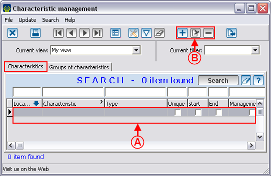
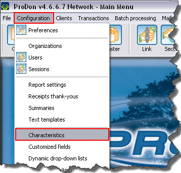
To go to the "Characteristic Management", from the software home page, click on the "Configuration" menu, then select "Characteristics". |
|
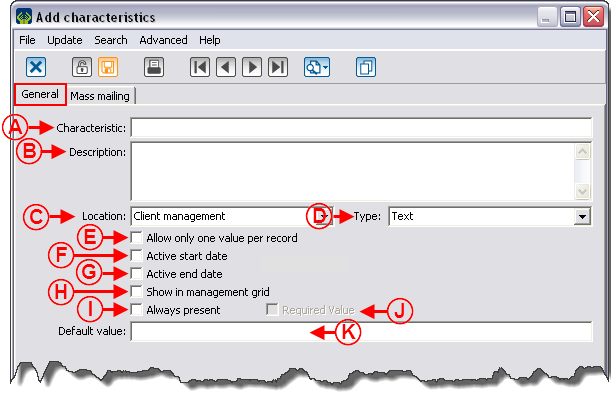
Add / Edit a Characteristic
"General" Tab
"Mass Mailing" Tab
This tab allows you to configure a characteristic with the intention of including it to a mass mailing.
For more details on the use of a characteristic in mass mailing, click here.
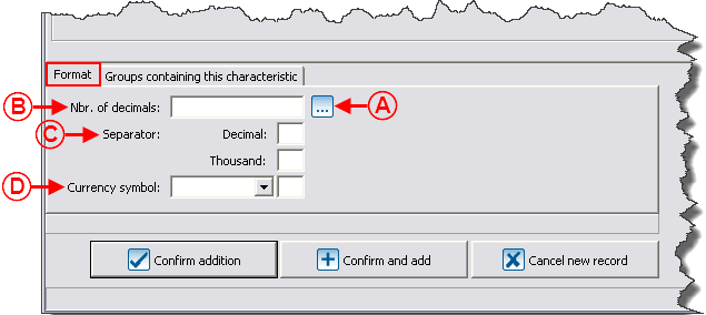
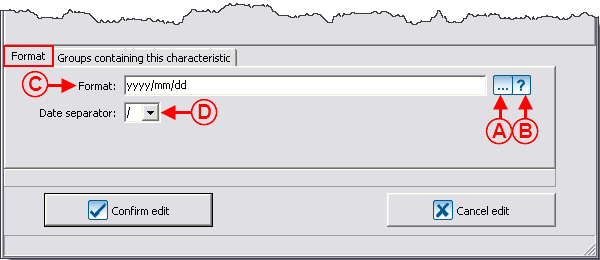
"Format" Tab
Different types of characteristics
There are 7 types of characteristics:
- Numeric
- Text
- Date and time
- Checkbox
- List of options
- Predefined list of options
- Long text
"Numeric" Type
A "Numeric" type characteristic contains numbers exclusively.
"Text" Type
A "Text" type characteristic has no predefined format. It is in a text form and may contain a maximum of 255 alphanumeric characters.
"Date and time" Type
A "Date and time" type characteristic must contain only one date, only one time, or a date and a time.
"Checkbox" Type
A "Checkbox" type characteristic has no predefined format and it comes in the form of a checkbox.
"List of options" Type
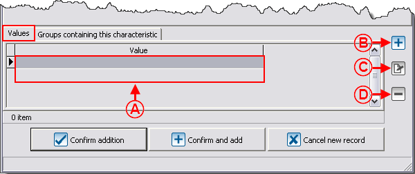
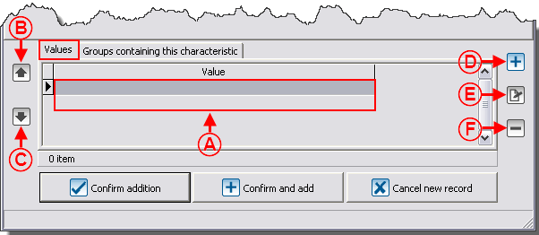
A "List of options" type characteristic comes in the form of a drop-down list (meaning that it is possible to manually add options to the list). Each value may contain a maximum of 255 alphanumeric characters.
"Predefined list of options" Type
A "Predefined list of options" type characteristic comes in the form of a static drop-down list (meaning that it is not possible to manually enter another response). Each value can contain a maximum of 255 alphanumeric characters.
"Long text" Type
A "Long text" type characteristic has no predefined format. It comes in a text form and the number of alphanumeric characters is limitless.
"Groups containing this characteristic" Tab
Configuring Groups of Characteristics
Add / Edit a Group of Characteristics
Using a Characteristic or a Group of Characteristics
Using a Characteristic in Mass Mailing
Document name: ProDon:Characteristic Management
