Difference between revisions of "ProDon:Characteristic Management"
(→Using a Characteristic in Mass Mailing) |
|||
| (21 intermediate revisions by 2 users not shown) | |||
| Line 1: | Line 1: | ||
| − | {{ | + | {{Header_TOC}}<br> |
| − | |||
| + | <br> | ||
== Introduction == | == Introduction == | ||
| − | The characteristics are fully configurable fields. Their main use is to manage information for which no field | + | The characteristics are fully configurable fields. Their main use is to manage information for which no field has been created in the software. For instance, someone who would want to manage his or her clients' marital status could easily do it. |
| − | It is possible to configure characteristics to | + | It is possible to configure characteristics to deal with information in many managements. For example, "Client management", "Transaction management", etc. |
If the information to be managed requires several precise pieces of information, it is possible to create groups of characteristics that contain many characteristics. When adding a group, all the characteristics that are in the group are added in a single operation. For instance, someone could create a group named "Call", that would contain 2 characteristics. A first one for the type of call, and a second one for the duration of the call. | If the information to be managed requires several precise pieces of information, it is possible to create groups of characteristics that contain many characteristics. When adding a group, all the characteristics that are in the group are added in a single operation. For instance, someone could create a group named "Call", that would contain 2 characteristics. A first one for the type of call, and a second one for the duration of the call. | ||
| Line 13: | Line 13: | ||
<br> | <br> | ||
| − | '''CAUTION: '''Prior to creating a characteristic, read the [[ProDon: | + | '''CAUTION: '''Prior to creating a characteristic, read the [[ProDon:Categories vs Customized Fields vs Characteristics|"Categories vs Customized Fields vs Characteristics"]] document. This document explains the different possibilities of configuration. |
== Configuring Characteristics == | == Configuring Characteristics == | ||
| − | {| cellspacing="1" cellpadding="1" border="1 | + | {| cellspacing="1" cellpadding="1" border="1" style="width: 365px; height: 407px;" class="wikitable" |
|- | |- | ||
| | | | ||
| − | To go to the "Characteristic Management", from the software home page, click on the "Configuration" menu, then select "Characteristics". | + | To go to the "Characteristic Management", from the software home page, click on the "Configuration" menu, then select "Characteristics". |
|- | |- | ||
| − | | [[Image: | + | | [[Image:Characteristic Management 001.png]] |
|} | |} | ||
<br> | <br> | ||
| − | {| cellspacing="1" cellpadding="1" border="1 | + | {| cellspacing="1" cellpadding="1" border="1" style="width: 552px; height: 380px;" class="wikitable" |
|- | |- | ||
| − | | colspan="2" | [[Image: | + | | colspan="2" | [[Image:Characteristic Management 002.png]] |
|- | |- | ||
| width="50%" | | | width="50%" | | ||
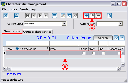
| − | '''<span style="color: rgb(255, 0, 0);">A: </span>'''List of all the characteristics. | + | '''<span style="color: rgb(255, 0, 0);">A: </span>'''List of all the characteristics. |
| width="50%" | | | width="50%" | | ||
| − | '''<span style="color: rgb(255, 0, 0);">B: </span>'''The [[Image: | + | '''<span style="color: rgb(255, 0, 0);">B: </span>'''The [[Image:Button add plus.png]] button allows you to add a new characteristic. The [[Image:Button Edit.png]] button allows you to modify an existing characteristic. The [[Image:Button Minus remove delete.png]] button allows you to delete a characteristic from the list. |
|} | |} | ||
| Line 48: | Line 48: | ||
==== "General" Tab ==== | ==== "General" Tab ==== | ||
| − | {| cellspacing="1" cellpadding="1" border="1 | + | {| cellspacing="1" cellpadding="1" border="1" style="width: 621px; height: 556px;" class="wikitable" |
|- | |- | ||
| colspan="2" | | | colspan="2" | | ||
| − | After clicking on the [[Image: | + | After clicking on the [[Image:Button add plus.png]] button, this window opens. |
|- | |- | ||
| − | | colspan="2" | [[Image: | + | | colspan="2" | [[Image:Characteristic Management 003.png]]<br> |
|- | |- | ||
| width="50%" | | | width="50%" | | ||
| − | '''<span style="color: rgb(255, 0, 0);">A: </span>'''This line contains the name of the characteristic. | + | '''<span style="color: rgb(255, 0, 0);">A: </span>'''This line contains the name of the characteristic. |
| width="50%" | | | width="50%" | | ||
| − | '''<span style="color: rgb(255, 0, 0);">B: </span>'''This line allows you to write notes on the use of the characteristic for the different users. | + | '''<span style="color: rgb(255, 0, 0);">B: </span>'''This line allows you to write down notes on the use of the characteristic for the different users. |
|- | |- | ||
| width="50%" | | | width="50%" | | ||
| − | '''<span style="color: rgb(255, 0, 0);">C: </span>'''This field allows you to specify the management in which the characteristic will be available | + | '''<span style="color: rgb(255, 0, 0);">C: </span>'''This field allows you to specify the management in which the characteristic will be available for use. For instance, to be able to use a characteristic in a client file, you must choose "Client management" here. |
| width="50%" | | | width="50%" | | ||
| − | '''<span style="color: rgb(255, 0, 0);">D: </span>'''The type of characteristic must be chosen based on the way the characteristic | + | '''<span style="color: rgb(255, 0, 0);">D: </span>'''The type of characteristic must be chosen based on the way the information of the characteristic is entered. For more details on the types of characteristics, consult the [[ProDon:Characteristic Management#Different_types_of_characteristics|"Different Types of Characteristics"]] section. |
|- | |- | ||
| width="50%" | | | width="50%" | | ||
| − | '''<span style="color: rgb(255, 0, 0);">E: </span>'''If this box is checked, it is not possible to add the characteristic more than once in an element of the management chosen in <span style="color: rgb(255, 0, 0);">'''C'''</span>. | + | '''<span style="color: rgb(255, 0, 0);">E: </span>'''If this box is checked, it is not possible to add the characteristic more than once in an element of the management chosen in <span style="color: rgb(255, 0, 0);">'''C'''</span>. |
| width="50%" | | | width="50%" | | ||
| − | '''<span style="color: rgb(255, 0, 0);">F: </span>'''Allows you to add a field to the characteristic in order to enter | + | '''<span style="color: rgb(255, 0, 0);">F: </span>'''Allows you to add a field to the characteristic in order to enter a start date. |
|- | |- | ||
| width="50%" | | | width="50%" | | ||
| − | '''<span style="color: rgb(255, 0, 0);">G: </span>'''Allows you to add a field to the characteristic in order to enter | + | '''<span style="color: rgb(255, 0, 0);">G: </span>'''Allows you to add a field to the characteristic in order to enter an end date. |
| width="50%" | | | width="50%" | | ||
| − | '''<span style="color: rgb(255, 0, 0);">H: </span>'''Allows you to add the column corresponding to the characteristic in different management grids of the software. | + | '''<span style="color: rgb(255, 0, 0);">H: </span>'''Allows you to add the column corresponding to the characteristic in different management grids of the software. |
| − | '''CAUTION: '''This box can be checked only the option in <span style="color: rgb(255, 0, 0);">'''E'''</span> is checked. Moreover, to be able to view the column in a management, consult the [[ | + | '''CAUTION: '''This box can be checked only if the option in <span style="color: rgb(255, 0, 0);">'''E'''</span> is checked. Moreover, to be able to view the column in a management, consult the [[Common functions:View Management|"View management"]] document. |
|- | |- | ||
| width="50%" | | | width="50%" | | ||
| − | '''<span style="color: rgb(255, 0, 0);">I: </span>'''Allows you to add the characteristic to all the elements of management chosen in <span style="color: rgb(255, 0, 0);">'''C'''</span>. | + | '''<span style="color: rgb(255, 0, 0);">I: </span>'''Allows you to add the characteristic to all the elements of management chosen in <span style="color: rgb(255, 0, 0);">'''C'''</span>. |
| width="50%" | | | width="50%" | | ||
| − | '''<span style="color: rgb(255, 0, 0);">J: </span>'''Allows you to require information entry for that characteristic. | + | '''<span style="color: rgb(255, 0, 0);">J: </span>'''Allows you to require information entry for that characteristic. |
|- | |- | ||
| width="50%" | | | width="50%" | | ||
| − | '''<span style="color: rgb(255, 0, 0);">K: </span>'''Allows you to specify a default value for new entries. | + | '''<span style="color: rgb(255, 0, 0);">K: </span>'''Allows you to specify a default value for new entries. |
| − | | width="50%" | | + | | width="50%" | <br> |
|} | |} | ||
| − | <br> | + | <br> |
==== "Mass Mailing" Tab ==== | ==== "Mass Mailing" Tab ==== | ||
| − | This tab allows you to configure a characteristic with the intention of including it to a mass mailing. | + | This tab allows you to configure a characteristic with the intention of including it to a mass mailing. |
| − | For more details on the use of a characteristic in mass mailing, [[ProDon: | + | For more details on the use of a characteristic in mass mailing, [[ProDon:Characteristic Management#Using_a_Characteristic_in_Mass_Mailing|click here]]. |
==== "Format" Tab ==== | ==== "Format" Tab ==== | ||
| Line 113: | Line 113: | ||
There are 7 types of characteristics: | There are 7 types of characteristics: | ||
| − | *[[ProDon: | + | *[[ProDon:Characteristic Management#.22Numeric.22_Type|Numeric]] |
| − | *[[ProDon: | + | *[[ProDon:Characteristic Management#.22Text.22_Type|Text]] |
| − | *[[ProDon: | + | *[[ProDon:Characteristic Management#.22Date_and_time.22_Type|Date and time]] |
| − | *[[ProDon: | + | *[[ProDon:Characteristic Management#.22Checkbox.22_Type|Checkbox]] |
| − | *[[ProDon: | + | *[[ProDon:Characteristic Management#.22List_of_options.22_Type|List of options]] |
| − | *[[ProDon: | + | *[[ProDon:Characteristic Management#.22Predefined_list_of_options.22_Type|Predefined list of options]] |
| − | *[[ProDon: | + | *[[ProDon:Characteristic Management#.22Long_text.22_Type|Long text]] |
| + | |||
| + | <br> | ||
===== "Numeric" Type ===== | ===== "Numeric" Type ===== | ||
| − | A "Numeric" type characteristic contains numbers exclusively. | + | A "Numeric" type characteristic contains numbers exclusively. |
| − | {| cellspacing="1" cellpadding="1" border="1 | + | {| cellspacing="1" cellpadding="1" border="1" style="width: 640px; height: 363px;" class="wikitable" |
|- | |- | ||
| − | | colspan="2" | [[Image: | + | | colspan="2" | [[Image:Characteristic Management 004.png]]<br> |
|- | |- | ||
| width="50%" | | | width="50%" | | ||
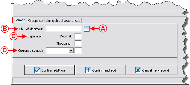
| − | '''<span style="color: rgb(255, 0, 0);">A: </span>'''The [[Image: | + | '''<span style="color: rgb(255, 0, 0);">A: </span>'''The [[Image:Button Selection 3 dots.png]] button contains three configurations of predefined formats: monetary, percentage and quantity. By selecting one of them, the <span style="color: rgb(255, 0, 0);">'''B'''</span>, <span style="color: rgb(255, 0, 0);">'''C'''</span> and <span style="color: rgb(255, 0, 0);">'''D'''</span> fields are automatically filled in. It is also possible to fill in these fields manually. |
| width="50%" | | | width="50%" | | ||
| − | '''<span style="color: rgb(255, 0, 0);">B: </span>'''Allows you to choose the number of decimals the number will comprise. For example, for a "Monetary" format, you must enter "2", since a monetary format only has two decimals. It is easier to use the button explained in <span style="color: rgb(255, 0, 0);">'''A'''</span>. | + | '''<span style="color: rgb(255, 0, 0);">B: </span>'''Allows you to choose the number of decimals the number will comprise. For example, for a "Monetary" format, you must enter "2", since a monetary format only has two decimals. Although, It is easier to use the button explained in <span style="color: rgb(255, 0, 0);">'''A'''</span>. |
|- | |- | ||
| width="50%" | | | width="50%" | | ||
| − | '''<span style="color: rgb(255, 0, 0);">C: </span>'''Allows you to specify if the numbers should contain a separation between the decimals or the thousands. For instance, for a "Monetary" format, you must enter a "." in the "Decimal" box. | + | '''<span style="color: rgb(255, 0, 0);">C: </span>'''Allows you to specify if the numbers should contain a separation between the decimals or the thousands. For instance, for a "Monetary" format, you must enter a "." in the "Decimal" box. Although, the use of the button explained in <span style="color: rgb(255, 0, 0);">'''A'''</span> is easier. |
| width="50%" | | | width="50%" | | ||
| − | '''<span style="color: rgb(255, 0, 0);">D: </span>'''Allows you to specify if a symbol must be added to the number. For example, for a "Monetary" format, you must choose "Before" in the drop-down list, then "$" in the second box. | + | '''<span style="color: rgb(255, 0, 0);">D: </span>'''Allows you to specify if a symbol must be added to the number. For example, for a "Monetary" format, you must choose "Before" in the drop-down list, then "$" in the second box. Although, the use of the button explained in <span style="color: rgb(255, 0, 0);">'''A '''</span>is faster. |
|} | |} | ||
| − | <br> | + | <br> |
===== "Text" Type ===== | ===== "Text" Type ===== | ||
| − | A "Text" type characteristic has no predefined format. It is in a text form and may contain a maximum of 255 alphanumeric characters. | + | A "Text" type characteristic has no predefined format. It is in a text form and may contain a maximum of 255 alphanumeric characters. |
| + | |||
| + | <br> | ||
===== "Date and time" Type ===== | ===== "Date and time" Type ===== | ||
| − | A "Date and time" type characteristic must contain only one date, only one time, or a date and a time. | + | A "Date and time" type characteristic must contain only one date, only one time, or a date and a time. |
{| cellspacing="1" cellpadding="1" border="1" class="wikitable" style="width: 609px; height: 307px;" | {| cellspacing="1" cellpadding="1" border="1" class="wikitable" style="width: 609px; height: 307px;" | ||
|- | |- | ||
| − | | colspan="2" | [[Image: | + | | colspan="2" | [[Image:Characteristic Management 005.png]] |
|- | |- | ||
| width="50%" | | | width="50%" | | ||
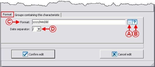
| − | '''<span style="color: rgb(255, 0, 0);">A: </span>'''The [[Image: | + | '''<span style="color: rgb(255, 0, 0);">A: </span>'''The [[Image:Button Selection 3 dots.png]] button contains three configurations of predefined formats: Date only, time only or date and time. |
| width="50%" | | | width="50%" | | ||
| − | '''<span style="color: rgb(255, 0, 0);">B: </span>'''The [[Image: | + | '''<span style="color: rgb(255, 0, 0);">B: </span>'''The [[Image:Bouton point interrogation.png]] button displays the legend of all the formats of date and time. |
|- | |- | ||
| width="50%" | | | width="50%" | | ||
| − | '''<span style="color: rgb(255, 0, 0);">C: </span>'''This line allows you to enter the date and time format. In this example, it is date only. | + | '''<span style="color: rgb(255, 0, 0);">C: </span>'''This line allows you to enter the date and time format. In this example, it is date only. |
| width="50%" | | | width="50%" | | ||
| − | '''<span style="color: rgb(255, 0, 0);">D: </span>'''This field allows you to specify the separator to be used for the date. For instance, if the " | + | '''<span style="color: rgb(255, 0, 0);">D: </span>'''This field allows you to specify the separator to be used for the date. For instance, if the "/" separator is chosen, the date will be entered as "2012/01/27". |
|} | |} | ||
| − | <br> | + | <br> |
===== "Checkbox" Type ===== | ===== "Checkbox" Type ===== | ||
| − | A "Checkbox" type characteristic has no predefined format and it comes in the form of a checkbox. | + | A "Checkbox" type characteristic has no predefined format and it comes in the form of a checkbox. |
| + | |||
| + | <br> | ||
===== "List of options" Type ===== | ===== "List of options" Type ===== | ||
| − | A "List of options" type characteristic comes in the form of a drop-down list (meaning that it is possible to manually add options to the list). Each value may contain a maximum of 255 alphanumeric characters. | + | A "List of options" type characteristic comes in the form of a dynamic drop-down list (meaning that it is possible to manually add options to the list). Each value may contain a maximum of 255 alphanumeric characters. |
{| cellspacing="1" cellpadding="1" border="1" class="wikitable" style="width: 609px; height: 318px;" | {| cellspacing="1" cellpadding="1" border="1" class="wikitable" style="width: 609px; height: 318px;" | ||
|- | |- | ||
| − | | colspan="2" | [[Image: | + | | colspan="2" | [[Image:Characteristic Management 006.png]] |
|- | |- | ||
| width="50%" | | | width="50%" | | ||
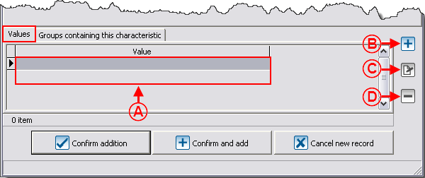
| − | '''<span style="color: rgb(255, 0, 0);">A: </span>'''It is the prefined list of options. They are always presented in alphabetical order. | + | '''<span style="color: rgb(255, 0, 0);">A: </span>'''It is the prefined list of options. They are always presented in alphabetical order. |
| width="50%" | | | width="50%" | | ||
| − | '''<span style="color: rgb(255, 0, 0);">B: </span>'''The [[Image: | + | '''<span style="color: rgb(255, 0, 0);">B: </span>'''The [[Image:Button add plus.png]] button allows you to add new values to the list. |
|- | |- | ||
| width="50%" | | | width="50%" | | ||
| − | '''<span style="color: rgb(255, 0, 0);">C: </span>'''The [[Image: | + | '''<span style="color: rgb(255, 0, 0);">C: </span>'''The [[Image:Button Edit.png]] button allows you to modify a value from the list. |
| width="50%" | | | width="50%" | | ||
| − | '''<span style="color: rgb(255, 0, 0);">D: </span>'''The [[Image: | + | '''<span style="color: rgb(255, 0, 0);">D: </span>'''The [[Image:Button Minus remove delete.png]] button allows you to delete a value from the list. |
|- | |- | ||
| colspan="2" | | | colspan="2" | | ||
| − | '''NOTE: '''When entering a "List of options" type characteristic, it is possible to add new values. If a new value is added in the entry, it will automatically be added in the "Characteristic management". | + | '''NOTE: '''When entering a "List of options" type characteristic, it is possible to add new values. If a new value is added in the entry, it will automatically be added in the "Characteristic management". |
|} | |} | ||
| − | <br> | + | <br> |
===== "Predefined list of options" Type ===== | ===== "Predefined list of options" Type ===== | ||
| Line 212: | Line 218: | ||
A "Predefined list of options" type characteristic comes in the form of a static drop-down list (meaning that it is not possible to manually enter another response). Each value can contain a maximum of 255 alphanumeric characters. | A "Predefined list of options" type characteristic comes in the form of a static drop-down list (meaning that it is not possible to manually enter another response). Each value can contain a maximum of 255 alphanumeric characters. | ||
| − | {| cellspacing="1" cellpadding="1" border="1" style="width: 612px; height: 348px; | + | {| cellspacing="1" cellpadding="1" border="1" class="wikitable" style="width: 612px; height: 348px;" |
|- | |- | ||
| colspan="2" | [[Image:Characteristic Management 007.png]] | | colspan="2" | [[Image:Characteristic Management 007.png]] | ||
|- | |- | ||
| width="50%" | | | width="50%" | | ||
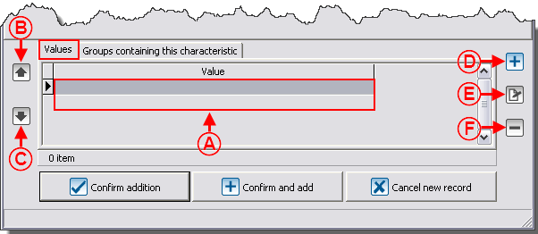
| − | '''<span style="color: rgb(255, 0, 0);">A: </span>'''It is the list of predefined values. The values can be placed in the desired order. | + | '''<span style="color: rgb(255, 0, 0);">A: </span>'''It is the list of predefined values. The values can be placed in the desired order. |
| width="50%" | | | width="50%" | | ||
| − | '''<span style="color: rgb(255, 0, 0);">B: </span>'''The [[Image: | + | '''<span style="color: rgb(255, 0, 0);">B: </span>'''The [[Image:Button Arrow up.png]] button allows you to move upward a value in the list. |
|- | |- | ||
| width="50%" | | | width="50%" | | ||
| − | '''<span style="color: rgb(255, 0, 0);">C: </span>'''The [[Image: | + | '''<span style="color: rgb(255, 0, 0);">C: </span>'''The [[Image:Button Arrow down.png]] button allows you to move downward a value in the list. |
| width="50%" | | | width="50%" | | ||
| − | '''<span style="color: rgb(255, 0, 0);">D: </span>'''The [[Image: | + | '''<span style="color: rgb(255, 0, 0);">D: </span>'''The [[Image:Button add plus.png]] button allows you to add a new value to the list. |
|- | |- | ||
| width="50%" | | | width="50%" | | ||
| − | '''<span style="color: rgb(255, 0, 0);">E: </span>'''The [[Image: | + | '''<span style="color: rgb(255, 0, 0);">E: </span>'''The [[Image:Button Edit.png]] button allows you to modify a value from the list. |
| width="50%" | | | width="50%" | | ||
| − | '''<span style="color: rgb(255, 0, 0);">F: </span>'''The [[Image: | + | '''<span style="color: rgb(255, 0, 0);">F: </span>'''The [[Image:Button Minus remove delete.png]] button allows you to delete a value from the list. |
|- | |- | ||
| colspan="2" | | | colspan="2" | | ||
| − | '''NOTE: '''When entering a "Predefined list of options" type characteristic, it is not possible to add new values. The different options must be configured in the characteristic. | + | '''NOTE: '''When entering a "Predefined list of options" type characteristic, it is not possible to add new values. The different options must be configured in the characteristic. |
|} | |} | ||
| − | <br> | + | <br> |
===== "Long text" Type ===== | ===== "Long text" Type ===== | ||
| − | A "Long text" type characteristic has no predefined format. It comes in a text form and the number of alphanumeric characters | + | A "Long text" type characteristic has no predefined format. It comes in a text form and has no limit with regards to the number of alphanumeric characters. |
| + | |||
| + | <br> | ||
==== "Groups containing this characteristic" Tab ==== | ==== "Groups containing this characteristic" Tab ==== | ||
| Line 253: | Line 261: | ||
|- | |- | ||
| colspan="2" | | | colspan="2" | | ||
| − | A group of characteristics must be created prior to attaching a characteristic to the group. To learn how to do this, [[ProDon: | + | A group of characteristics must be created prior to attaching a characteristic to the group. To learn how to do this, [[ProDon:Characteristic Management#Configuring_Groups_of_Characteristics|click here]]. |
|- | |- | ||
| − | | colspan="2" | [[Image: | + | | colspan="2" | [[Image:Characteristic Management 008.png]] |
|- | |- | ||
| width="50%" | | | width="50%" | | ||
| − | '''<span style="color: rgb(255, 0, 0);">A: </span>'''It is the list of the characteristics available in the different groups of characteristics. For more information concerning groups of characteristics, consult the [[ProDon: | + | '''<span style="color: rgb(255, 0, 0);">A: </span>'''It is the list of the characteristics available in the different groups of characteristics. For more information concerning groups of characteristics, consult the [[ProDon:Characteristic Management#Add_.2F_Edit_a_Group_of_Characteristics|"Add / Edit a Group of Characteristics"]] section. |
| width="50%" | | | width="50%" | | ||
| − | '''<span style="color: rgb(255, 0, 0);">B: </span>'''The [[Image: | + | '''<span style="color: rgb(255, 0, 0);">B: </span>'''The [[Image:Button uncheck.png]] button allows you to uncheck the box under the "Req. for the group?" field. If the box is unchecked, the characteristic may remain empty during the entry. |
| − | '''NOTE: '''It is also possible to select the line and to use the spacebar of the keyboard to check or uncheck a box. | + | '''NOTE: '''It is also possible to select the line and to use the spacebar of the keyboard to check or uncheck a box. |
|- | |- | ||
| width="50%" | | | width="50%" | | ||
| − | '''<span style="color: rgb(255, 0, 0);">C: </span>'''The [[Image: | + | '''<span style="color: rgb(255, 0, 0);">C: </span>'''The [[Image:Button checkbox checked crossed.png]] button allows you to check the box under the "Req. for the group?" field. If the box is checked, you must fill in the characteristic during its entry. |
| − | '''NOTE: '''It is also possible to select the line and use the spacebar of the keyboard to check or uncheck a box. | + | '''NOTE: '''It is also possible to select the line and use the spacebar of the keyboard to check or uncheck a box. |
| width="50%" | | | width="50%" | | ||
| − | '''<span style="color: rgb(255, 0, 0);">D: </span>'''The [[Image: | + | '''<span style="color: rgb(255, 0, 0);">D: </span>'''The [[Image:Button add plus.png]] button allows you to assign the characteristic to an existing group. |
|- | |- | ||
| width="50%" | | | width="50%" | | ||
| − | '''<span style="color: rgb(255, 0, 0);">E: </span>'''The [[Image: | + | '''<span style="color: rgb(255, 0, 0);">E: </span>'''The [[Image:Button Edit.png]] button allows you to modify the group for which the characteristic has been assigned. |
| − | | width="50%" | '''<span style="color: rgb(255, 0, 0);">F: </span>'''The [[Image: | + | | width="50%" | '''<span style="color: rgb(255, 0, 0);">F: </span>'''The [[Image:Button Minus remove delete.png]] button allows you to delete the characteristic from a group by deleting a line. |
|} | |} | ||
| Line 287: | Line 295: | ||
|- | |- | ||
| | | | ||
| − | To go to the "Characteristic management", from the software home page, click on the "Configuration" menu, then select "Characteristics". | + | To go to the "Characteristic management", from the software home page, click on the "Configuration" menu, then select "Characteristics". |
|- | |- | ||
| − | | [[Image: | + | | [[Image:Characteristic Management 009.png]] |
|} | |} | ||
| Line 300: | Line 308: | ||
|- | |- | ||
| colspan="2" | | | colspan="2" | | ||
| − | Then select the "Groups of characteristics" tab. | + | Then select the "Groups of characteristics" tab. |
|- | |- | ||
| − | | colspan="2" | [[Image: | + | | colspan="2" | [[Image:Characteristic Management 010.png]] |
|- | |- | ||
| width="50%" | | | width="50%" | | ||
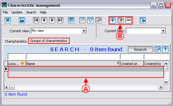
| − | '''<span style="color: rgb(255, 0, 0);">A: </span>'''List of all the groups of characteristics. | + | '''<span style="color: rgb(255, 0, 0);">A: </span>'''List of all the groups of characteristics. |
| width="50%" | | | width="50%" | | ||
| − | '''<span style="color: rgb(255, 0, 0);">B: </span>'''The [[Image: | + | '''<span style="color: rgb(255, 0, 0);">B: </span>'''The [[Image:Button add plus.png]] button allows you to add a new group of characteristics. The [[Image:Button Edit.png]] button allows you to modify an existing group of characteristics. The [[Image:Button Minus remove delete.png]] button allows you to remove a group of characteristics from the list. |
|} | |} | ||
| Line 322: | Line 330: | ||
|- | |- | ||
| colspan="2" | | | colspan="2" | | ||
| − | After clicking on the [[Image: | + | After clicking on the [[Image:Button add plus.png]] button, this window opens. |
|- | |- | ||
| − | | colspan="2" | [[Image: | + | | colspan="2" | [[Image:Characteristic Management 011.png]] |
|- | |- | ||
| width="50%" | | | width="50%" | | ||
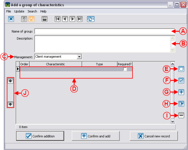
| − | '''<span style="color: rgb(255, 0, 0);">A: </span>'''This line contains the name of the group of characteristics. | + | '''<span style="color: rgb(255, 0, 0);">A: </span>'''This line contains the name of the group of characteristics. |
| width="50%" | | | width="50%" | | ||
| − | '''<span style="color: rgb(255, 0, 0);">B: </span>'''This line allows you to write notes | + | '''<span style="color: rgb(255, 0, 0);">B: </span>'''This line allows you to write down notes on the use of the characteristic for the different users. |
|- | |- | ||
| width="50%" | | | width="50%" | | ||
| − | '''<span style="color: rgb(255, 0, 0);">C: </span>'''This field allows you to specify in which management the group of characteristics is available | + | '''<span style="color: rgb(255, 0, 0);">C: </span>'''This field allows you to specify in which management the group of characteristics is available for use. For example, to be able to use a group of characteristics in a client file, you need to choose "Client management" here. |
| width="50%" | | | width="50%" | | ||
| − | '''<span style="color: rgb(255, 0, 0);">D: </span>'''It is the list of characteristics present in the group of characteristics. | + | '''<span style="color: rgb(255, 0, 0);">D: </span>'''It is the list of characteristics present in the group of characteristics. |
|- | |- | ||
| width="50%" | | | width="50%" | | ||
| − | '''<span style="color: rgb(255, 0, 0);">E: </span>'''The [[Image: | + | '''<span style="color: rgb(255, 0, 0);">E: </span>'''The [[Image:Button uncheck.png]] button allows you to uncheck the box under the "Required?" field. If the box is unchecked, the characteristic may remain empty during the entry. |
| − | '''NOTE: '''It is also possible to select the line and use the spacebar of the keyboard to check or uncheck a box. | + | '''NOTE: '''It is also possible to select the line and use the spacebar of the keyboard to check or uncheck a box. |
| width="50%" | | | width="50%" | | ||
| − | '''<span style="color: rgb(255, 0, 0);">F: </span>'''The [[Image: | + | '''<span style="color: rgb(255, 0, 0);">F: </span>'''The [[Image:Button checkbox checked crossed.png]] button allows you to check the box under the "Required?" field. If this box is checked, you must fill in the characteristic during the entry. |
| − | '''NOTE: '''It is also possible to select the line and use the spacebar of the keyboard check or uncheck a box. | + | '''NOTE: '''It is also possible to select the line and use the spacebar of the keyboard to check or uncheck a box. |
|- | |- | ||
| width="50%" | | | width="50%" | | ||
| − | '''<span style="color: rgb(255, 0, 0);">G: </span>'''The [[Image: | + | '''<span style="color: rgb(255, 0, 0);">G: </span>'''The [[Image:Button add plus.png]] button allows you to add a new characteristic to the group of characteristcs. |
| − | '''NOTE: '''The characteristic must have previously been created in the "Characteristics" tab. | + | '''NOTE: '''The characteristic must have previously been created in the "Characteristics" tab. |
| width="50%" | | | width="50%" | | ||
| − | '''<span style="color: rgb(255, 0, 0);">H: </span>'''The [[Image: | + | '''<span style="color: rgb(255, 0, 0);">H: </span>'''The [[Image:Button Edit.png]] allows you to modify a characteristic from the list. |
|- | |- | ||
| width="50%" | | | width="50%" | | ||
| − | '''<span style="color: rgb(255, 0, 0);">I: </span>'''The [[Image: | + | '''<span style="color: rgb(255, 0, 0);">I: </span>'''The [[Image:Button Minus remove delete.png]] button allows you to remove a characteristic from the list. |
| width="50%" | | | width="50%" | | ||
| − | '''<span style="color: rgb(255, 0, 0);">J: </span>'''The [[Image: | + | '''<span style="color: rgb(255, 0, 0);">J: </span>'''The [[Image:Button Arrow up.png]] and [[Image:Button Arrow down.png]] buttons allow you to move the values upward and downward in the list. |
|} | |} | ||
| Line 371: | Line 379: | ||
== Using a Characteristic or a Group of Characteristics == | == Using a Characteristic or a Group of Characteristics == | ||
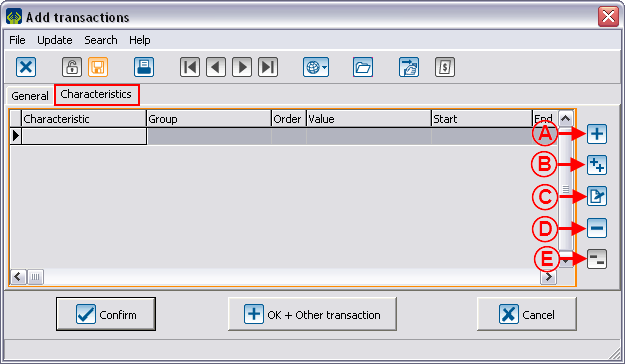
| − | For every management where characteristics are available (clients, transactions, etc.), the "Characteristics" tab is | + | For every management where characteristics are available (clients, transactions, etc.), the "Characteristics" tab is present. In the example below, it is a transaction file. |
| − | {| cellspacing="1" cellpadding="1" border="1" | + | {| cellspacing="1" cellpadding="1" border="1" style="width: 633px; height: 601px;" class="wikitable" |
|- | |- | ||
| colspan="2" | | | colspan="2" | | ||
| Line 379: | Line 387: | ||
|- | |- | ||
| − | | colspan="2" | | + | | colspan="2" | [[Image:Characteristic Management 012.png]] |
|- | |- | ||
| width="50%" | | | width="50%" | | ||
| Line 403: | Line 411: | ||
== Using a Characteristic in Mass Mailing == | == Using a Characteristic in Mass Mailing == | ||
| − | Prior to using a characteristic in a master document, it is important to configure it correctly. To learn how to adequately configure a characteristic, consult the [[ProDon: | + | Prior to using a characteristic in a master document, it is important to configure it correctly. To learn how to adequately configure a characteristic, consult the [[ProDon:Characteristic Management#Configuring_Characteristics|"Configuring Characteristics"]] section. |
<br> | <br> | ||
| Line 409: | Line 417: | ||
After correctly configuring the characteristic to include in the mass mailing, go to the "Mass mailing" tab. | After correctly configuring the characteristic to include in the mass mailing, go to the "Mass mailing" tab. | ||
| − | {| cellspacing="1" cellpadding="1" border="1 | + | {| width="50%" cellspacing="1" cellpadding="1" border="1" class="wikitable" |
|- | |- | ||
| − | | colspan="2" | [[Image: | + | | colspan="2" | [[Image:Characteristic Management 013.png]] |
|- | |- | ||
| width="50%" | | | width="50%" | | ||
| Line 421: | Line 429: | ||
|- | |- | ||
| colspan="2" | | | colspan="2" | | ||
| − | ''' | + | '''General notes:''' |
| − | It is possible to type text directly, as " | + | It is possible to type text directly, as "from:" in the example above. The square brackets are useful only when a characteristic might be present more than once. |
|} | |} | ||
| Line 433: | Line 441: | ||
{| cellspacing="1" cellpadding="1" border="1" class="wikitable" style="width: 616px; height: 541px;" | {| cellspacing="1" cellpadding="1" border="1" class="wikitable" style="width: 616px; height: 541px;" | ||
|- | |- | ||
| − | | [[Image: | + | | [[Image:Characteristic Management 014.png]]<br> |
|- | |- | ||
| | | | ||
| − | All characteristics can be used as merge fields in the [[ProDon: | + | All characteristics can be used as merge fields in the [[ProDon:Master Document Management|master documents]]. |
The characteristics are under the "Characteristics" sub-section. | The characteristics are under the "Characteristics" sub-section. | ||
| − | The "characteristic" merge fields are all named as follows: " | + | The "characteristic" merge fields are all named as follows: "Charact_Name of the characteristic". |
|} | |} | ||
| Line 448: | Line 456: | ||
<br> | <br> | ||
| − | {{ | + | {{Footer_ProDon_Version|4.6.5.13}}<br> |
Latest revision as of 16:57, 4 May 2016
| Characteristic Management |
Contents
[hide]- 1 Introduction
- 2 Configuring Characteristics
- 3 Configuring Groups of Characteristics
- 4 Using a Characteristic or a Group of Characteristics
- 5 Using a Characteristic in Mass Mailing
Introduction
The characteristics are fully configurable fields. Their main use is to manage information for which no field has been created in the software. For instance, someone who would want to manage his or her clients' marital status could easily do it.
It is possible to configure characteristics to deal with information in many managements. For example, "Client management", "Transaction management", etc.
If the information to be managed requires several precise pieces of information, it is possible to create groups of characteristics that contain many characteristics. When adding a group, all the characteristics that are in the group are added in a single operation. For instance, someone could create a group named "Call", that would contain 2 characteristics. A first one for the type of call, and a second one for the duration of the call.
CAUTION: Prior to creating a characteristic, read the "Categories vs Customized Fields vs Characteristics" document. This document explains the different possibilities of configuration.
Configuring Characteristics
|
To go to the "Characteristic Management", from the software home page, click on the "Configuration" menu, then select "Characteristics". |
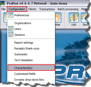
|
Add / Edit a Characteristic
"General" Tab
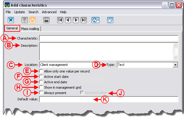 | |
|
A: This line contains the name of the characteristic. |
B: This line allows you to write down notes on the use of the characteristic for the different users. |
|
C: This field allows you to specify the management in which the characteristic will be available for use. For instance, to be able to use a characteristic in a client file, you must choose "Client management" here. |
D: The type of characteristic must be chosen based on the way the information of the characteristic is entered. For more details on the types of characteristics, consult the "Different Types of Characteristics" section. |
|
E: If this box is checked, it is not possible to add the characteristic more than once in an element of the management chosen in C. |
F: Allows you to add a field to the characteristic in order to enter a start date. |
|
G: Allows you to add a field to the characteristic in order to enter an end date. |
H: Allows you to add the column corresponding to the characteristic in different management grids of the software. CAUTION: This box can be checked only if the option in E is checked. Moreover, to be able to view the column in a management, consult the "View management" document. |
|
I: Allows you to add the characteristic to all the elements of management chosen in C. |
J: Allows you to require information entry for that characteristic. |
|
K: Allows you to specify a default value for new entries. |
|
"Mass Mailing" Tab
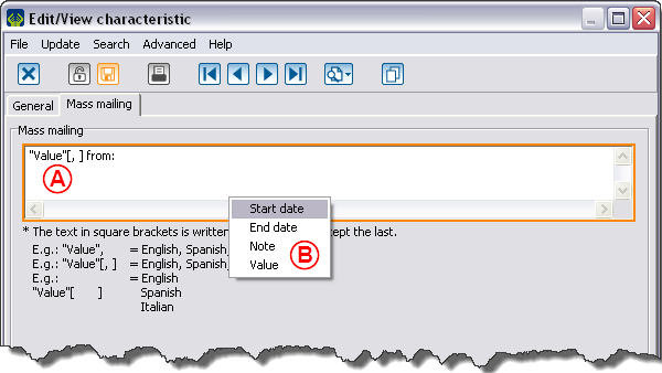
This tab allows you to configure a characteristic with the intention of including it to a mass mailing.
For more details on the use of a characteristic in mass mailing, click here.
"Format" Tab
Different types of characteristics
There are 7 types of characteristics:
"Numeric" Type
A "Numeric" type characteristic contains numbers exclusively.
"Text" Type
A "Text" type characteristic has no predefined format. It is in a text form and may contain a maximum of 255 alphanumeric characters.
"Date and time" Type
A "Date and time" type characteristic must contain only one date, only one time, or a date and a time.
"Checkbox" Type
A "Checkbox" type characteristic has no predefined format and it comes in the form of a checkbox.
"List of options" Type
A "List of options" type characteristic comes in the form of a dynamic drop-down list (meaning that it is possible to manually add options to the list). Each value may contain a maximum of 255 alphanumeric characters.
"Predefined list of options" Type
A "Predefined list of options" type characteristic comes in the form of a static drop-down list (meaning that it is not possible to manually enter another response). Each value can contain a maximum of 255 alphanumeric characters.
"Long text" Type
A "Long text" type characteristic has no predefined format. It comes in a text form and has no limit with regards to the number of alphanumeric characters.
"Groups containing this characteristic" Tab
|
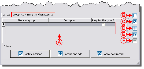
A group of characteristics must be created prior to attaching a characteristic to the group. To learn how to do this, click here. | |
| |
|
A: It is the list of the characteristics available in the different groups of characteristics. For more information concerning groups of characteristics, consult the "Add / Edit a Group of Characteristics" section. |
B: The NOTE: It is also possible to select the line and to use the spacebar of the keyboard to check or uncheck a box. |
|
C: The NOTE: It is also possible to select the line and use the spacebar of the keyboard to check or uncheck a box. |
D: The |
|
E: The |
F: The |
Configuring Groups of Characteristics
|
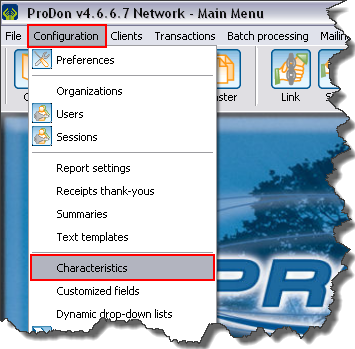
To go to the "Characteristic management", from the software home page, click on the "Configuration" menu, then select "Characteristics". |
|
Add / Edit a Group of Characteristics
Using a Characteristic or a Group of Characteristics
For every management where characteristics are available (clients, transactions, etc.), the "Characteristics" tab is present. In the example below, it is a transaction file.
Using a Characteristic in Mass Mailing
Prior to using a characteristic in a master document, it is important to configure it correctly. To learn how to adequately configure a characteristic, consult the "Configuring Characteristics" section.
After correctly configuring the characteristic to include in the mass mailing, go to the "Mass mailing" tab.
 |
|
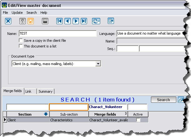
All characteristics can be used as merge fields in the master documents. The characteristics are under the "Characteristics" sub-section. The "characteristic" merge fields are all named as follows: "Charact_Name of the characteristic". |
Document name: ProDon:Characteristic Management
Version : 4.6.5.13
