Difference between revisions of "ProDon:Creating a Web Form"
(→Introduction) |
|||
| Line 279: | Line 279: | ||
| width="50%" | | | width="50%" | | ||
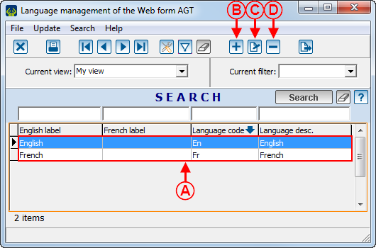
| − | <span style="color: rgb(255, 0, 0);">'''D: '''</span>The [[Image:Button Minus remove delete.png]] button alllows you to remove a language from the list. To do so, select the language to modify at <span style="color: rgb(255, 0, 0);">'''A'''</span>, then click on the [[Image:Button Minus remove delete.png]] button. | + | <span style="color: rgb(255, 0, 0);">'''D: '''</span>The [[Image:Button Minus remove delete.png]] button alllows you to remove a language from the list. To do so, select the language to modify at <span style="color: rgb(255, 0, 0);">'''A'''</span>, then click on the [[Image:Button Minus remove delete.png]] button. |
|} | |} | ||
| Line 308: | Line 308: | ||
|} | |} | ||
| − | <br> | + | <br> |
=== "Transaction" Tab === | === "Transaction" Tab === | ||
| Line 464: | Line 464: | ||
|- | |- | ||
| − | | style="text-align: center; | + | | colspan="2" style="text-align: center;" | [[Image:Creating a Web Form 011.png]]<br> |
|- | |- | ||
| | | | ||
| Line 531: | Line 531: | ||
|} | |} | ||
| − | <br> | + | <br> |
=== "Commitment" Tab === | === "Commitment" Tab === | ||
| Line 679: | Line 679: | ||
|- | |- | ||
| − | | | + | | style="text-align: center;" colspan="2" | [[Image:Creating a Web Form 017.png]]<br> |
|- | |- | ||
| width="50%" | | | width="50%" | | ||
| Line 734: | Line 734: | ||
|} | |} | ||
| − | <br> | + | <br> |
==== "Frequencies" Tab ==== | ==== "Frequencies" Tab ==== | ||
| Line 746: | Line 746: | ||
| width="50%" | | | width="50%" | | ||
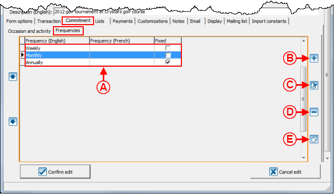
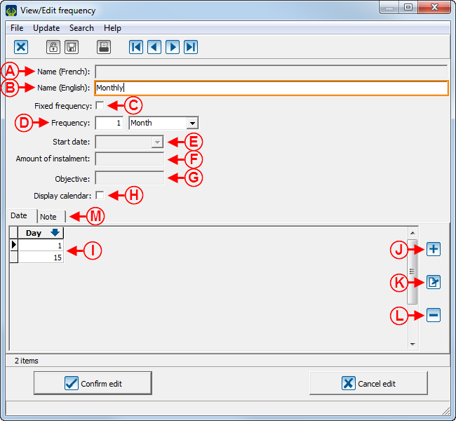
| − | <span style="color: rgb(255, 0, 0);">'''B:'''</span> The [[Image: | + | <span style="color: rgb(255, 0, 0);">'''B:'''</span> The [[Image:Button add plus.png]] button allows you to add frequencies to the list at <span style="color: rgb(255, 0, 0);">'''A'''</span>. |
|- | |- | ||
| | | | ||
| − | <span style="color: rgb(255, 0, 0);">'''C:'''</span> The [[Image: | + | <span style="color: rgb(255, 0, 0);">'''C:'''</span> The [[Image:Button Edit.png]] button allows you to modify the frequencies in the list at <span style="color: rgb(255, 0, 0);">'''A'''</span>. To do so, select the frequency to modify at <span style="color: rgb(255, 0, 0);">'''A'''</span>, then click on the [[Image:Button Edit.png]] button.<br> |
| | | | ||
| − | <span style="color: rgb(255, 0, 0);">'''D:'''</span> The [[Image: | + | <span style="color: rgb(255, 0, 0);">'''D:'''</span> The [[Image:Button Minus remove delete.png]] button allows you to delete a frequency from the list at <span style="color: rgb(255, 0, 0);">'''A'''</span>. To do so, select the frequency to delete at <span style="color: rgb(255, 0, 0);">'''A'''</span>, then click on the [[Image:Button Minus remove delete.png]] button. |
|- | |- | ||
| colspan="2" | | | colspan="2" | | ||
| − | <span style="color: rgb(255, 0, 0);">'''E:'''</span> The [[Image: | + | <span style="color: rgb(255, 0, 0);">'''E:'''</span> The [[Image:Bouton dupliquer.png]] button allows you to duplicate the frequencies from another activity in the form. |
|} | |} | ||
| Line 766: | Line 766: | ||
|- | |- | ||
| colspan="2" | | | colspan="2" | | ||
| − | After clicking on the [[Image: | + | After clicking on the [[Image:Button add plus.png]] button or the [[Image:Button Edit.png]] button, this window opens. |
|- | |- | ||
| Line 809: | Line 809: | ||
| | | | ||
| − | <span style="color: rgb(255, 0, 0);">'''J:'''</span> The [[Image: | + | <span style="color: rgb(255, 0, 0);">'''J:'''</span> The [[Image:Button add plus.png]] button allows you to add a new choice of day at <span style="color: rgb(255, 0, 0);">'''I'''</span>.<br> |
|- | |- | ||
| | | | ||
| − | <span style="color: rgb(255, 0, 0);">'''K:'''</span> The [[Image: | + | <span style="color: rgb(255, 0, 0);">'''K:'''</span> The [[Image:Button Edit.png]] button allows you to modify the choices of day at <span style="color: rgb(255, 0, 0);">'''I'''</span>. To do so, select the day to modify at <span style="color: rgb(255, 0, 0);">'''I'''</span>, then click on the [[Image:Button Edit.png]] button.<br> |
| | | | ||
| − | <span style="color: rgb(255, 0, 0);">'''L:'''</span> The [[Image: | + | <span style="color: rgb(255, 0, 0);">'''L:'''</span> The [[Image:Button Minus remove delete.png]] button allows you to delete the day choices at <span style="color: rgb(255, 0, 0);">'''I'''</span>. To do so, select the day to delete at <span style="color: rgb(255, 0, 0);">'''I'''</span>, then click on the [[Image:Button Minus remove delete.png]] button.<br> |
|- | |- | ||
| colspan="2" | | | colspan="2" | | ||
| − | <span style="color: rgb(255, 0, 0);">'''M:'''</span> The "Note" tab allows you to add a note below the frequency when it is chosen in the form. To view an example of note below the frequency, see '''point '''<span style="color: rgb(255, 0, 0);">'''G'''</span> of the "Web Form Example 1" section. | + | <span style="color: rgb(255, 0, 0);">'''M:'''</span> The "Note" tab allows you to add a note below the frequency when it is chosen in the form. To view an example of note below the frequency, see '''point '''<span style="color: rgb(255, 0, 0);">'''G'''</span> of the "Web Form Example 1" section. |
'''NOTE:''' To learn how to configure the "Add note to the form" window, see this section.<br> | '''NOTE:''' To learn how to configure the "Add note to the form" window, see this section.<br> | ||
| Line 826: | Line 826: | ||
|} | |} | ||
| − | <br> | + | <br> |
=== "Lists" Tab<br> === | === "Lists" Tab<br> === | ||
| Line 854: | Line 854: | ||
| | | | ||
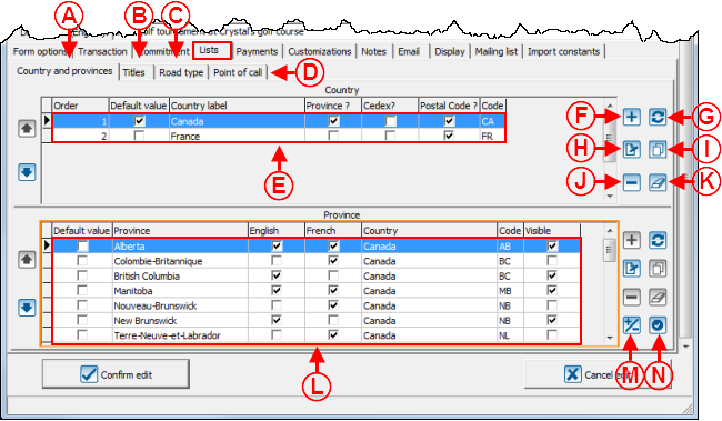
| − | <span style="color: rgb(255, 0, 0);">'''F:'''</span> The [[Image: | + | <span style="color: rgb(255, 0, 0);">'''F:'''</span> The [[Image:Button add plus.png]] button allows you to a coubtry to the list at <span style="color: rgb(255, 0, 0);">'''E'''</span>. |
|- | |- | ||
| | | | ||
| − | <span style="color: rgb(255, 0, 0);">'''G:'''</span> The [[Image: | + | <span style="color: rgb(255, 0, 0);">'''G:'''</span> The [[Image:Round arrows button.png]] button allows you to add to the list at <span style="color: rgb(255, 0, 0);">'''E'''</span> all the existing conutries in '''''ProDon'''''. |
| | | | ||
| − | <span style="color: rgb(255, 0, 0);">'''H:'''</span> The [[Image: | + | <span style="color: rgb(255, 0, 0);">'''H:'''</span> The [[Image:Button Edit.png]] button allows you to modify a country of the list at <span style="color: rgb(255, 0, 0);">'''E'''</span>. To do so, select the country to modify, then click on the [[Image:Button Edit.png]] button. |
|- | |- | ||
| | | | ||
| − | <span style="color: rgb(255, 0, 0);">'''I:'''</span> The [[Image: | + | <span style="color: rgb(255, 0, 0);">'''I:'''</span> The [[Image:Bouton dupliquer.png]] button allows you to duplicate countries from another form to add them at <span style="color: rgb(255, 0, 0);">'''E'''</span>. |
| | | | ||
| − | <span style="color: rgb(255, 0, 0);">'''J:'''</span> The [[Image: | + | <span style="color: rgb(255, 0, 0);">'''J:'''</span> The [[Image:Button Minus remove delete.png]] button allows you to remove a country from the list at <span style="color: rgb(255, 0, 0);">'''E'''</span>. To do so, select the country to remove , then click on the [[Image:Button Minus remove delete.png]] button. |
|- | |- | ||
| Line 881: | Line 881: | ||
|- | |- | ||
| | | | ||
| − | <span style="color: rgb(255, 0, 0);">'''M:'''</span> The [[Image: | + | <span style="color: rgb(255, 0, 0);">'''M:'''</span> The [[Image:More less button.png]] button allows you to display or not theprovince on the form. |
| | | | ||
| − | <span style="color: rgb(255, 0, 0);">'''N:'''</span> The [[Image: | + | <span style="color: rgb(255, 0, 0);">'''N:'''</span> The [[Image:Circle checkmark button.png]] button allows you to modify the default province specified in the list at <span style="color: rgb(255, 0, 0);"><span style="font-weight: bold;">L</span></span>.<br> |
|} | |} | ||
| Line 915: | Line 915: | ||
|- | |- | ||
| | | | ||
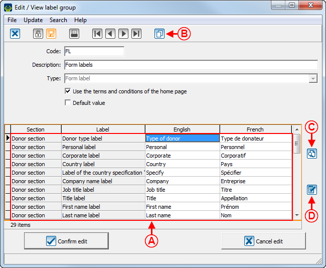
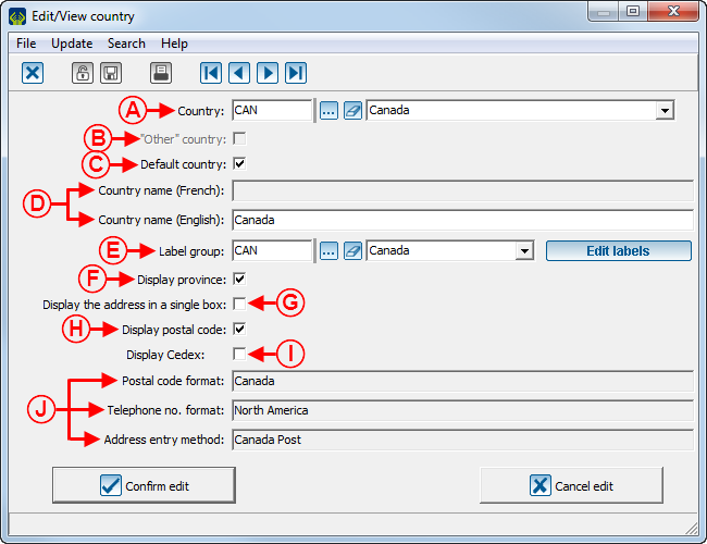
| − | <span style="color: rgb(255, 0, 0);">'''E:'''</span> The [[Image: | + | <span style="color: rgb(255, 0, 0);">'''E:'''</span> The [[Image:Edit labels button.png]] button allows you to configure the country labels at <span style="color: rgb(255, 0, 0);">'''A'''</span>. For more information about labels, see the "Label Configuration" document. |
| | | | ||
| Line 936: | Line 936: | ||
|} | |} | ||
| − | <br> | + | <br> |
=== "Payment" Tab<br> === | === "Payment" Tab<br> === | ||
| Line 1,007: | Line 1,007: | ||
|} | |} | ||
| − | <br> | + | <br> |
=== "Customizations" Tab<br> === | === "Customizations" Tab<br> === | ||
| Line 1,015: | Line 1,015: | ||
To learn how to configure the customizations of a Web form, see this document. | To learn how to configure the customizations of a Web form, see this document. | ||
| − | <br> | + | <br> |
=== "Notes" Tab<br> === | === "Notes" Tab<br> === | ||
| Line 1,029: | Line 1,029: | ||
| width="50%" | | | width="50%" | | ||
| − | <span style="color: rgb(255, 0, 0);">'''B:'''</span> The [[Image: | + | <span style="color: rgb(255, 0, 0);">'''B:'''</span> The [[Image:Button add plus.png]] button allows you to add a new note to the form.<br> |
|- | |- | ||
| | | | ||
| − | <span style="color: rgb(255, 0, 0);">'''C:'''</span> The [[Image: | + | <span style="color: rgb(255, 0, 0);">'''C:'''</span> The [[Image:Button Edit.png]] button allows you to modify a note in the list at <span style="color: rgb(255, 0, 0);">'''A'''</span>. To do so, select the note to modify at <span style="color: rgb(255, 0, 0);">'''A'''</span>, then click on the [[Image:Button Edit.png]] button.<br> |
| | | | ||
| − | <span style="color: rgb(255, 0, 0);">'''D:'''</span> The [[Image: | + | <span style="color: rgb(255, 0, 0);">'''D:'''</span> The [[Image:Button Minus remove delete.png]] button allows you to delete a note in the list at <span style="color: rgb(255, 0, 0);">'''A'''</span>. To do so, select the note to modify at <span style="color: rgb(255, 0, 0);">'''A'''</span>, then click on the [[Image:Button Minus remove delete.png]] button. |
|- | |- | ||
| Line 1,052: | Line 1,052: | ||
|- | |- | ||
| colspan="2" | | | colspan="2" | | ||
| − | After clicking on the [[Image: | + | After clicking on the [[Image:Button add plus.png]] button or the [[Image:Button Edit.png]] button, this window opens. |
|- | |- | ||
| Line 1,068: | Line 1,068: | ||
| width="50%" | | | width="50%" | | ||
| − | <span style="color: rgb(255, 0, 0);">'''D:'''</span> The [[Image: | + | <span style="color: rgb(255, 0, 0);">'''D:'''</span> The [[Image:Colour button.png]] button allows you to modify the font colour of the note. The [[Image:Font button.png]] button allows you to modify the font of the note.<br> |
|- | |- | ||
| Line 1,086: | Line 1,086: | ||
|} | |} | ||
| − | <br> | + | <br> |
=== "Email" Tab<br> === | === "Email" Tab<br> === | ||
| Line 1,134: | Line 1,134: | ||
|} | |} | ||
| − | <br> | + | <br> |
=== "Display" Tab<br> === | === "Display" Tab<br> === | ||
| Line 1,165: | Line 1,165: | ||
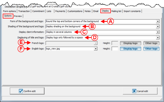
<span style="color: rgb(255, 0, 0);">'''E:'''</span> Allows you to insert the French logo that will be in the form header. | <span style="color: rgb(255, 0, 0);">'''E:'''</span> Allows you to insert the French logo that will be in the form header. | ||
| − | The [[Image:Display logo button.png]] button allows you to view the logo that is at the top of the French form. | + | The [[Image:Display logo button.png]] button allows you to view the logo that is at the top of the French form. |
| − | The [[Image: | + | The [[Image:Other logo button.png]] button allows you to modify the logo that is at the top of the French form.<br> |
| | | | ||
<span style="color: rgb(255, 0, 0);">'''F:'''</span> Allows you to display the English logo that will be in the form header.<br> | <span style="color: rgb(255, 0, 0);">'''F:'''</span> Allows you to display the English logo that will be in the form header.<br> | ||
| − | The [[Image: | + | The [[Image:Display logo button.png]] button allows you to view the logo that is at the top of the English form. |
| − | The [[Image: | + | The [[Image:Other logo button.png]] button allows you to modify the logo that is at the top of the English form.<br> |
|- | |- | ||
| Line 1,182: | Line 1,182: | ||
|} | |} | ||
| − | <br> | + | <br> |
==== "Overview" Tab ==== | ==== "Overview" Tab ==== | ||
| Line 1,193: | Line 1,193: | ||
|- | |- | ||
| width="50%" | | | width="50%" | | ||
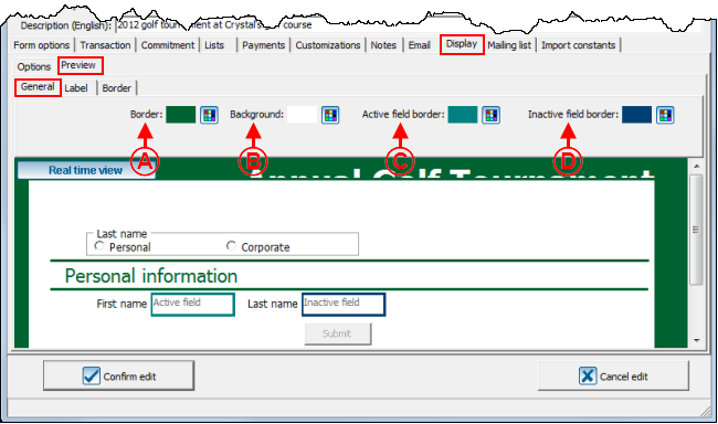
| − | <span style="color: rgb(255, 0, 0);">'''A:'''</span> The [[Image: | + | <span style="color: rgb(255, 0, 0);">'''A:'''</span> The [[Image:Colour button.png]] button allows you to modify the colour of the form margin. To view an example of margin, see '''point '''<span style="color: rgb(255, 0, 0);">'''A'''</span> of the "Web Form Example 3" section.<br> |
| width="50%" | | | width="50%" | | ||
| − | <span style="color: rgb(255, 0, 0);">'''B:'''</span> The [[Image: | + | <span style="color: rgb(255, 0, 0);">'''B:'''</span> The [[Image:Colour button.png]] button allows you to modify the colour of the form background. To view an example of background, see '''point '''<span style="color: rgb(255, 0, 0);">'''B'''</span> of the "Web Form Example 3" section.<br> |
|- | |- | ||
| | | | ||
| − | <span style="color: rgb(255, 0, 0);">'''C:'''</span> The [[Image: | + | <span style="color: rgb(255, 0, 0);">'''C:'''</span> The [[Image:Colour button.png]] button allows you to modify the colour of the border around the active box. To view an example of border around the active box, see '''point '''<span style="color: rgb(255, 0, 0);"><span style="font-weight: bold;">H</span></span> of the "Web Form Example 2" section.<br> |
| | | | ||
| − | <span style="color: rgb(255, 0, 0);">'''D:'''</span> The [[Image: | + | <span style="color: rgb(255, 0, 0);">'''D:'''</span> The [[Image:Colour button.png]] button allows you to modify the colour of the border around the inactive boxes. To view an example of border around an inactive box, see '''point '''<span style="color: rgb(255, 0, 0);"><span style="font-weight: bold;">I</span></span> of the "Web Form Example 2" section.<br> |
|} | |} | ||
| − | <br> | + | <br> |
===== "Label" Tab ===== | ===== "Label" Tab ===== | ||
| Line 1,216: | Line 1,216: | ||
|- | |- | ||
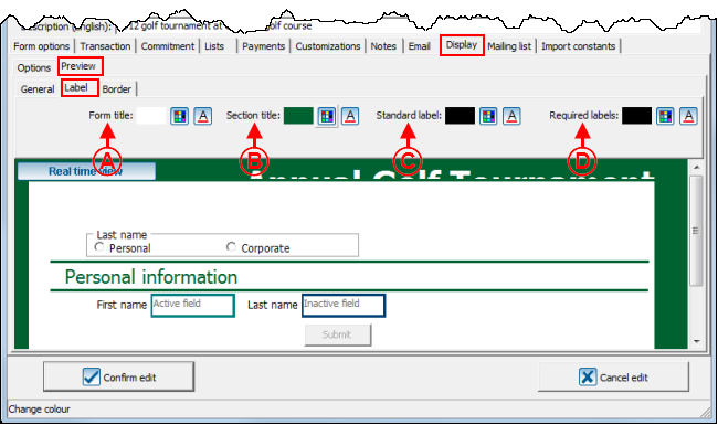
| width="50%" | | | width="50%" | | ||
| − | <span style="color: rgb(255, 0, 0);">'''A:'''</span> The [[Image: | + | <span style="color: rgb(255, 0, 0);">'''A:'''</span> The [[Image:Colour button.png]] button allows you to modify the font colour of the form title. The [[Image:Font button.png]] button allows you to modify the title font. To view an example of title font, see '''point '''<span style="color: rgb(255, 0, 0);">'''K'''</span> of the "Web Form Example 1" section. |
| width="50%" | | | width="50%" | | ||
| − | <span style="color: rgb(255, 0, 0);">'''B:'''</span> The [[Image: | + | <span style="color: rgb(255, 0, 0);">'''B:'''</span> The [[Image:Colour button.png]] button allows you to modify the font colour of the sections titles. The [[Image:Font button.png]] button allows you to modify the font of the sections titles. To view an example of section titles, see '''point '''<span style="color: rgb(255, 0, 0);">'''L'''</span> of the "Web Form Example 1" section.<br> |
|- | |- | ||
| | | | ||
| − | <span style="color: rgb(255, 0, 0);">'''C:'''</span> The [[Image: | + | <span style="color: rgb(255, 0, 0);">'''C:'''</span> The [[Image:Colour button.png]] button allows you to modify the font colour of the standard fields labels. The [[Image:Font button.png]] button allows you to modify the font of the standard field labels. To view an example of standard field label, see '''point '''<span style="color: rgb(255, 0, 0);">'''K'''</span> of the "Web Form Example 2" section.<br> |
| | | | ||
| − | <span style="color: rgb(255, 0, 0);">'''D:'''</span> The [[Image: | + | <span style="color: rgb(255, 0, 0);">'''D:'''</span> The [[Image:Colour button.png]] button allows you to modify the font colour of the required fileds labels. The [[Image:Font button.png]] button allows you to modify the font of the required fields labels. To view an example of required field label, see '''point '''<span style="color: rgb(255, 0, 0);">'''L'''</span> of the "Web Form Example 2" section.<br> |
|} | |} | ||
| − | <br> | + | <br> |
===== "Border" Tab ===== | ===== "Border" Tab ===== | ||
| Line 1,239: | Line 1,239: | ||
|- | |- | ||
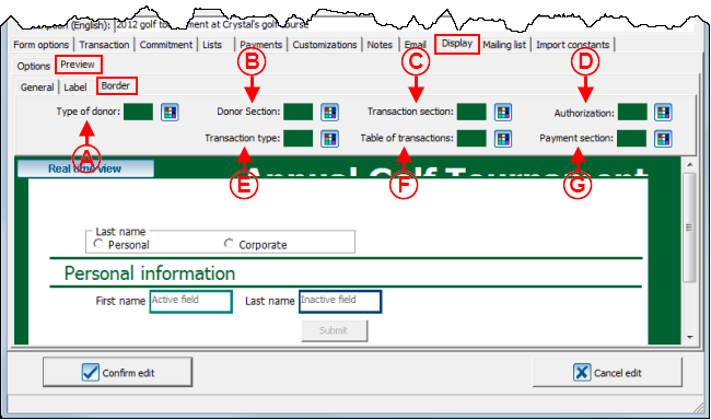
| width="50%" | | | width="50%" | | ||
| − | <span style="color: rgb(255, 0, 0);">'''A:'''</span> The [[Image: | + | <span style="color: rgb(255, 0, 0);">'''A:'''</span> The [[Image:Colour button.png]] button allows you to modify the border colour of the donor type section. To view an example of a "Type of donor" border, see '''point '''<span style="color: rgb(255, 0, 0);">'''F'''</span> of the "Web Form Example 3" section. |
| width="50%" | | | width="50%" | | ||
| − | <span style="color: rgb(255, 0, 0);">'''B:'''</span> The [[Image: | + | <span style="color: rgb(255, 0, 0);">'''B:'''</span> The [[Image:Colour button.png]] button allows you to modify the boreder colour of the donor type section. To view an example of "Type of donor" border, see '''point '''<span style="color: rgb(255, 0, 0);">'''G'''</span> of the "Web Form Example 3" section. |
|- | |- | ||
| width="50%" | | | width="50%" | | ||
| − | <span style="color: rgb(255, 0, 0);">'''C:'''</span> The [[Image: | + | <span style="color: rgb(255, 0, 0);">'''C:'''</span> The [[Image:Colour button.png]] button allows you to modify the colour of the border of the transaction section. To view an example of the "Transaction section" border, see '''point '''<span style="color: rgb(255, 0, 0);">'''H'''</span> of the "Web Form Example 3" section. |
| width="50%" | | | width="50%" | | ||
| − | <span style="color: rgb(255, 0, 0);">'''D:'''</span> The [[Image: | + | <span style="color: rgb(255, 0, 0);">'''D:'''</span> The [[Image:Colour button.png]] button allows you to modify the border of the authorization section. To view an example of the "Authorization" border, see '''point '''<span style="color: rgb(255, 0, 0);">'''I'''</span> of the "Web Form Example 3" section. |
|- | |- | ||
| width="50%" | | | width="50%" | | ||
| − | <span style="color: rgb(255, 0, 0);">'''E:'''</span> The [[Image: | + | <span style="color: rgb(255, 0, 0);">'''E:'''</span> The [[Image:Colour button.png]] button allows you to modify the colour of the transaction type section. To view an example of "Transaction type" border, see '''point '''<span style="color: rgb(255, 0, 0);">'''J'''</span> of the "Web Form Example 3" section. |
| width="50%" | | | width="50%" | | ||
| − | <span style="color: rgb(255, 0, 0);">'''F:'''</span> The [[Image: | + | <span style="color: rgb(255, 0, 0);">'''F:'''</span> The [[Image:Colour button.png]] button allows you to modify the border colour of the transaction tables. To view an example of "Table of transactions" border, '''point '''<span style="color: rgb(255, 0, 0);">'''K'''</span> of the "Web Form Example 3" section. |
|- | |- | ||
| width="50%" | | | width="50%" | | ||
| − | <span style="color: rgb(255, 0, 0);">'''G:'''</span> The [[Image: | + | <span style="color: rgb(255, 0, 0);">'''G:'''</span> The [[Image:Colour button.png]] button allows you to modify the colour of the payment section border. To view an example of "Payment section" border, see '''point '''<span style="color: rgb(255, 0, 0);">'''L'''</span> of the "Web Form Example 3" section. |
| | | | ||
| Line 1,267: | Line 1,267: | ||
|} | |} | ||
| − | <br> | + | <br> |
=== "Distribution list" Tab === | === "Distribution list" Tab === | ||
| Line 1,285: | Line 1,285: | ||
| width="50%" | | | width="50%" | | ||
| − | <span style="color: rgb(255, 0, 0);">'''B:'''</span> The [[Image: | + | <span style="color: rgb(255, 0, 0);">'''B:'''</span> The [[Image:Button add plus.png]] button allows you to add a distribution list at <span style="color: rgb(255, 0, 0);">'''A'''</span>. |
'''NOTE:''' To add a distribution list, it must have previously been created in the "Distribution list management". | '''NOTE:''' To add a distribution list, it must have previously been created in the "Distribution list management". | ||
| Line 1,291: | Line 1,291: | ||
|- | |- | ||
| | | | ||
| − | <span style="color: rgb(255, 0, 0);">'''C:'''</span> The [[Image: | + | <span style="color: rgb(255, 0, 0);">'''C:'''</span> The [[Image:Button Edit.png]] button allows you to modify a distribution list at <span style="color: rgb(255, 0, 0);">'''A'''</span>. To do so, select the distribution list to modify, then click on the [[Image:Button Edit.png]] button.<br> |
| | | | ||
| − | <span style="color: rgb(255, 0, 0);">'''D:'''</span> The [[Image: | + | <span style="color: rgb(255, 0, 0);">'''D:'''</span> The [[Image:Bouton dupliquer.png]] button allows you to duplicate distribution lists form another form.<br> |
|- | |- | ||
| | | | ||
| − | <span style="color: rgb(255, 0, 0);">'''E:'''</span> The [[Image: | + | <span style="color: rgb(255, 0, 0);">'''E:'''</span> The [[Image:Button Minus remove delete.png]] button allows you to delete a distribution list at <span style="color: rgb(255, 0, 0);">'''A'''</span>. To do so, select the distribution list to delete, then click on the [[Image:Button Minus remove delete.png]] button. |
| | | | ||
| Line 1,310: | Line 1,310: | ||
|- | |- | ||
| colspan="2" | | | colspan="2" | | ||
| − | After clicking on the [[Image: | + | After clicking on the [[Image:Button add plus.png]] button or on the [[Image:Button Edit.png]] button, this window opens. |
|- | |- | ||
| Line 1,323: | Line 1,323: | ||
|} | |} | ||
| − | <br> | + | <br> |
=== "Import constants" Tab === | === "Import constants" Tab === | ||
| Line 1,331: | Line 1,331: | ||
{| width="50%" cellspacing="1" cellpadding="1" border="1" class="wikitable" | {| width="50%" cellspacing="1" cellpadding="1" border="1" class="wikitable" | ||
|- | |- | ||
| − | | colspan="2" | [[Image: | + | | colspan="2" | [[Image:Creating a Web Form 035.png]] |
|- | |- | ||
| width="50%" | | | width="50%" | | ||
Revision as of 18:11, 25 July 2013
Contents
Introduction
The Online Donation Module allows the donors to make donations directly through the Web.
In order for the donors to be able to make donations, a website must first be created and configured. The creation of an online donation website includes the configuration of the home page and the website, as well as the creation of different Web forms. Each Web form is attached to a donation occasion, this ensures that Internet users are able to register online to the fundraising activities of an organization, or make a donation directly online.
Moreover, when an Internet user makes a donation or registers to an activity through a Web form, ProDon automatically adds him or her to the database when donations are imported..
Creating a Web Form
If it is not already done, it is better to configure the home page and the website prior to creating Web forms.
To learn how to configure the home page and the website, consult this procedure.
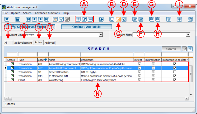
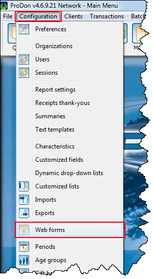
To create a Web form, go to "Web form management".
|
To do so, click on the "Configuration" menu, then select " | |
 |
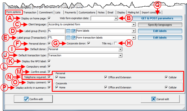
"Form Options" Tab
This tab allows you to configure the general appearance of the form.
"Transaction" Tab
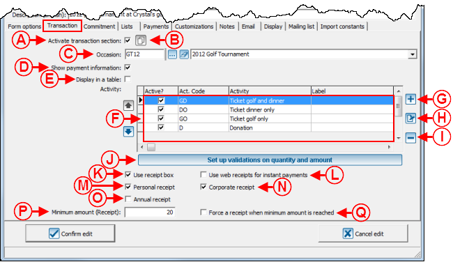
This tab allows you to configure the "Transaction" section of the form.
"Commitment" Tab
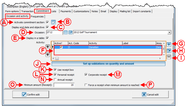
Allows you to configure the "Commitment" section of a Web form.
"Donation occasion and activities" Tab
|
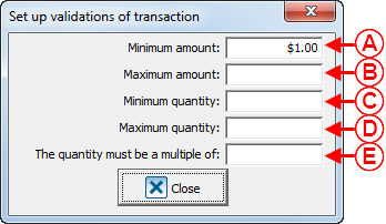
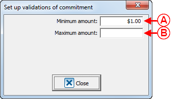
After clicking on the "Set up validation on quantity and amount" button, this window opens. | |
|
A: Allows you to enter a minimum amount the donor can donate. |
B: Allows you to enter a maximum amount the donor can donate. |
"Frequencies" Tab
"Lists" Tab
This tab allows you to configure the lists of predefined choices of the form.
Adding a Country
"Payment" Tab
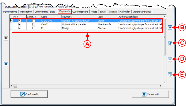
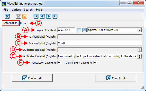
This tab allows you to choose the payment methods donors may use.
"Customizations" Tab
This tab allows you to create the characteristics that will be added to the donors' files in ProDon during the import.
To learn how to configure the customizations of a Web form, see this document.
"Notes" Tab
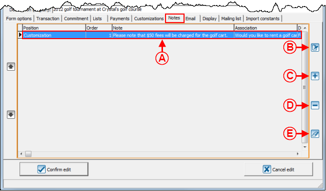
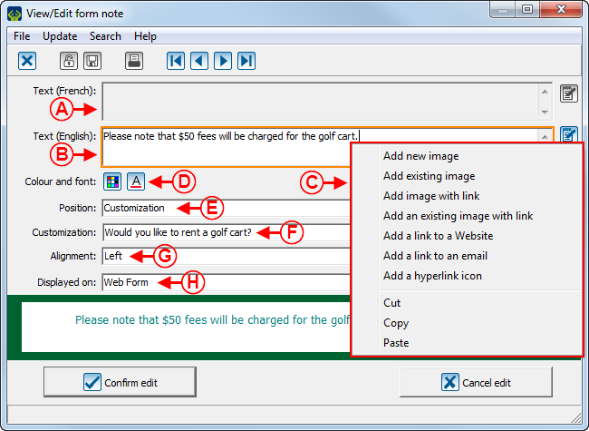
This tab allows you to insert notes into the form.
"Email" Tab
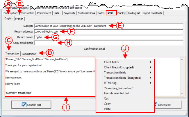
This tab allows you to write the emails that will automatically be sent to donors once their donations will be made.
It is possible to write French and English emails for single donation transactions and for commitment transactions.
"Display" Tab
This tab allows you to customize the appearance of the form..
"Options" Tab
"Overview" Tab
"General" Tab
"Label" Tab
"Border" Tab
"Distribution list" Tab
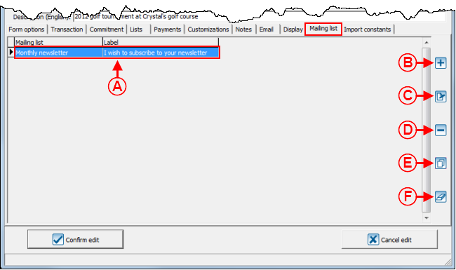
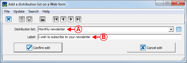
This tab allows you to add checkboxes to the form so that the donors can register to different distribution lists.
If a donor checks a registration checkbox to a distribution list in the Web form, he or she will automatically be registered to a distribution list in ProDon during the import.
NOTE: This tab is only visible if the Email Blast Module is activated in ProDon.
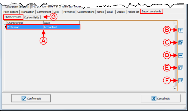
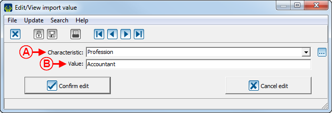
"Import constants" Tab
This tab allows you to add characteristics or customized fields to donors' files during the import.
Web Form Examples
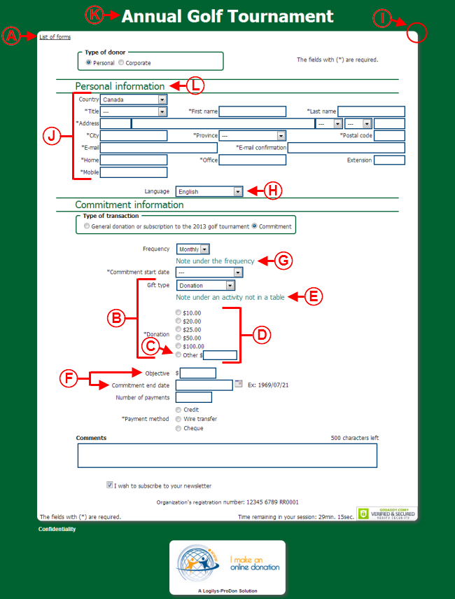
Web Form Example 1
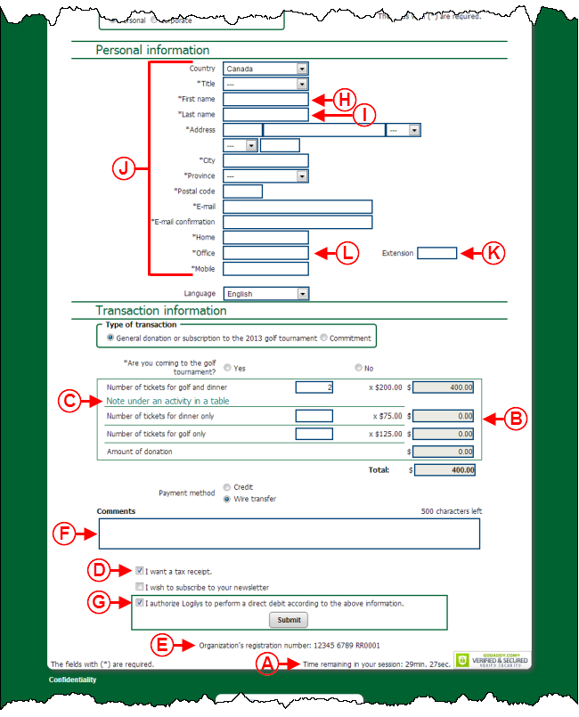
Web Form Example 2
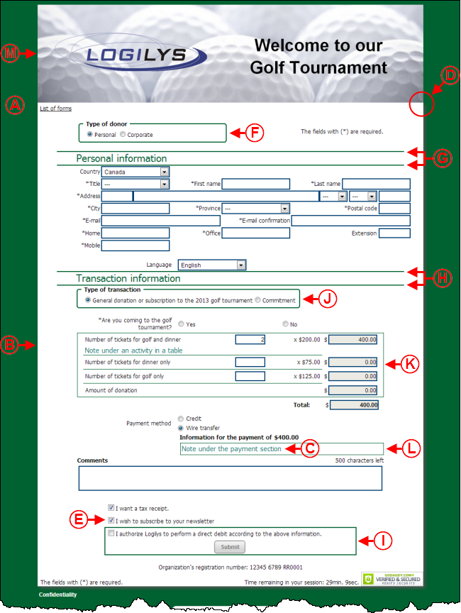
Web Form Example 3
Document name: ProDon:Creating a Web Form
