Difference between revisions of "ProDon:Back office"
Jguillemette (talk | contribs) (→Add files in the back office / Ajouter des fichiers dans le back-office) |
Jguillemette (talk | contribs) (→The "Background picture" tab) |
||
| (34 intermediate revisions by the same user not shown) | |||
| Line 1: | Line 1: | ||
{{Header_TOC}}<br> | {{Header_TOC}}<br> | ||
| − | |||
| − | |||
| − | |||
| − | |||
| − | |||
<br><span style="color: rgb(255, 0, 0);">'''CAUTION:'''</span> This document is conceived for the '''version 5.0.4''' of '''ProDon'''. For the '''version 5.0.3''', [[ProDon:Back office 5.0.3|click here]]. | <br><span style="color: rgb(255, 0, 0);">'''CAUTION:'''</span> This document is conceived for the '''version 5.0.4''' of '''ProDon'''. For the '''version 5.0.3''', [[ProDon:Back office 5.0.3|click here]]. | ||
| − | |||
| − | |||
| Line 14: | Line 7: | ||
The back office is linked to the Online Donation module. It allows the management of all graphic elements of the homepage and of the forms.This is where one will be able to edit the font, the colors and the pictures that will appear on the IMakeAnOnlineDonation of the organization. | The back office is linked to the Online Donation module. It allows the management of all graphic elements of the homepage and of the forms.This is where one will be able to edit the font, the colors and the pictures that will appear on the IMakeAnOnlineDonation of the organization. | ||
| − | + | == Creation of a LogiZone account == | |
| + | A LogiZone account is a profile once given the right accesses will allow the user to log in to the back office. | ||
| + | To create a LogiZone account, go to the back office. | ||
| − | + | To do so, go to "Web forms management". | |
| − | |||
| − | |||
| − | |||
| − | To | ||
| − | |||
| − | |||
| − | |||
{| width="200" cellspacing="1" cellpadding="1" border="1" class="wikitable" | {| width="200" cellspacing="1" cellpadding="1" border="1" class="wikitable" | ||
|- | |- | ||
| − | | colspan="2" | Click on the "Configuration" menu, then select the "File: | + | | colspan="2" | Click on the "Configuration" menu, then select the "[[File:Web form button.png]] Web Forms". |
| − | |||
|- | |- | ||
| − | | colspan="2" | [[ | + | | colspan="2" | [[File:ProDon5_BackOffice_001.png]]<br> |
|} | |} | ||
<br> | <br> | ||
| − | {| width=" | + | {| width="20%" cellspacing="1" cellpadding="1" border="1" class="wikitable" |
|- | |- | ||
| − | | colspan="2" | After clicking on " | + | | colspan="2" | After clicking on "[[File:Web form button.png]] Web Forms", this window will open. |
| − | |||
|- | |- | ||
| − | | colspan="2" |[[ | + | | colspan="2" |[[File:ProDon5 BackOffice 002.png]]<br> |
|} | |} | ||
| − | {| class="wikitable" | + | {| class="wikitable" width="20%" cellspacing="1" cellpadding="1" border="1" |
| − | | Once this window is | + | | Once this window is open, select the button [[File:Earth button.png]] and select "Back office". |
| − | |||
|- | |- | ||
| − | |[[ | + | |[[File:ProDon5 BackOffice 006.png]] |
|} | |} | ||
| − | {| class="wikitable" | + | {| class="wikitable" width="20%" cellspacing="1" cellpadding="1" border="1" |
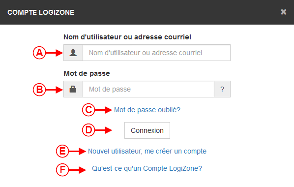
| − | | colspan="2" |Once on the page to the back office, the user will have to create their LogiZone account | + | | colspan="2" |Once on the page to the back office, the user will have to create their LogiZone account if they do not have one. |
| − | + | ||
|- | |- | ||
| − | | colspan="2" |[[ | + | | colspan="2" |[[File:ProDon5 BackOffice 003.png]] |
|- | |- | ||
| width="50%" | | | width="50%" | | ||
| − | <span style="color: rgb(255, 0, 0);">'''A | + | <span style="color: rgb(255, 0, 0);">'''A:'''</span> Allows the user to log to an active LogiZone by entering the user name or the email address. |
| − | + | ||
| − | |<span style="color: rgb(255, 0, 0);">'''B :'''</span> Enter the password of the existing LogiZone | + | |<span style="color: rgb(255, 0, 0);">'''B:'''</span> Enter the password of the existing LogiZone. |
| − | |||
|- | |- | ||
| + | |<span style="color: rgb(255, 0, 0);">'''C:'''</span> Use this link to change the password of the existing LogiZone. | ||
| + | |||
| + | |<span style="color: rgb(255, 0, 0);">'''D:'''</span> Allows the creation of a new LogiZone account. | ||
| − | |||
| − | |||
| − | |||
| − | |||
|- | |- | ||
| − | |<span style="color: rgb(255, 0, 0);">'''E :'''</span> Help to get more information about the LogiZone account. | + | | colspan="2" | <span style="color: rgb(255, 0, 0);">'''E:'''</span> Help to get more information about the LogiZone account. |
| − | |||
| − | |||
| − | |||
| − | |||
| − | |||
| − | + | |} | |
| − | |||
| − | |||
| + | == Back office accesses == | ||
| + | To access the back office, one must first have a LogiZone account. Once the LogiZone account created, go to ProDon to give the access to the back office to this account. | ||
| − | + | From ProDon, give the access to the LogiZone account which will be able to edit the back office. | |
| − | + | To do so, one must go to the "[[File:Web form button.png]] Web form management". | |
{| class="wikitable" width="200" cellspacing="1" cellpadding="1" border="1" | {| class="wikitable" width="200" cellspacing="1" cellpadding="1" border="1" | ||
|- | |- | ||
| − | |||
| colspan="2" | | | colspan="2" | | ||
| − | Click on the "Configuration" menu, then select " | + | Click on the "Configuration" menu, then select "[[File:Web form button.png]] Web Forms". |
| − | |||
| − | |||
|- | |- | ||
| − | | colspan="2" | [[ | + | | colspan="2" | [[File:ProDon5 BackOffice 001.png]] |
|} | |} | ||
<br> | <br> | ||
| − | {| class="wikitable" width=" | + | {| class="wikitable" width="20%" cellspacing="1" cellpadding="1" border="1" |
|- | |- | ||
| − | | colspan="2" | | + | | colspan="2" | After clicking on "[[File:Web form button.png]] Web Forms", this window will open. |
| − | |||
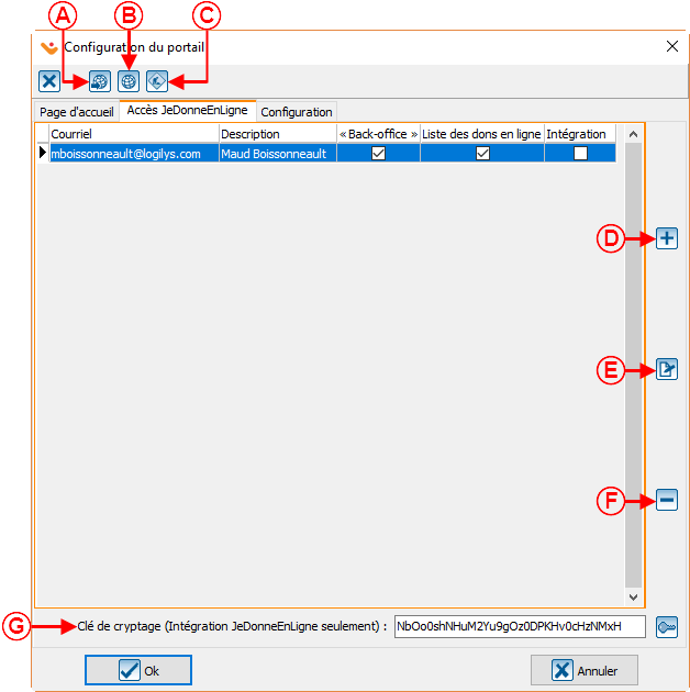
| − | |||
|- | |- | ||
| − | | colspan="2" | [[ | + | | colspan="2" | [[File:ProDon5_BackOffice_002.png]]<br> |
|- | |- | ||
| − | | colspan="2" | | + | | colspan="2" | Then, click on the button [[File:Homepage Configuration.png]]. |
| − | |||
|} | |} | ||
| − | {| class="wikitable" width=" | + | {| class="wikitable" width="20%" cellspacing="1" cellpadding="1" border="1" |
|- | |- | ||
| − | | colspan="2" | | + | | colspan="2" | In this window, go to the "Access IMakeAnOnlineDonation" tab and click on the [[File:Button +.png]] to add a user. |
| − | |||
| − | |||
|- | |- | ||
| − | | colspan="2" | [[ | + | | colspan="2" | [[File:ProDon5 BackOffice 004.png]]<br> |
|- | |- | ||
| − | | '''NOTE:''' | + | | '''NOTE:''' From the bottom of this window, it is possible to create an encryption key. It is not necessary to have one. |
|} | |} | ||
| − | {| class="wikitable" width=" | + | {| class="wikitable" width="20%" cellspacing="1" cellpadding="1" border="1" |
|- | |- | ||
| colspan="2" | | | colspan="2" | | ||
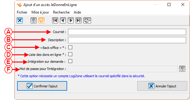
Then, this window will open: | Then, this window will open: | ||
| − | |||
| − | |||
|- | |- | ||
| − | | colspan="2" | [[ | + | | colspan="2" | [[File:ProDon5 BackOffice 005.png]]<br> |
|- | |- | ||
|<span style="color: rgb(255, 0, 0);">'''A'''</span>: In this box, enter the email that will be used to access the LogiZone. | |<span style="color: rgb(255, 0, 0);">'''A'''</span>: In this box, enter the email that will be used to access the LogiZone. | ||
| − | + | ||
|<span style="color: rgb(255, 0, 0);">'''B'''</span>: Usually, enter the name of the person who will use this email to access the LogiZone. | |<span style="color: rgb(255, 0, 0);">'''B'''</span>: Usually, enter the name of the person who will use this email to access the LogiZone. | ||
| − | |||
|- | |- | ||
| − | |<span style="color: rgb(255, 0, 0);">'''C'''</span>: The | + | |<span style="color: rgb(255, 0, 0);">'''C'''</span>: The "Back office" checkbox is used to grant the access to let the user work on the back office. |
| − | + | |<span style="color: rgb(255, 0, 0);">'''D'''</span>: The "Online donation list" checkbox is used to grant the access to let the user see the list of online donations. | |
| − | |<span style="color: rgb(255, 0, 0);">'''D'''</span>: The | ||
| − | |||
|- | |- | ||
|<span style="color: rgb(255, 0, 0);">'''E'''</span>: When there is an encryption key, this box give the access to the user to do integration on demand. | |<span style="color: rgb(255, 0, 0);">'''E'''</span>: When there is an encryption key, this box give the access to the user to do integration on demand. | ||
| − | + | ||
|<span style="color: rgb(255, 0, 0);">'''F'''</span>: Write the user's password for integration in this box. | |<span style="color: rgb(255, 0, 0);">'''F'''</span>: Write the user's password for integration in this box. | ||
| − | + | ||
|} | |} | ||
| − | {| class="wikitable" width=" | + | {| class="wikitable" width="20%" cellspacing="1" cellpadding="1" border="1" |
|- | |- | ||
| colspan="2" | | | colspan="2" | | ||
The email linked to the LogiZone account will appear here. | The email linked to the LogiZone account will appear here. | ||
| − | |||
|- | |- | ||
| − | | colspan="2" | [[ | + | | colspan="2" | [[File:ProDon5 BackOffice_007.png]]<br> |
|- | |- | ||
|} | |} | ||
| − | == Create themes in the back | + | == Create themes in the back office == |
Then, redo the steps of the LogiZone creation, but in place of creating a new one, connect to the session. | Then, redo the steps of the LogiZone creation, but in place of creating a new one, connect to the session. | ||
| − | |||
| − | |||
{| class="wikitable" width="200" cellspacing="1" cellpadding="1" border="1" | {| class="wikitable" width="200" cellspacing="1" cellpadding="1" border="1" | ||
| Line 182: | Line 144: | ||
| colspan="2" | | | colspan="2" | | ||
Normally, the user will get to this window: | Normally, the user will get to this window: | ||
| − | |||
|- | |- | ||
| − | | colspan="2" | [[ | + | | colspan="2" | [[File:ProDon5 BackOffice_008.png]]<br> |
|- | |- | ||
| width="50%" | <span style="color: rgb(255, 0, 0);">'''A''':</span> Please be sure to be in the right section. | | width="50%" | <span style="color: rgb(255, 0, 0);">'''A''':</span> Please be sure to be in the right section. | ||
| − | + | ||
| <span style="color: rgb(255, 0, 0);">'''B''':</span> Click on this button to create a new theme. | | <span style="color: rgb(255, 0, 0);">'''B''':</span> Click on this button to create a new theme. | ||
| − | |||
|} | |} | ||
| − | {| class="wikitable" width=" | + | {| class="wikitable" width="20%" cellspacing="1" cellpadding="1" border="1" |
|- | |- | ||
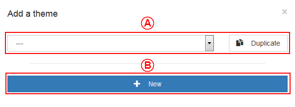
| colspan="2" | This window will open: | | colspan="2" | This window will open: | ||
| − | + | ||
|- | |- | ||
| − | | colspan="2" | [[ | + | | colspan="2" | [[File:ProDon5 BackOffice_009.png]]<br> |
|- | |- | ||
| width="50%" | <span style="color: rgb(255, 0, 0);">'''A''':</span> This section allows the duplication of an existing theme. It is in the drop-down list on the left that the theme to be duplicated must be selected. | | width="50%" | <span style="color: rgb(255, 0, 0);">'''A''':</span> This section allows the duplication of an existing theme. It is in the drop-down list on the left that the theme to be duplicated must be selected. | ||
| − | + | ||
| <span style="color: rgb(255, 0, 0);">'''B''':</span> To create a new theme, click on the "New" button. | | <span style="color: rgb(255, 0, 0);">'''B''':</span> To create a new theme, click on the "New" button. | ||
| − | + | ||
|} | |} | ||
| − | === The "Option" tab | + | === The "Option" tab === |
| − | {| class="wikitable" width=" | + | {| class="wikitable" width="20%" cellspacing="1" cellpadding="1" border="1" |
|- | |- | ||
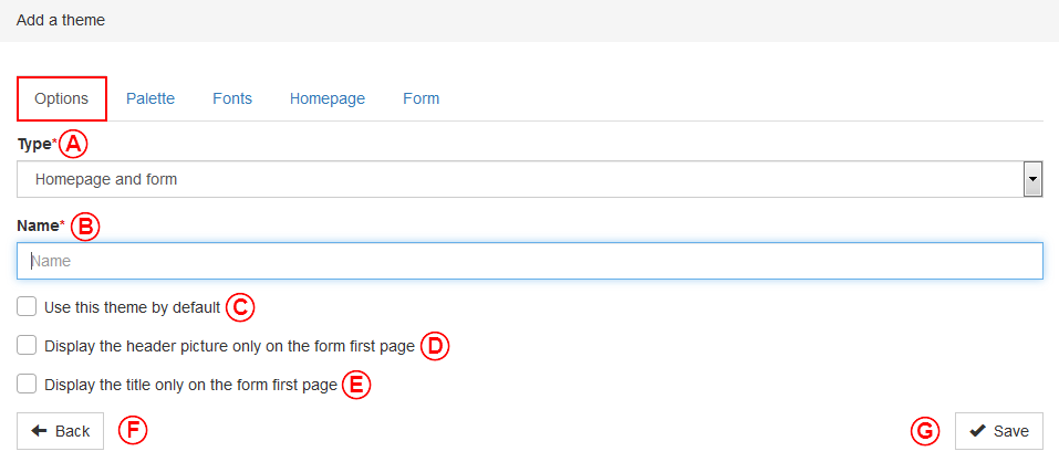
| colspan="2" | Then, this window opens: | | colspan="2" | Then, this window opens: | ||
| − | + | ||
|- | |- | ||
| − | | colspan="2" | [[ | + | | colspan="2" | [[File:ProDon5 BackOffice_010.png]]<br> |
|- | |- | ||
| − | | width="50%" | <span style="color: rgb(255, 0, 0);">'''A''':</span> This section allows the choice of the theme type that will be created. The possible choices are: create a theme for the homepage and the forms, for the homepage only or for the forms only. | + | | width="50%" | <span style="color: rgb(255, 0, 0);">'''A''':</span> This section allows the choice of the theme type that will be created. The possible choices are: create a theme for the homepage and the forms, create a theme for the homepage only or create a theme for the forms only. |
| − | + | | <span style="color: rgb(255, 0, 0);">'''B''':</span> This section allows the naming of the theme. | |
| − | |||
| − | |||
|- | |- | ||
| <span style="color: rgb(255, 0, 0);">'''C''':</span> This checkbox allows this theme to be applied by default. | | <span style="color: rgb(255, 0, 0);">'''C''':</span> This checkbox allows this theme to be applied by default. | ||
| − | + | ||
| <span style="color: rgb(255, 0, 0);">'''D''':</span> This checkbox allows the display of the header only on the first page of the form. | | <span style="color: rgb(255, 0, 0);">'''D''':</span> This checkbox allows the display of the header only on the first page of the form. | ||
| + | |- | ||
| + | | <span style="color: rgb(255, 0, 0);">'''E''':</span> This checkbox allows the display of the title only on the first page of the form. | ||
| − | |||
| − | |||
| − | |||
| − | |||
| <span style="color: rgb(255, 0, 0);">'''F''':</span> In all windows, this button return the user to the overview of everything in this section. For example, when a user is in the themes, this button will return to the overview of all themes of the back office. | | <span style="color: rgb(255, 0, 0);">'''F''':</span> In all windows, this button return the user to the overview of everything in this section. For example, when a user is in the themes, this button will return to the overview of all themes of the back office. | ||
| − | |||
|- | |- | ||
| − | | colspan="2" | <span style="color: rgb(255, 0, 0);">'''G''':</span> This button allows to save the edits. Furthermore, | + | | colspan="2" | <span style="color: rgb(255, 0, 0);">'''G''':</span> This button allows to save the edits. Furthermore, every time a change is detected in a section, when the user switch to another section, the back office will ask to save the changes. |
| − | |||
|} | |} | ||
| − | === The "Palette" tab | + | === The "Palette" tab === |
| − | {| class="wikitable" width=" | + | {| class="wikitable" width="20%" cellspacing="1" cellpadding="1" border="1" |
|- | |- | ||
| colspan="2" | | | colspan="2" | | ||
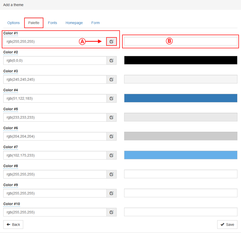
| − | The "Palette" tab allows the definition of the colors that will be used in the other tabs of the back office. Usually, the user | + | The "Palette" tab allows the definition of the colors that will be used in the other tabs of the back office. Usually, the user configures the organization's colors. With the version 5.0.4, this tool has been split into 2 columns and each of these columns calls a different tool. |
| − | |||
| − | |||
|- | |- | ||
| − | | colspan="2" | [[ | + | | colspan="2" | [[File:ProDon5 BackOffice_011.png]]<br> |
|- | |- | ||
| width="50%" | <span style="color: rgb(255, 0, 0);">'''A''':</span> To get the most precise colors, the back office system use the rgba. The numbers be between 0 and 255. The first number is the amount of red, the second is the amount of green, the third is the amount of blue and the last one is the opacity (alpha). The more this number is close to 1.0, the more the color will be opaque, the more it is near to 0.0, the more this color will be transparent. | | width="50%" | <span style="color: rgb(255, 0, 0);">'''A''':</span> To get the most precise colors, the back office system use the rgba. The numbers be between 0 and 255. The first number is the amount of red, the second is the amount of green, the third is the amount of blue and the last one is the opacity (alpha). The more this number is close to 1.0, the more the color will be opaque, the more it is near to 0.0, the more this color will be transparent. | ||
| − | + | | <span style="color: rgb(255, 0, 0);">'''B''':</span> If the user does not have the numbers for their colors, this section uses another tool. This system of the back office uses the rgba, hsla and hex functions. | |
| − | | <span style="color: rgb(255, 0, 0);">'''B''':</span> If the user does not have the numbers for their colors, | + | |
| − | |||
|} | |} | ||
{| class="wikitable" width="200" cellspacing="1" cellpadding="1" border="1" | {| class="wikitable" width="200" cellspacing="1" cellpadding="1" border="1" | ||
|- | |- | ||
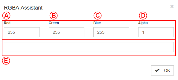
| − | | colspan="2" | By clicking on '''A''' of the last section. | + | | colspan="2" | By clicking on '''A''' of the last section, this window will open. |
| − | + | ||
|- | |- | ||
| − | | colspan="2" | [[ | + | | colspan="2" | [[File:ProDon5 BackOffice_012.png]]<br> |
|- | |- | ||
| − | | width="50%" | <span style="color: rgb(255, 0, 0);">'''A''':</span> This option allows the setting of the | + | | width="50%" | <span style="color: rgb(255, 0, 0);">'''A''':</span> This option allows the setting of the amount of red. |
| − | + | ||
| − | | <span style="color: rgb(255, 0, 0);">'''B''':</span> This option allows the setting of the | + | | <span style="color: rgb(255, 0, 0);">'''B''':</span> This option allows the setting of the amount of green. |
| − | |||
|- | |- | ||
| − | | <span style="color: rgb(255, 0, 0);">'''C''':</span> This option allows the setting of the | + | | <span style="color: rgb(255, 0, 0);">'''C''':</span> This option allows the setting of the amount of blue. |
| − | + | ||
| <span style="color: rgb(255, 0, 0);">'''D''':</span> This option allows the setting of the color transparency. | | <span style="color: rgb(255, 0, 0);">'''D''':</span> This option allows the setting of the color transparency. | ||
| − | + | ||
|- | |- | ||
| colspan="2" | <span style="color: rgb(255, 0, 0);">'''E''':</span> This box allows the preview of the result. | | colspan="2" | <span style="color: rgb(255, 0, 0);">'''E''':</span> This box allows the preview of the result. | ||
| − | + | ||
|} | |} | ||
| Line 278: | Line 228: | ||
{| class="wikitable" width="200" cellspacing="1" cellpadding="1" border="1" | {| class="wikitable" width="200" cellspacing="1" cellpadding="1" border="1" | ||
|- | |- | ||
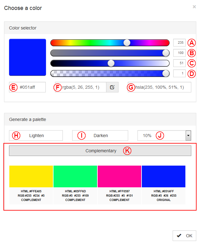
| − | | colspan="2" | By clicking on '''B''' of the first section. This section of the back office uses the rgba, hsla and hex functions | + | | colspan="2" | By clicking on '''B''' of the first section, this window will open. This section of the back office uses the rgba, hsla and hex functions. |
| − | |||
| − | |||
|- | |- | ||
| − | | colspan="2" | [[ | + | | colspan="2" | [[File:ProDon5 BackOffice_013.png]]<br> |
|- | |- | ||
| width="50%" | <span style="color: rgb(255, 0, 0);">'''A''':</span> This option allows the adjustment of the color. | | width="50%" | <span style="color: rgb(255, 0, 0);">'''A''':</span> This option allows the adjustment of the color. | ||
| − | + | ||
| − | | <span style="color: rgb(255, 0, 0);">'''B''':</span> This option allows the adjustment of the saturation. | + | | <span style="color: rgb(255, 0, 0);">'''B''':</span> This option allows the adjustment of the color saturation. |
| − | + | ||
|- | |- | ||
| <span style="color: rgb(255, 0, 0);">'''C''':</span> This option allows the adjustment of the luminosity. | | <span style="color: rgb(255, 0, 0);">'''C''':</span> This option allows the adjustment of the luminosity. | ||
| − | + | ||
| <span style="color: rgb(255, 0, 0);">'''D''':</span> This option allows the adjustment of the color transparency. | | <span style="color: rgb(255, 0, 0);">'''D''':</span> This option allows the adjustment of the color transparency. | ||
| − | + | ||
|- | |- | ||
| <span style="color: rgb(255, 0, 0);">'''E''':</span> This box allows the setting of the color in hexadecimal. | | <span style="color: rgb(255, 0, 0);">'''E''':</span> This box allows the setting of the color in hexadecimal. | ||
| − | + | ||
| <span style="color: rgb(255, 0, 0);">'''F''':</span> This box allows the setting of the color in rgba. | | <span style="color: rgb(255, 0, 0);">'''F''':</span> This box allows the setting of the color in rgba. | ||
| − | + | ||
|- | |- | ||
| <span style="color: rgb(255, 0, 0);">'''G''':</span> This box allows the setting of the color in hsla. By using the 4 sliders, it is the same thing as working in hsla. | | <span style="color: rgb(255, 0, 0);">'''G''':</span> This box allows the setting of the color in hsla. By using the 4 sliders, it is the same thing as working in hsla. | ||
| − | + | ||
| <span style="color: rgb(255, 0, 0);">'''H''':</span> By clicking on this box, the user will have a preview of the selected color and will see 4 lighter possibilities. | | <span style="color: rgb(255, 0, 0);">'''H''':</span> By clicking on this box, the user will have a preview of the selected color and will see 4 lighter possibilities. | ||
| − | + | ||
|- | |- | ||
| <span style="color: rgb(255, 0, 0);">'''I''':</span> By clicking on this box, the user will have a preview of the selected color and will see 4 darker possibilities. | | <span style="color: rgb(255, 0, 0);">'''I''':</span> By clicking on this box, the user will have a preview of the selected color and will see 4 darker possibilities. | ||
| − | + | ||
| − | | <span style="color: rgb(255, 0, 0);">'''J''':</span> This percentage allows the | + | | <span style="color: rgb(255, 0, 0);">'''J''':</span> This percentage allows the adjustment of the color shading of the "Lighten" and "Darken" options. |
| − | + | ||
|- | |- | ||
| colspan="2" | <span style="color: rgb(255, 0, 0);">'''K''':</span> This box allows a preview of 3 colors potentially complementary to the selected color. '''Note:''' The color on the right is the original color. | | colspan="2" | <span style="color: rgb(255, 0, 0);">'''K''':</span> This box allows a preview of 3 colors potentially complementary to the selected color. '''Note:''' The color on the right is the original color. | ||
| − | |||
|} | |} | ||
| − | === The "Fonts" tab | + | === The "Fonts" tab === |
{| class="wikitable" width="200" cellspacing="1" cellpadding="1" border="1" | {| class="wikitable" width="200" cellspacing="1" cellpadding="1" border="1" | ||
|- | |- | ||
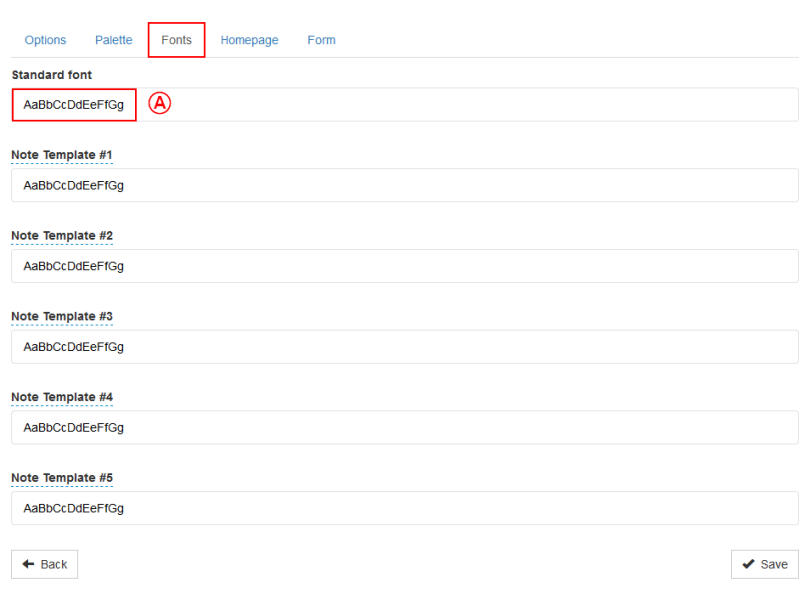
| − | | colspan="2" | The "Fonts" tab allows the definition of the standard font and the font color that will be used in the forms created by the back office. Usually, the user | + | | colspan="2" | The "Fonts" tab allows the definition of the standard font and the font color that will be used in the forms created by the back office. Usually, the user configures the general font of their organization with a color easily readable in the organization's colors. |
| − | |||
|- | |- | ||
| − | | colspan="2" | [[ | + | | colspan="2" | [[File:ProDon5 BackOffice_014.png]]<br> |
|- | |- | ||
| colspan="2" | <span style="color: rgb(255, 0, 0);">'''A''':</span> To open the menu to configure the font, click on the box of the line that must be edited. | | colspan="2" | <span style="color: rgb(255, 0, 0);">'''A''':</span> To open the menu to configure the font, click on the box of the line that must be edited. | ||
| − | + | ||
|- | |- | ||
| − | | colspan="2" | [[ | + | | colspan="2" | [[File:ProDon5 BackOffice_015.png]]<br> |
|- | |- | ||
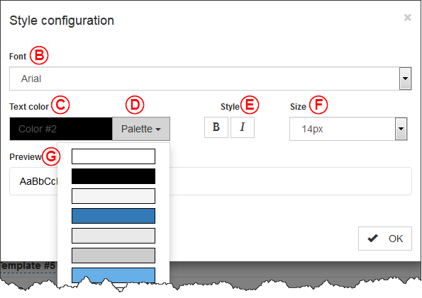
| width="50%" |<span style="color: rgb(255, 0, 0);">'''B''':</span> The "Font" option allows the setting of the text display. | | width="50%" |<span style="color: rgb(255, 0, 0);">'''B''':</span> The "Font" option allows the setting of the text display. | ||
| − | + | ||
|<span style="color: rgb(255, 0, 0);">'''C''':</span> The "Text color" option allows the user to choose the writing color in the forms and the homepage. | |<span style="color: rgb(255, 0, 0);">'''C''':</span> The "Text color" option allows the user to choose the writing color in the forms and the homepage. | ||
| − | |||
|- | |- | ||
| − | |<span style="color: rgb(255, 0, 0);">'''D''':</span> The "Palette" option allows the selection of the text color among the ones set in the last tab. It is used in several | + | |<span style="color: rgb(255, 0, 0);">'''D''':</span> The "Palette" option allows the selection of the text color among the ones set in the last tab. It is used in several sections of the back office. |
| − | |||
|<span style="color: rgb(255, 0, 0);">'''E''':</span> The "Style" option allows the display of the text in bold ('''B''') or in italic (''I''). | |<span style="color: rgb(255, 0, 0);">'''E''':</span> The "Style" option allows the display of the text in bold ('''B''') or in italic (''I''). | ||
| − | + | ||
|- | |- | ||
|<span style="color: rgb(255, 0, 0);">'''F''':</span> The "Size" allows the setting of the text size. | |<span style="color: rgb(255, 0, 0);">'''F''':</span> The "Size" allows the setting of the text size. | ||
| − | + | ||
|<span style="color: rgb(255, 0, 0);">'''G''':</span> The "Preview" section let the user preview the result of all the choices. | |<span style="color: rgb(255, 0, 0);">'''G''':</span> The "Preview" section let the user preview the result of all the choices. | ||
| − | |||
|} | |} | ||
| − | === The "Homepage" tab | + | === The "Homepage" tab === |
| − | {| class="wikitable" width=" | + | {| class="wikitable" width="20%" cellspacing="1" cellpadding="1" border="1" |
|- | |- | ||
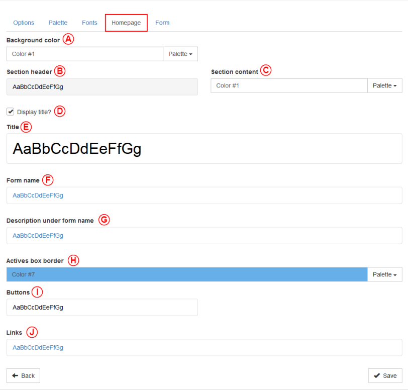
| colspan="2" | The "Homepage" tab allows the configuration of colors and fonts used in the homepage. | | colspan="2" | The "Homepage" tab allows the configuration of colors and fonts used in the homepage. | ||
| − | |||
|- | |- | ||
| − | | colspan="2" | [[ | + | | colspan="2" | [[File:ProDon5 BackOffice_016.png]]<br> |
|- | |- | ||
| − | | <span style="color: rgb(255, 0, 0);">'''A''':</span> To choose the background of the homepage, go to the "Palette" option. | + | | <span style="color: rgb(255, 0, 0);">'''A''':</span> To choose the background color of the homepage, go to the "Palette" option. |
| − | |||
| width="50%" |<span style="color: rgb(255, 0, 0);">'''B''':</span> The "Section header" allows the definition of the color, the size, the style and the background color of the section headers. | | width="50%" |<span style="color: rgb(255, 0, 0);">'''B''':</span> The "Section header" allows the definition of the color, the size, the style and the background color of the section headers. | ||
| − | |||
|- | |- | ||
|<span style="color: rgb(255, 0, 0);">'''C''':</span> The "Section content" option allows the selection of the background of the section content. The font used in this part will be the standard one. | |<span style="color: rgb(255, 0, 0);">'''C''':</span> The "Section content" option allows the selection of the background of the section content. The font used in this part will be the standard one. | ||
| − | + | |<span style="color: rgb(255, 0, 0);">'''D''':</span> When the "Display title?" checkbox is checked, the "Title" section will be displayed. | |
| − | |||
| − | |||
| − | |||
|- | |- | ||
|<span style="color: rgb(255, 0, 0);">'''E''':</span> The "Title" option helps to select the color, the size, the style and the background color of the title of the homepage. | |<span style="color: rgb(255, 0, 0);">'''E''':</span> The "Title" option helps to select the color, the size, the style and the background color of the title of the homepage. | ||
| − | |||
|<span style="color: rgb(255, 0, 0);">'''F''':</span> The "Form name" option helps to set the color, the size and the style of the form name. | |<span style="color: rgb(255, 0, 0);">'''F''':</span> The "Form name" option helps to set the color, the size and the style of the form name. | ||
| − | |||
| − | |||
|- | |- | ||
|<span style="color: rgb(255, 0, 0);">'''G''':</span> The "Description under form name" option helps to set the color, the size and the style of the description under the form name. | |<span style="color: rgb(255, 0, 0);">'''G''':</span> The "Description under form name" option helps to set the color, the size and the style of the description under the form name. | ||
| − | |||
|<span style="color: rgb(255, 0, 0);">'''H''':</span> The "Active box border" option helps to set from the palette the color of the border of the active box. The active box is the box currently selected by a user. | |<span style="color: rgb(255, 0, 0);">'''H''':</span> The "Active box border" option helps to set from the palette the color of the border of the active box. The active box is the box currently selected by a user. | ||
| − | |||
|- | |- | ||
| <span style="color: rgb(255, 0, 0);">'''I''':</span> The "Buttons" option allows the configuration of the background color, the text color and the style of the buttons of the homepage. | | <span style="color: rgb(255, 0, 0);">'''I''':</span> The "Buttons" option allows the configuration of the background color, the text color and the style of the buttons of the homepage. | ||
| − | |||
| <span style="color: rgb(255, 0, 0);">'''J''':</span> The "Links" option allows the configuration of the text color, the style and the size of the hyperlink of the homepage. | | <span style="color: rgb(255, 0, 0);">'''J''':</span> The "Links" option allows the configuration of the text color, the style and the size of the hyperlink of the homepage. | ||
| − | |||
|} | |} | ||
| − | === The " | + | === The "Form" tab === |
{| class="wikitable" width="200" cellspacing="1" cellpadding="1" border="1" | {| class="wikitable" width="200" cellspacing="1" cellpadding="1" border="1" | ||
| Line 402: | Line 332: | ||
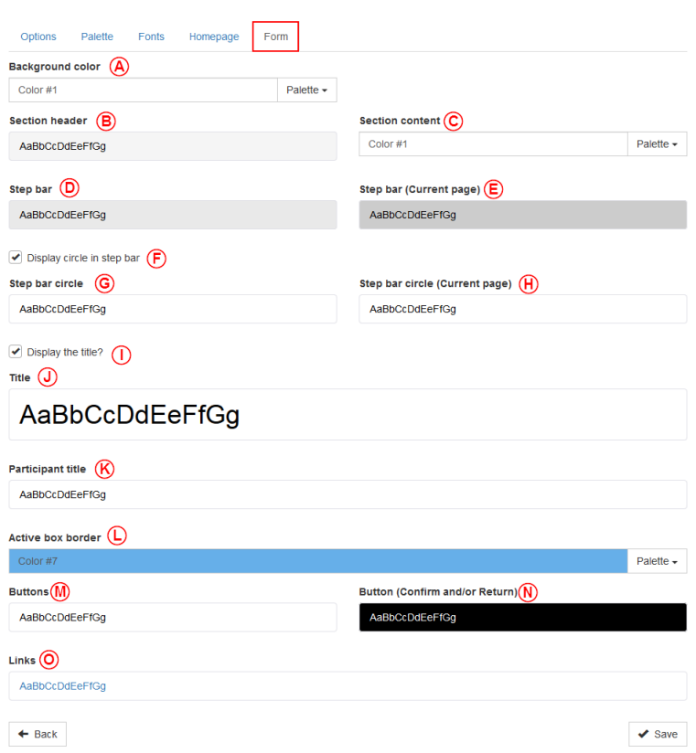
| colspan="2" | The "Form" tab allows the configuration of the colors and fonts used in the forms. | | colspan="2" | The "Form" tab allows the configuration of the colors and fonts used in the forms. | ||
| − | |||
|- | |- | ||
| − | | colspan="2" | [[ | + | | colspan="2" | [[File:ProDon5 BackOffice_017.png]]<br> |
|- | |- | ||
| <span style="color: rgb(255, 0, 0);">'''A''':</span> To select the background color of the forms, go to the "Palette" option. | | <span style="color: rgb(255, 0, 0);">'''A''':</span> To select the background color of the forms, go to the "Palette" option. | ||
| − | |||
| − | |||
| width="50%" |<span style="color: rgb(255, 0, 0);">'''B''':</span> The "Section header" option allows the selection of the color, the size, and the background color of the section headers. | | width="50%" |<span style="color: rgb(255, 0, 0);">'''B''':</span> The "Section header" option allows the selection of the color, the size, and the background color of the section headers. | ||
| − | |||
| − | |||
|- | |- | ||
|<span style="color: rgb(255, 0, 0);">'''C''':</span> The "Section content" allows the selection of the background color of the section content. The font used will be the standard one. | |<span style="color: rgb(255, 0, 0);">'''C''':</span> The "Section content" allows the selection of the background color of the section content. The font used will be the standard one. | ||
| − | |||
| − | |||
|<span style="color: rgb(255, 0, 0);">'''D''':</span> The "Step bar" option allows the selection of the color, the size, the style and the background color of the step bar. | |<span style="color: rgb(255, 0, 0);">'''D''':</span> The "Step bar" option allows the selection of the color, the size, the style and the background color of the step bar. | ||
| − | |||
| − | |||
| − | |||
|- | |- | ||
|<span style="color: rgb(255, 0, 0);">'''E''':</span> The "Step bar (current page)" allows the selection of the color, the size, the style and the background color of the current page of the step bar. | |<span style="color: rgb(255, 0, 0);">'''E''':</span> The "Step bar (current page)" allows the selection of the color, the size, the style and the background color of the current page of the step bar. | ||
| − | + | |<span style="color: rgb(255, 0, 0);">'''F''':</span> The checkbox "Display the circle in the step bar" allows to display a circle in which there will be the number of the steps. This box must be checked to unlock the options <span style="color: rgb(255, 0, 0);">'''G'''</span> and <span style="color: rgb(255, 0, 0);">'''H''' </span>. | |
| − | |||
| − | |||
| − | |<span style="color: rgb(255, 0, 0);">'''F''':</span> The checkbox "Display the circle in the step bar" allows to display a circle in which there will be the number of the | ||
| − | |||
| − | |||
|- | |- | ||
| Line 443: | Line 358: | ||
|<span style="color: rgb(255, 0, 0);">'''G''':</span> The "Step bar circle" allows the selection of the color, the size, the style and the background color of the circle in the step bar. | |<span style="color: rgb(255, 0, 0);">'''G''':</span> The "Step bar circle" allows the selection of the color, the size, the style and the background color of the circle in the step bar. | ||
| − | + | |<span style="color: rgb(255, 0, 0);">'''H''':</span> The "Step bar circle (Current page)" allows the selection of the color, the size, the style and the background color of the current page of the step bar. | |
| − | |||
| − | |||
| − | |<span style="color: rgb(255, 0, 0);">'''H''':</span> The "Step bar | ||
| − | |||
| − | |||
| − | |||
|- | |- | ||
|<span style="color: rgb(255, 0, 0);">'''I''':</span> The "Display the title?" option allows the title to be displayed or not. The option must be activated to display the "Title" section. | |<span style="color: rgb(255, 0, 0);">'''I''':</span> The "Display the title?" option allows the title to be displayed or not. The option must be activated to display the "Title" section. | ||
| − | |||
| − | |||
| − | |||
|<span style="color: rgb(255, 0, 0);">'''J''':</span> The "Title" option allows the selection of the color, the size, the style and the background color of the title of the form. | |<span style="color: rgb(255, 0, 0);">'''J''':</span> The "Title" option allows the selection of the color, the size, the style and the background color of the title of the form. | ||
| − | |||
| − | |||
|- | |- | ||
| Line 465: | Line 369: | ||
|<span style="color: rgb(255, 0, 0);">'''K''':</span> The "Participants title" allows the selection of the color, the size and the style of the participants title. | |<span style="color: rgb(255, 0, 0);">'''K''':</span> The "Participants title" allows the selection of the color, the size and the style of the participants title. | ||
| − | |||
| − | |||
| − | |||
| − | |||
| − | L'option | + | |<span style="color: rgb(255, 0, 0);">'''L''':</span> The "Active box border" option allows the selection of the color from the colors already set in the palette. An active is the currently selected box. |
|- | |- | ||
|<span style="color: rgb(255, 0, 0);">'''M''':</span> The "Buttons" option allows the configuration of the background color, the text color and the style used for the form buttons. | |<span style="color: rgb(255, 0, 0);">'''M''':</span> The "Buttons" option allows the configuration of the background color, the text color and the style used for the form buttons. | ||
| − | |||
| − | |||
|<span style="color: rgb(255, 0, 0);">'''N''':</span> The "Button (Confirm)" option allows the configuration of the background color, the text color and the style used for the form confirm button. | |<span style="color: rgb(255, 0, 0);">'''N''':</span> The "Button (Confirm)" option allows the configuration of the background color, the text color and the style used for the form confirm button. | ||
| − | |||
|- | |- | ||
| colspan="2" |<span style="color: rgb(255, 0, 0);">'''O''':</span> The "Links" option allows the configuration of the text color, the style and the size of the hyperlink of the homepage. | | colspan="2" |<span style="color: rgb(255, 0, 0);">'''O''':</span> The "Links" option allows the configuration of the text color, the style and the size of the hyperlink of the homepage. | ||
| − | |||
|} | |} | ||
| − | === The "CSS" tab | + | === The "CSS" tab === |
This option has been removed for the creation, but the user will be able to use it once a theme is named. | This option has been removed for the creation, but the user will be able to use it once a theme is named. | ||
| Line 493: | Line 389: | ||
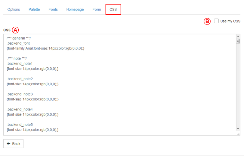
| colspan="2" | The "CSS" tab allows the configuration of the colors and the fonts used in the forms. | | colspan="2" | The "CSS" tab allows the configuration of the colors and the fonts used in the forms. | ||
| − | |||
|- | |- | ||
| − | | colspan="2" | [[ | + | | colspan="2" | [[File:ProDon5 BackOffice_018.png]]<br> |
|- | |- | ||
| − | | <span style="color: rgb(255, 0, 0);">'''A''':</span> CSS is for "Cascading Style Sheet". It is a programming language which is only used to adjust visual elements. It is not | + | | <span style="color: rgb(255, 0, 0);">'''A''':</span> CSS is for "Cascading Style Sheet". It is a programming language which is only used to adjust visual elements. It is not recommended to touch this window. |
| − | |||
| width="50%" |<span style="color: rgb(255, 0, 0);">'''B''':</span> If the user is really at ease and knows the CSS language, it is possible to remove all tabs only to keep the CSS tab. To do so, only click on the "Use my CSS" box. | | width="50%" |<span style="color: rgb(255, 0, 0);">'''B''':</span> If the user is really at ease and knows the CSS language, it is possible to remove all tabs only to keep the CSS tab. To do so, only click on the "Use my CSS" box. | ||
| − | |||
|} | |} | ||
| − | == Add files in the back | + | == Add files in the back office == |
To add files, click on the "My files" section and click on add. | To add files, click on the "My files" section and click on add. | ||
| − | |||
| − | [[ | + | [[File:ProDon5_BackOffice_019.png]] |
| − | {| class="wikitable" width=" | + | {| class="wikitable" width="20%" cellspacing="1" cellpadding="1" border="1" |
|- | |- | ||
| colspan="2" | Then this window will open: | | colspan="2" | Then this window will open: | ||
| − | |||
|- | |- | ||
| − | | colspan="2" | [[ | + | | colspan="2" | [[File:ProDon5 BackOffice_020.png]]<br> |
|- | |- | ||
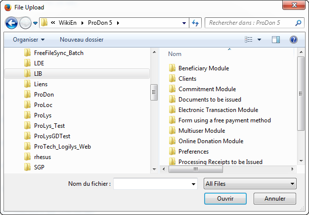
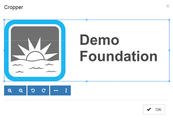
| colspan="2" | The user will have to go find the pictures that will have to be added. Then, the cropper will appear: | | colspan="2" | The user will have to go find the pictures that will have to be added. Then, the cropper will appear: | ||
| − | |||
|- | |- | ||
| − | | colspan="2" | [[ | + | | colspan="2" | [[File:ProDon5 BackOffice_021.png]]<br> |
|} | |} | ||
| − | {| class="wikitable" width=" | + | {| class="wikitable" width="20%" cellspacing="1" cellpadding="1" border="1" |
|- | |- | ||
| colspan="2" | Then this window will open: | | colspan="2" | Then this window will open: | ||
| − | + | ||
|- | |- | ||
| − | | colspan="2" | [[ | + | | colspan="2" | [[File:ProDon5 BackOffice_022.png]]<br> |
|- | |- | ||
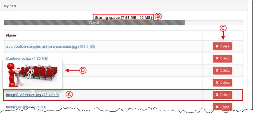
| <span style="color: rgb(255, 0, 0);">'''A''':</span> Here, the user can see the file that has been added. | | <span style="color: rgb(255, 0, 0);">'''A''':</span> Here, the user can see the file that has been added. | ||
| − | |||
| <span style="color: rgb(255, 0, 0);">'''B''':</span> The user can see how much storage space used by the files. | | <span style="color: rgb(255, 0, 0);">'''B''':</span> The user can see how much storage space used by the files. | ||
| − | |||
|- | |- | ||
| <span style="color: rgb(255, 0, 0);">'''C''':</span> To remove a file, click on the delete button. | | <span style="color: rgb(255, 0, 0);">'''C''':</span> To remove a file, click on the delete button. | ||
| − | + | ||
| <span style="color: rgb(255, 0, 0);">'''D''':</span> A new feature is by placing the mouse on the picture link, it is now possible to have a preview without having to open it. | | <span style="color: rgb(255, 0, 0);">'''D''':</span> A new feature is by placing the mouse on the picture link, it is now possible to have a preview without having to open it. | ||
| − | + | ||
|} | |} | ||
| − | == Create a picture group in the back | + | == Create a picture group in the back office == |
To create a picture group, the user will have to click on the "My picture groups" section and click on add. | To create a picture group, the user will have to click on the "My picture groups" section and click on add. | ||
| − | |||
| − | |||
| − | === The "Option" tab | + | [[File:ProDon5_BackOffice_031.png]] |
| + | |||
| + | === The "Option" tab === | ||
{| class="wikitable" width="20%" cellspacing="1" cellpadding="1" border="1" | {| class="wikitable" width="20%" cellspacing="1" cellpadding="1" border="1" | ||
|- | |- | ||
| − | | colspan="2" | [[ | + | | colspan="2" | [[File:ProDon5_BackOffice_023.png]]<br> |
|- | |- | ||
| width="50%" |<span style="color: rgb(255, 0, 0);">'''A''':</span> Here is where the user shall name the picture group. | | width="50%" |<span style="color: rgb(255, 0, 0);">'''A''':</span> Here is where the user shall name the picture group. | ||
| − | + | ||
| <span style="color: rgb(255, 0, 0);">'''B''':</span> This checkbox allows this picture group to be used by default. | | <span style="color: rgb(255, 0, 0);">'''B''':</span> This checkbox allows this picture group to be used by default. | ||
| − | + | ||
|} | |} | ||
| − | === The "Background picture" tab | + | === The "Background picture" tab === |
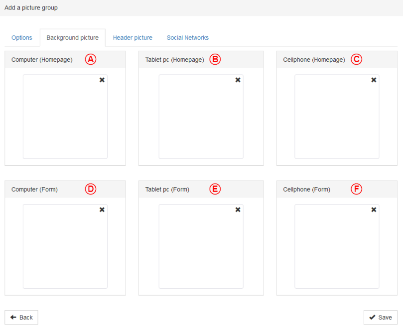
{| class="wikitable" width="20%" cellspacing="1" cellpadding="1" border="1" | {| class="wikitable" width="20%" cellspacing="1" cellpadding="1" border="1" | ||
|- | |- | ||
| − | | colspan="2" | [[ | + | | colspan="2" | [[File:ProDon5_BackOffice_024.png]]<br> |
|- | |- | ||
| width="50%" |<span style="color: rgb(255, 0, 0);">'''A''':</span> This option allows the setting of the background picture of the homepage for computers. | | width="50%" |<span style="color: rgb(255, 0, 0);">'''A''':</span> This option allows the setting of the background picture of the homepage for computers. | ||
| − | + | ||
| − | |<span style="color: rgb(255, 0, 0);">'''B''':</span> This option allows the setting of the background picture of the homepage for tablet | + | |<span style="color: rgb(255, 0, 0);">'''B''':</span> This option allows the setting of the background picture of the homepage for tablet PCs. |
| − | + | ||
|- | |- | ||
|<span style="color: rgb(255, 0, 0);">'''C''':</span> This option allows the setting of the background picture of the homepage for cellphones. | |<span style="color: rgb(255, 0, 0);">'''C''':</span> This option allows the setting of the background picture of the homepage for cellphones. | ||
| − | + | ||
|<span style="color: rgb(255, 0, 0);">'''D''':</span> This option allows the setting of the background picture of the forms for computers. | |<span style="color: rgb(255, 0, 0);">'''D''':</span> This option allows the setting of the background picture of the forms for computers. | ||
| − | + | ||
|- | |- | ||
| − | |<span style="color: rgb(255, 0, 0);">'''E''':</span> This option allows the setting of the background picture of the forms for tablet | + | |<span style="color: rgb(255, 0, 0);">'''E''':</span> This option allows the setting of the background picture of the forms for tablet PCs. |
| − | |||
|<span style="color: rgb(255, 0, 0);">'''F''':</span> This option allows the setting of the background picture of the forms for cellphones. | |<span style="color: rgb(255, 0, 0);">'''F''':</span> This option allows the setting of the background picture of the forms for cellphones. | ||
| − | + | |- | |
| + | | colspan="2" | '''''NOTE:''''' For the background pictures, the maximum suggested size for the background pictures is of 1920 x 1080 pixels. If the picture size is greater than this, it may be possible that some browsers will not load it. | ||
|} | |} | ||
| − | === The "Header picture" tab | + | === The "Header picture" tab === |
{| class="wikitable" width="20%" cellspacing="1" cellpadding="1" border="1" | {| class="wikitable" width="20%" cellspacing="1" cellpadding="1" border="1" | ||
|- | |- | ||
| − | | colspan="2" | [[ | + | | colspan="2" | [[File:ProDon5_BackOffice_025.png]]<br> |
|- | |- | ||
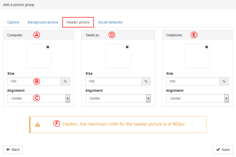
| width="50%" |<span style="color: rgb(255, 0, 0);">'''A''':</span> This option allows the setting the header picture when the forms will be called by a computer. | | width="50%" |<span style="color: rgb(255, 0, 0);">'''A''':</span> This option allows the setting the header picture when the forms will be called by a computer. | ||
| − | |||
| − | |<span style="color: rgb(255, 0, 0);">'''B''':</span> This box allows the setting of the picture size by using | + | |
| − | + | |<span style="color: rgb(255, 0, 0);">'''B''':</span> This box allows the setting of the picture size by using percentages. | |
| + | |||
|- | |- | ||
|<span style="color: rgb(255, 0, 0);">'''C''':</span> This box allows the setting of the alignment of the picture. | |<span style="color: rgb(255, 0, 0);">'''C''':</span> This box allows the setting of the alignment of the picture. | ||
| − | + | ||
| − | |<span style="color: rgb(255, 0, 0);">'''D''':</span> This option allows the setting the header picture when the forms will be called by a tablet | + | |<span style="color: rgb(255, 0, 0);">'''D''':</span> This option allows the setting the header picture when the forms will be called by a tablet PCs. |
| − | + | ||
|- | |- | ||
|<span style="color: rgb(255, 0, 0);">'''E''':</span> This option allows the setting the header picture when the forms will be called by a cellphone. | |<span style="color: rgb(255, 0, 0);">'''E''':</span> This option allows the setting the header picture when the forms will be called by a cellphone. | ||
| − | + | ||
|<span style="color: rgb(255, 0, 0);">'''F''':</span> Please consider this important warning. There is not really a limit about the height, but the width of the header pictures must not exceed 960 pixels. | |<span style="color: rgb(255, 0, 0);">'''F''':</span> Please consider this important warning. There is not really a limit about the height, but the width of the header pictures must not exceed 960 pixels. | ||
| − | |||
|} | |} | ||
| − | === The "Social Networks" tab | + | === The "Social Networks" tab === |
| Line 626: | Line 513: | ||
|- | |- | ||
| − | | colspan="2" | [[ | + | | colspan="2" | [[File:ProDon5_BackOffice_026.png]]<br> |
|- | |- | ||
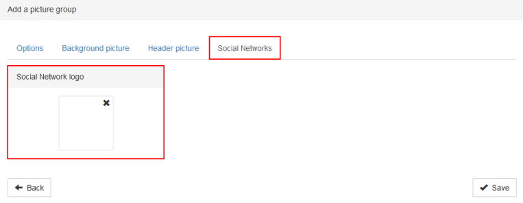
|This option allows the selection of the picture that will appear on the social network when the forms or the homepage will be shared. | |This option allows the selection of the picture that will appear on the social network when the forms or the homepage will be shared. | ||
| − | + | ||
|- | |- | ||
|'''''Note :''''' Furthermore, the minimal size for social network picture is of 600 x 315 pixels. The recommanded size is of 1200 x 630 pixels. For any other size, it is recommanded to follow the 1.91:1 ratio. | |'''''Note :''''' Furthermore, the minimal size for social network picture is of 600 x 315 pixels. The recommanded size is of 1200 x 630 pixels. For any other size, it is recommanded to follow the 1.91:1 ratio. | ||
| − | |||
| − | |||
|} | |} | ||
| − | == Send forms into | + | == Send forms into production == |
After having created all the basics of the back office, it is time to send everything into production. | After having created all the basics of the back office, it is time to send everything into production. | ||
| − | |||
{| class="wikitable" width="20%" cellspacing="1" cellpadding="1" border="1" | {| class="wikitable" width="20%" cellspacing="1" cellpadding="1" border="1" | ||
| Line 647: | Line 531: | ||
| colspan="2" | Then, everywhere this section is appeared, click on the "Production" button. | | colspan="2" | Then, everywhere this section is appeared, click on the "Production" button. | ||
| − | |||
|- | |- | ||
| − | | colspan="2" | [[ | + | | colspan="2" | [[File:ProDon5_BackOffice_027.png]] |
|- | |- | ||
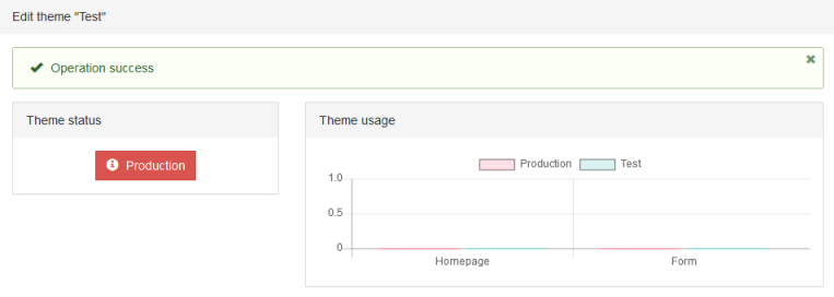
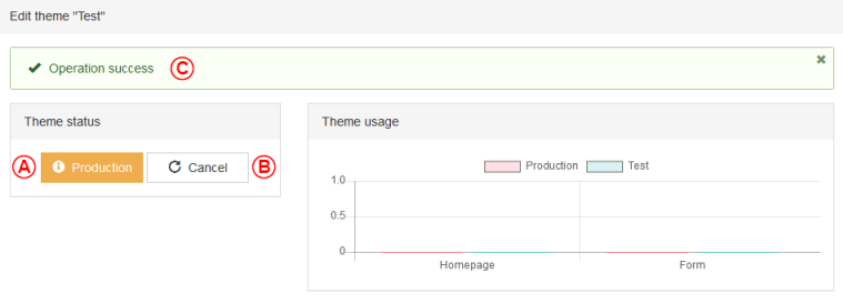
| colspan="2" | When the button is red, the form/picture group has never been into production. | | colspan="2" | When the button is red, the form/picture group has never been into production. | ||
| − | |||
|- | |- | ||
| − | | colspan="2" | [[ | + | | colspan="2" | [[File:ProDon5_BackOffice_028.png]] |
|- | |- | ||
| width="50%" | <span style="color: rgb(255, 0, 0);">'''A'''</span>: When the button is yellow, the form/picture group has been edited and the edits are not applied yet, so they are not into production. | | width="50%" | <span style="color: rgb(255, 0, 0);">'''A'''</span>: When the button is yellow, the form/picture group has been edited and the edits are not applied yet, so they are not into production. | ||
| − | + | |<span style="color: rgb(255, 0, 0);">'''B'''</span>: A new feature: It is now possible to cancel the edits before sending the form into production. | |
| + | |- | ||
| + | | colspan="2" |<span style="color: rgb(255, 0, 0);">'''C'''</span>: A new feature: After having saved, a section appears to show if the operation has worked. | ||
| − | |||
| − | |||
|- | |- | ||
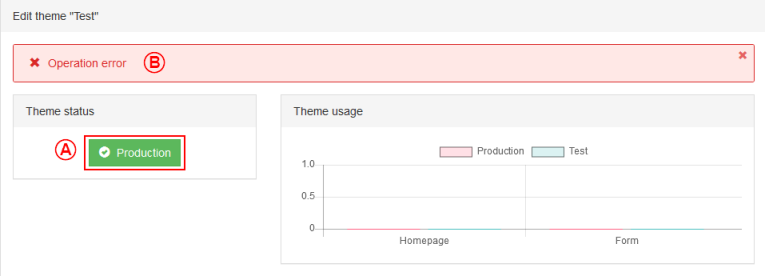
| − | + | | colspan="2" | [[File:ProDon5_BackOffice_029.png]] | |
| − | |||
| − | |||
| − | | colspan="2" | [[ | ||
|- | |- | ||
| width="50%" | <span style="color: rgb(255, 0, 0);">'''A'''</span>: When the button is green, the form/picture group is in production and all edits are used. | | width="50%" | <span style="color: rgb(255, 0, 0);">'''A'''</span>: When the button is green, the form/picture group is in production and all edits are used. | ||
| − | |||
| <span style="color: rgb(255, 0, 0);">'''B'''</span>: When this error happens, contact '''''Logilys'''''' tech support. Unfortunately for the user, all edits will be erased. | | <span style="color: rgb(255, 0, 0);">'''B'''</span>: When this error happens, contact '''''Logilys'''''' tech support. Unfortunately for the user, all edits will be erased. | ||
| − | |||
|} | |} | ||
| − | == Link the back office into | + | == Link the back office into ProDon == |
{| class="wikitable" width="20%" cellspacing="1" cellpadding="1" border="1" | {| class="wikitable" width="20%" cellspacing="1" cellpadding="1" border="1" | ||
|- | |- | ||
| − | | colspan="2" | Then this | + | | colspan="2" | Then go back to this screen: |
| − | + | ||
|- | |- | ||
| − | | colspan="2" | [[ | + | | colspan="2" | [[File:ProDon5_BackOffice_030.png]] |
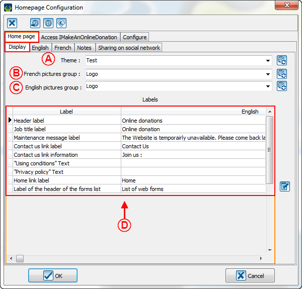
|- | |- | ||
| width="50%" |<span style="color: rgb(255, 0, 0);">'''A''':</span> In this box, the user will be able to select the theme just created on the back office. | | width="50%" |<span style="color: rgb(255, 0, 0);">'''A''':</span> In this box, the user will be able to select the theme just created on the back office. | ||
| − | |||
| <span style="color: rgb(255, 0, 0);">'''B''':</span> In this box, the user will be able to select the picture group that will have to be used in the French forms and the French homepage. | | <span style="color: rgb(255, 0, 0);">'''B''':</span> In this box, the user will be able to select the picture group that will have to be used in the French forms and the French homepage. | ||
| − | + | ||
|- | |- | ||
| <span style="color: rgb(255, 0, 0);">'''C''':</span> In this box, the user will be able to select the picture group that will have to be used in the English forms and the English homepage. | | <span style="color: rgb(255, 0, 0);">'''C''':</span> In this box, the user will be able to select the picture group that will have to be used in the English forms and the English homepage. | ||
| − | |||
| <span style="color: rgb(255, 0, 0);">'''D''':</span> Do not forget to adjust the French and the English labels, because these elements will appear online. | | <span style="color: rgb(255, 0, 0);">'''D''':</span> Do not forget to adjust the French and the English labels, because these elements will appear online. | ||
| − | |||
|} | |} | ||
{{Footer_ProDon_Version|5.0.4}}<br> | {{Footer_ProDon_Version|5.0.4}}<br> | ||
Latest revision as of 08:33, 27 April 2017
| Back office |
CAUTION: This document is conceived for the version 5.0.4 of ProDon. For the version 5.0.3, click here.
Introduction
The back office is linked to the Online Donation module. It allows the management of all graphic elements of the homepage and of the forms.This is where one will be able to edit the font, the colors and the pictures that will appear on the IMakeAnOnlineDonation of the organization.
Creation of a LogiZone account
A LogiZone account is a profile once given the right accesses will allow the user to log in to the back office.
To create a LogiZone account, go to the back office.
To do so, go to "Web forms management".
| Click on the "Configuration" menu, then select the " | |
 |
| After clicking on " | |
 |
| Once this window is open, select the button |
|
Back office accesses
To access the back office, one must first have a LogiZone account. Once the LogiZone account created, go to ProDon to give the access to the back office to this account.
From ProDon, give the access to the LogiZone account which will be able to edit the back office.
To do so, one must go to the "![]() Web form management".
Web form management".
|
Click on the "Configuration" menu, then select " | |

|
| After clicking on " | |
 | |
| Then, click on the button |
|
The email linked to the LogiZone account will appear here. | |
 |
Create themes in the back office
Then, redo the steps of the LogiZone creation, but in place of creating a new one, connect to the session.
|
Normally, the user will get to this window: | |
 | |
| A: Please be sure to be in the right section. | B: Click on this button to create a new theme. |
The "Option" tab
The "Palette" tab
The "Fonts" tab
The "Homepage" tab
The "Form" tab
The "CSS" tab
This option has been removed for the creation, but the user will be able to use it once a theme is named.
Add files in the back office
To add files, click on the "My files" section and click on add.
| Then this window will open: | |
 | |
| The user will have to go find the pictures that will have to be added. Then, the cropper will appear: | |
 |
Create a picture group in the back office
To create a picture group, the user will have to click on the "My picture groups" section and click on add.
The "Option" tab
 | |
| A: Here is where the user shall name the picture group. | B: This checkbox allows this picture group to be used by default. |
The "Background picture" tab
The "Header picture" tab
The "Social Networks" tab
Send forms into production
After having created all the basics of the back office, it is time to send everything into production.
Link the back office into ProDon
Document name: ProDon:Back office
Version : 5.0.4

