|
|
| Line 191: |
Line 191: |
| | |} | | |} |
| | | | |
| − | === "Palette" tab === | + | === The "Palette" tab === |
| | {| class="wikitable" width="200" cellspacing="1" cellpadding="1" border="1" | | {| class="wikitable" width="200" cellspacing="1" cellpadding="1" border="1" |
| | |- | | |- |
Revision as of 10:04, 20 April 2017
CAUTION: This document is currently being revised, it may be possible that some parts are missing or outdated
CAUTION: This function is only available from the version 5.0.3 of ProDon.
Introduction
The back office is linked to the Online Donation module. It allows the management of all graphic elements of the homepage and of the forms. This is where one will be able to edit the font, the colors and the pictures that will appear on the IMakeAnOnlineDonation of the organization.
Creating a LogiZone account
A LogiZone account is a profile which once the access given will allow to login to the back office.
To create a LogiZone account, go to the back office.
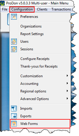
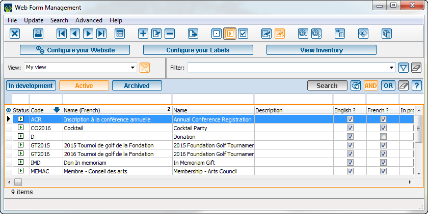
To do so, go to the "Web form management".
| Once on the page to the back office, the user will have to create their LogiZone account, if they do not have one.
|

|
|
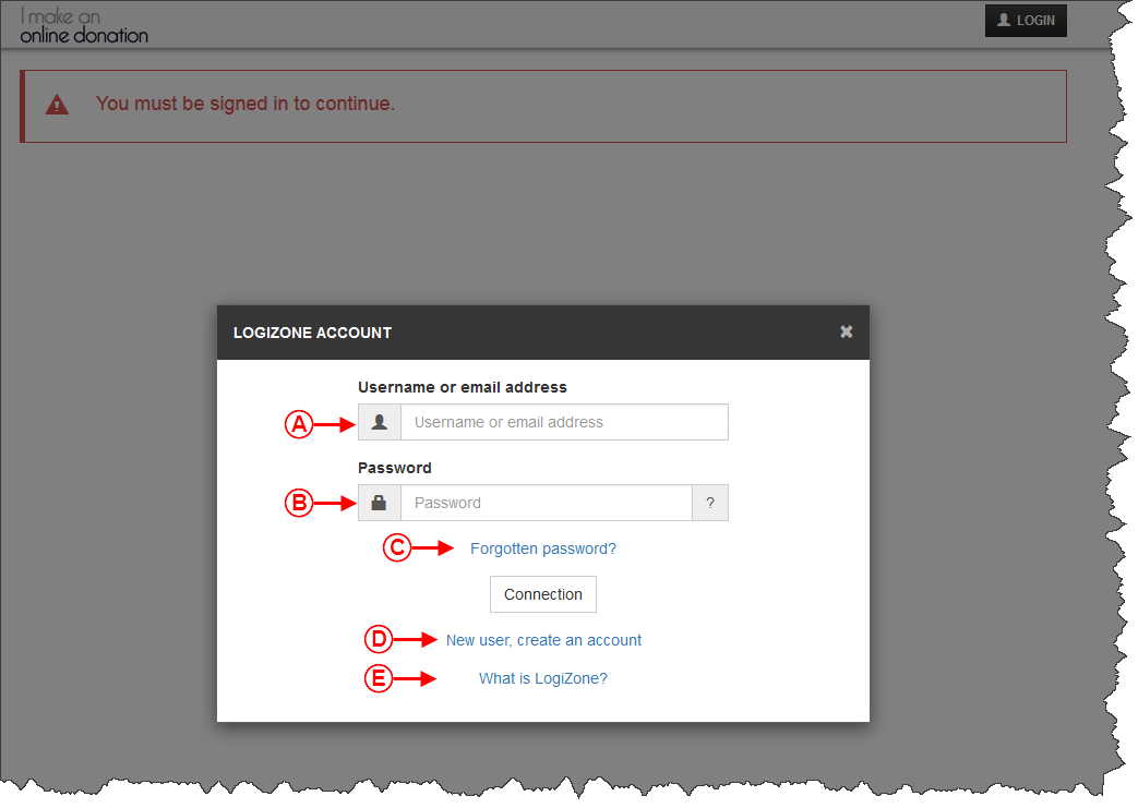
A : Allows the user to login an active LogiZone by entering the user name or the email address.
|
B : Enter the password of the existing LogiZone.
|
| C : Use this link to change the password of the existing LogiZone.
|
D : Allows the creation of a new LogiZone account.
|
| E : Help to get more information about the LogiZone account.
|
Back office accesses
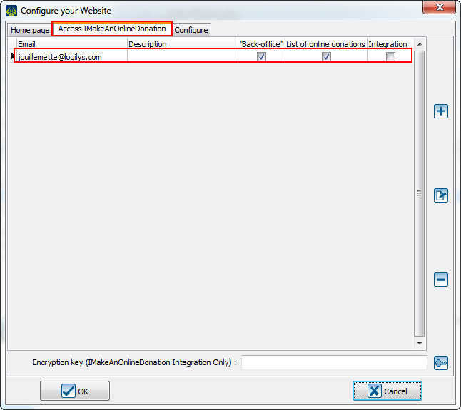
To access the back office, one must first have a LogiZone account. Once the LogiZone account created, go to ProDon to give it the access to the back office.
From ProDon, give the access to the LogiZone account which will be able to edit the back office.
To do so, one must go to the "Web form management".
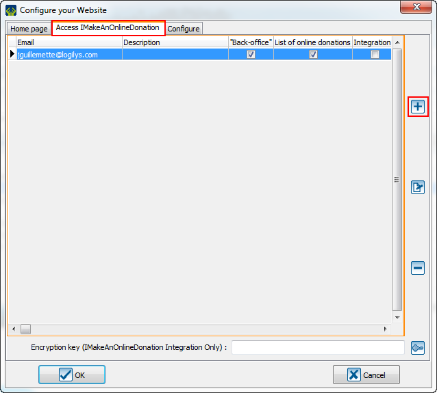
In this window, go to the "Access IMakeAnOnlineDonation" tab and click on the  to add a user. to add a user.
|

|
| NOTE: From the bottom of this window, it is possible to create an encryption key. It is not necessary to have one.
|
|
Then, this window will open:
|

|
| A: In this box, enter the email that will be used to access the LogiZone.
|
B: Usually, enter the name of the person who will use this email to access the LogiZone.
|
| C: The checkbox "Back office" is used to grant the access to let the user work on the back office.
|
D: The checkbox "Online donation list" is used to grant the access to let the user see the list of online donation.
|
| E: When there is an encryption key, this box give the access to the user to do integration on demand.
|
F: Write the user's password for integration in this box.
|
| The email linked to the LogiZone account will appear here.
|

|
Create themes in the back office
Then, redo the steps of the LogiZone creation, but in place of creating a new one, connect to the session.
| Normally, the user will get to this window:
|

|
| A: Please be sure to be in the right section.
|
B: Click on this button to create a new theme.
|
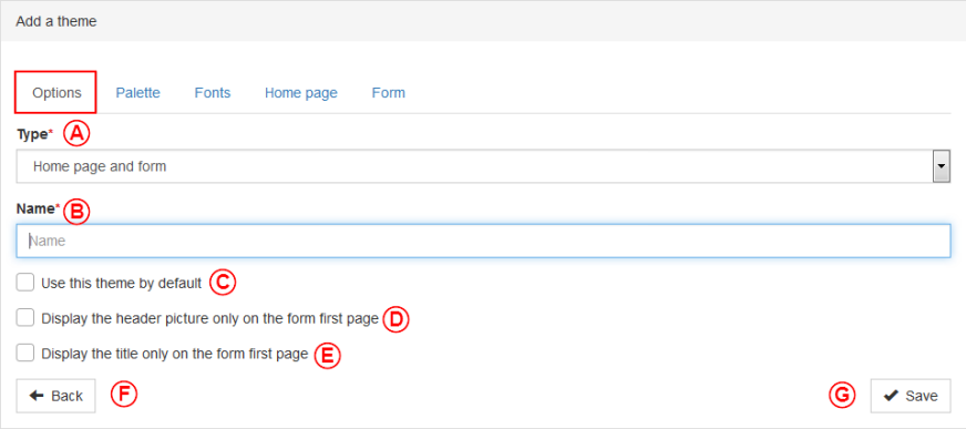
The "Option" tab
| Then, this window opens:
|

|
| A: This section allows the choice of the theme type that will be created. The possible choices are: create a theme for the homepage and the forms, for the homepage only or for the forms only.
|
B: This sections allows the naming of the theme.
|
| C: This checkbox allows this theme to be applied by default.
|
D: This checkbox allows the display of the header only on the first page of the form.
|
| E: This checkbox allows the display of the title only on the first page of the form.
|
F: In all windows, this button return the user to the overview of everything in this section. For example, when a user is in the themes, this button will return to the overview of all themes of the back office.
|
| G: This button allows to save the edits. Furthermore, everytime a change is detected in a section, when the user goes to another section, the back office ask to save the changes.
|
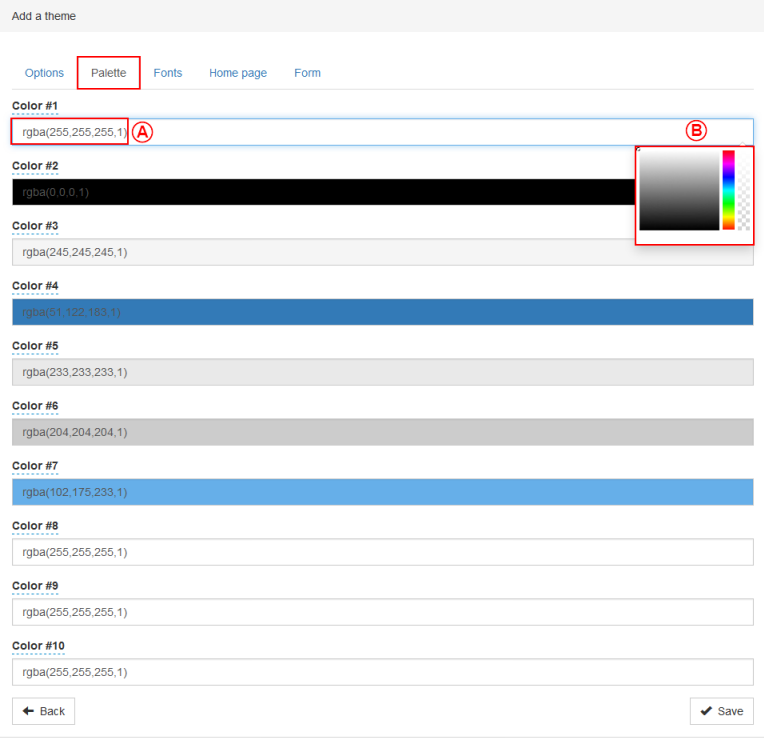
The "Palette" tab
| The "Palette" tab allows the definition of the colors that will be used in the other tabs of the back office. Usually, the user configure the organization's colors.
|

|
| A: To get the most precise colors, the back office system use the rgba. The numbers be between 0 and 255. The first number is the amount of red, the second is the amount of green, the third is the amount of blue and the last one is the opacity (alpha). The more this number is close to 1.0, the more the color will be opaque, the more it is near to 0.0, the more this color will be transparent.
|
B: If the user does not have the numbers for their colors, it is possible to use this tool. The user will only have to click on the bar and the tool will open.
|
The "Fonts" tab
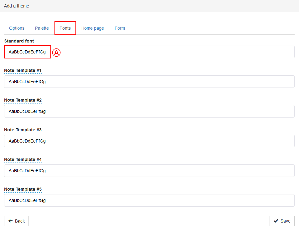
| The "Fonts" tab allows the definition of the standard font and the font color that will be used in the forms created by the back office. Usually, the user configure the general font of their organization with a color easily readable in the organization's colors.
|

|
| A: To open the menu to configure the font, click on the box of the line that must be edited.
|

|
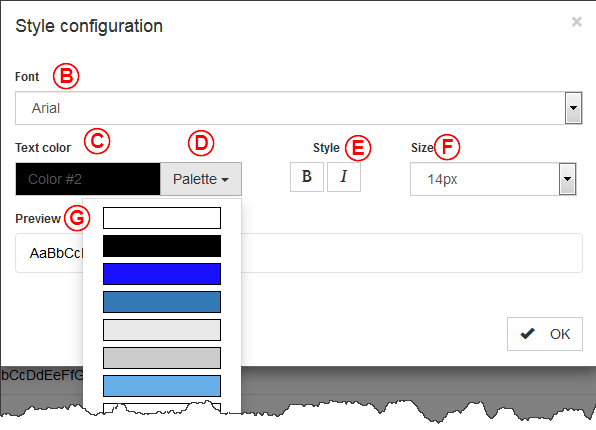
| B: The "Font" option allows the setting of the text display.
|
C: The "Text color" option allows the user to choose the writing color in the forms and the homepage.
|
| D: The "Palette" option allows the selection of the text color among the ones set in the last tab. It is used in several section of the back office.
|
E: The "Style" option allows the display of the text in bold (B) or in italic (I).
|
| F: The "Size" allows the setting of the text size.
L'option « Taille » permet de déterminer la taille du texte.
|
G: The "Preview" section let the user preview the result of all the choices.
|
The "Homepage" tab
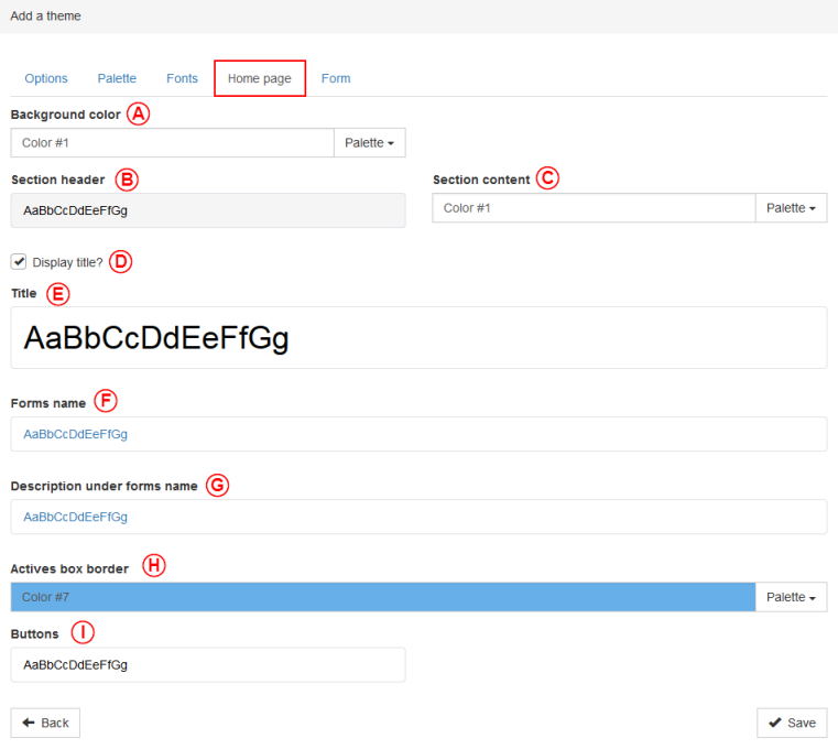
| The "Homepage" tab allows the configuration of colors and fonts used in the homepage.
|

|
| A: To choose the background color of the homepage, go to the "Palette" option.
|
B: The "Section header" allows the definition of the color, the size, the style and the background color of the section headers.
|
| C: The "Section content" option allows the selection of the background of the section content. The font used in this part will be the standard one.
|
D: When the "Display title?" checkbox is checked, the "Title" option will be displayed.
|
| E: The "Title" option helps to select the color, the size, the style and the background color of the title of the homepage.
|
F: The "Forms name" option helps to set the color, the size and the style of the form name.
|
| G: The "Description under forms name" option helps to set the color, the size and the style of the description under the form name.
|
H: The "Active box border" option helps to set from the palette the color of the border of the active box. The active box is the box currently selected by a user.
|
| I: The "Buttons" option allows the configuration of the background color, the text color and the style of the buttons of the homepage.
|
The "Form" tab
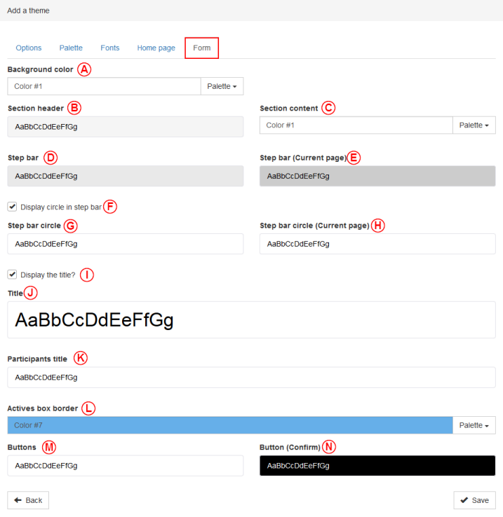
| The "Form" tab allows the configuration of the colors and fonts used in the forms.
|

|
| A: To select the background color of the forms, go to the "Palette" option.
|
B: The "Section header" option allows the selection of the color, the size, and the background color of the section headers.
|
| C: The "Section content" allows the selection of the background color of the section content. The font used will be the standard one.
|
D: The "Step bar" option allows the selection of the color, the size, the style and the background color of the step bar.
|
| E: The "Step bar (current page)" allows the selection of the color, the size, the style and the background color of the current page of the step bar.
|
F: The checkbox "Display the circle in the step bar" allows to display a circle in which there will be the number of the step. This box must be checked to unlock the options G and H .
|
| G: The "Step bar circle" allows the selection of the color, the size, the style and the background color of the circle in the step bar.
|
H: The "Step bar cicle (Current page)" allows the selection of the color, the size, the style and the background color of the current page of the step bar.
|
| I: The "Display the title?" option allows the title to be displayed or not. The option must be activated to display the "Title" section.
|
J: The "Title" option allows the selection of the color, the size, the style and the background color of the title of the form.
|
| K: The "Participants title" allows the selection of the color, the size and the style of the participants title.
|
L: The "Active box border" option allows the selection of the color from the the colors already set in the palette. An active is the currently selected box.
|
| M: The "Buttons" option allows the configuration of the background color, the text color and the style used for the form buttons.
|
N: The "Button (Confirm)" option allows the configuration of the background color, the text color and the style used for the form confirm button.
|
The "CSS" tab
This option has been removed for the creation, but the user will be able to use it once a theme is named.
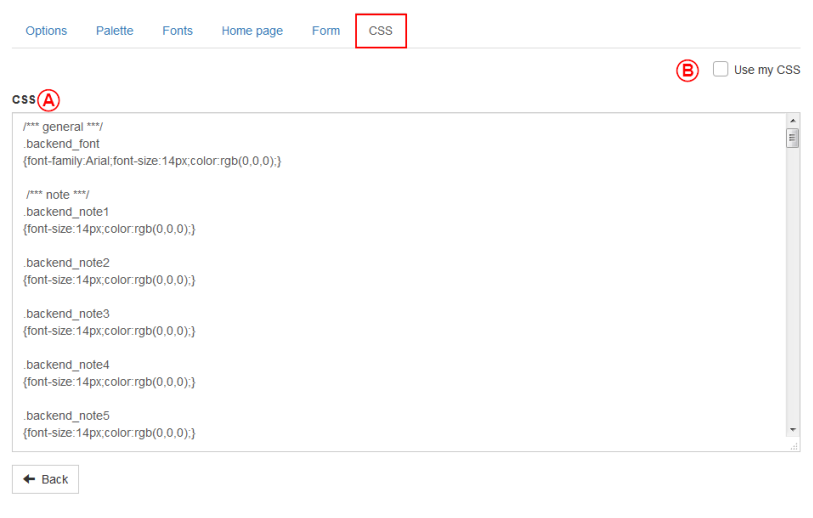
| The "CSS" tab allows the configuration of the colors and the fonts used in the forms.
|

|
| A: CSS is for "Cascading Style Sheet". It is a programming language which is only used to adjust visual elements. It is not recommanded to touch this window.
|
B: If the user is really at ease and knows the CSS language, it is possible to remove all tabs only to keep the CSS tab. To do so, only click on the "Use my CSS" box.
|
Add files into the back office
To add files, click on the "My files" section and click on add.

| Then this window will open:
|

|
| The user will have to go find the pictures that will have to be added.
|
| Then this window will open:
|

|
| A: Here, the user can see the file that has been added.
|
B: The user can see how much storage space used by the files.
|
| C: To remove a file, click on the delete button.
|
Create a picture group in the back office
To create a picture group, the user will have to click on the "My picture groups" section and click on add.

| Then, this window will open:
|

|
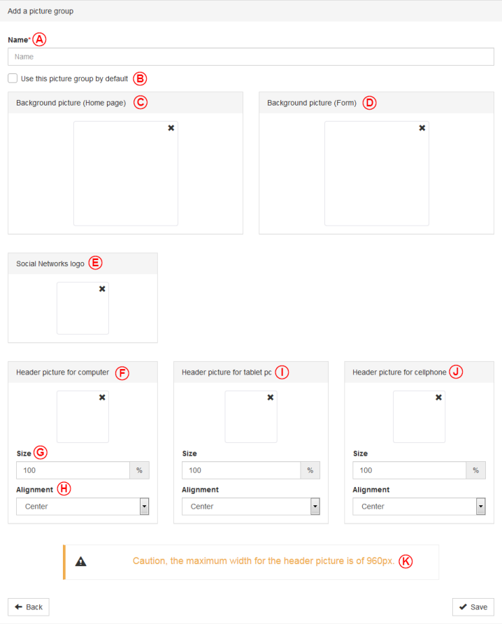
| A: This is where the user will have to name the picture group.
|
B: This checkbox let this picture group to be used by default.
|
| C: This option allows the setting of the background picture of the homepage.
|
D: This option allows the setting of the background picture of the forms.
|
| E: This option allows the selection of the picture that will appear on the social network when the forms or the homepage will be shared.
|
Note : Furthermore, the minimal size for social network picture is of 600 x 315 pixels. The recommanded size is of 1200 x 630 pixels. For any other size, it is recommanded to follow the 1.91:1 ratio.
|
| F: This option allows the setting the header picture when the forms will be called by a computer.
|
G: This box allows the setting of the picture size by using percentage.
|
| H: This box allows the setting of the alignment of the picture.
|
I: This option allows the setting the header picture when the forms will be called by a tablet PC.
|
| J: This option allows the setting the header picture when the forms will be called by a cellphone.
|
K: Please consider this important warning. There is no real limit about the height, but the width of the header pictures must not exceed 960 pixels.
|
| NOTE: For the background pictures, the maximum suggested size for the background pictures is of 1920 x 1080 pixels. If the picture size is greater than this, it may be possible that the some browsers will not load it.
|
Send forms into production
After having created all the basics of the back office, it is time to send everything into production.
| Then, everywhere this section is appeared, click on the "Production" button.
|

|
| When the button is red, the form/picture group has never been into production.
|

|
| When the button is yellow, the form/picture group has been edited and the edits are not applied yet, so they are not into production.
|

|
| When the button is green, the form/picture group is in production and all edits are used.
|
Link the back office into ProDon
| Then this window will open:
|
| File:ProDon5 BackOffice 5.0.3 025.png
|
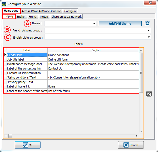
| A: In this box, the user will be able to select the theme just created on the back office.
|
B: In this box, the user will be able to select the picture group that will have to be used in the French forms and the French homepage.
|
| C: In this box, the user will be able to select the picture group that will have to be used in the English forms and the English homepage.
|
D: Do not forget to adjust the French and the English labels, because these elements will appear online.
|
Document name: ProDon:Back office 5.0.3
Version : 5.0.3
