Difference between revisions of "ProDon:Home Page and Website Configuration"
| (86 intermediate revisions by 2 users not shown) | |||
| Line 1: | Line 1: | ||
| − | {{ | + | {{Header_TOC}}<br> |
<br> | <br> | ||
| − | == Introduction | + | == Introduction == |
| − | The Online Donation Module allows the donors to make donations directly | + | The Online Donation Module allows the donors to make donations directly through the Web.<br> |
| − | In order for the donors to be able to make donations, a website must first be created and configured. The creation of | + | In order for the donors to be able to make donations, a website must first be created and configured. The creation of an online donation website includes the configuration of the website's home page, as well as the creation of different Web forms. Each Web form is attached to a [[ProDon:Donation Occasion Management|donation occasion]], this ensures that Internet users are able to sign up for the fundraising activities of an organization, or make a donation directly online. |
| + | <br> | ||
| + | Moreover, when an Internet user makes a donation or registers to an activity via a Web form, '''''ProDon''''' adds him or her automatically to the database when [[ProDon:Importing Donations|importing the donations]]. | ||
| − | + | <br> | |
| + | == Home Page and Website Configuration == | ||
| + | Prior to creating the Web forms, it is important to configure the home page and the website. The home page contains the list of all the Web forms available to Internet users.<br> | ||
| − | + | After having made the modifications, you must send them in test and/or in production. For more information concerning the modification transfer, view [[ProDon:Home Page and Website Configuration#Sending_the_Information_to_the_Website|this section]]. | |
| − | + | To do so, go to "Web form management". | |
| − | + | {| cellspacing="1" cellpadding="1" border="1" style="width: 169px; height: 612px;" class="wikitable" | |
| − | |||
| − | {| | ||
|- | |- | ||
| | | | ||
| − | Click on the "Configuration" menu, then select "[[Image: | + | Click on the "Configuration" menu, then select <br>"[[Image:Web form button.png]] Web forms". |
|- | |- | ||
| − | | <br> | + | | [[Image:Home page and Website Configuration 001.png]]<br> |
|} | |} | ||
<br> | <br> | ||
| − | + | {| cellspacing="1" cellpadding="1" border="1" class="wikitable" style="width: 600px; height: 462px;" | |
| − | |||
| − | {| | ||
|- | |- | ||
| | | | ||
| − | After clicking on "[[Image: | + | After clicking on "[[Image:Web form button.png]] Web forms", this window opens. |
|- | |- | ||
| − | | <br> | + | | [[Image:Home page and Website Configuration 002.png]]<br> |
|- | |- | ||
| | | | ||
| − | To configure the | + | To configure the home page, click on the [[Image:Configure website button.png]] button. |
|} | |} | ||
<br> | <br> | ||
| − | |||
| − | |||
=== Configuration Tab<br> === | === Configuration Tab<br> === | ||
| − | This tab allows you to customize the appearance of the | + | This tab allows you to customize the appearance of the home page, as well as a few options of the website. It is possible to choose the colours and writing fonts, to choose the colour of the background and margins, to add a logo and personalized notes, etc. |
<br> | <br> | ||
| Line 59: | Line 57: | ||
==== "Preview" Tab<br> ==== | ==== "Preview" Tab<br> ==== | ||
| − | This tab allows you to customize the appearance of the | + | This tab allows you to customize the appearance of the home page, as well as a few general options of the Web forms.<br> |
| − | {| | + | {| cellspacing="1" cellpadding="1" border="1" class="wikitable" style="width: 612px; height: 1216px;" |
|- | |- | ||
| colspan="2" | | | colspan="2" | | ||
| − | After clicking on the [[Image:Configure | + | After clicking on the [[Image:Configure website button.png]] button of the previous page, this window opens.<br> |
|- | |- | ||
| − | | colspan="2" | <br> | + | | colspan="2" | [[Image:Home page and Website Configuration 003.png]]<br> |
|- | |- | ||
| width="50%" | | | width="50%" | | ||
| − | '''<span style="color: rgb(255, 0, 0);">A: </span>'''The [[Image:Colour button.png]] button allows you to modify the colour of the margin. To view an example of margin, see'''point '''<span style="color: rgb(255, 0, 0);">'''A'''</span> of the "Example | + | '''<span style="color: rgb(255, 0, 0);">A: </span>'''The [[Image:Colour button.png]] button allows you to modify the colour of the margin. To view an example of margin, see '''point '''<span style="color: rgb(255, 0, 0);">'''A'''</span> of the [[ProDon:Home Page and Website Configuration#Home_Page_Example|"Home Page Example"]] section.<br> |
| + | |||
| + | | width="50%" | | ||
| + | '''<span style="color: rgb(255, 0, 0);">B: </span>'''The [[Image:Colour button.png]] button allows you to modify the colour of the background. To view an example of background, see '''point'''<span style="color: rgb(255, 0, 0);">''' B'''</span> of the [[ProDon:Home Page and Website Configuration#Home_Page_Example|"Home Page Example"]] section. | ||
| − | |||
|- | |- | ||
| − | | width="50%" | < | + | | width="50%" | |
| − | | width="50%" | < | + | '''<span style="color: rgb(255, 0, 0);">C: </span>'''The [[Image:Colour button.png]] button allows you to modify the home page title and the [[Image:Font button.png]] button allows you to modify the font of the home page title. To view an example of title font, see '''point '''<span style="color: rgb(255, 0, 0);">'''C'''</span> of the [[ProDon:Home Page and Website Configuration#Home_Page_Example|"Home Page Example"]] section. |
| + | |||
| + | | width="50%" | | ||
| + | '''<span style="color: rgb(255, 0, 0);">D: </span>'''The [[Image:Colour button.png]] button allows you to modify the colour of the form name and the [[Image:Font button.png]] button allows you to modify the form name font. To view an example of form name font, see '''point '''<span style="color: rgb(255, 0, 0);">'''D'''</span> of the [[ProDon:Home Page and Website Configuration#Home_Page_Example|"Home Page Example"]] section. | ||
| + | |||
|- | |- | ||
| − | | width="50%" | < | + | | width="50%" | |
| − | | width="50%" | < | + | '''<span style="color: rgb(255, 0, 0);">E: </span>'''The [[Image:Colour button.png]] button allows you to modify the colour of the form description and the [[Image:Font button.png]] button allows you to modify the font of the form description. To view an example of form description font, see '''point '''<span style="color: rgb(255, 0, 0);">'''E''' </span>of the [[ProDon:Home Page and Website Configuration#Home_Page_Example|"Home Page Example"]] section. |
| + | |||
| + | | width="50%" | | ||
| + | '''<span style="color: rgb(255, 0, 0);">F: </span>'''The [[Image:Edit font button.png]] button allows you to modify the font of the report that contains the list of online donations. | ||
| + | |||
|- | |- | ||
| − | | width="50%" | < | + | | width="50%" | |
| − | | width="50%" | < | + | '''<span style="color: rgb(255, 0, 0);">G: </span>'''Displays a back link to the home page in the form. To view an example of back link to the home page, see '''point '''<span style="color: rgb(255, 0, 0);">'''A'''</span> of the [[ProDon:Creating a Web Form#Web_Form_Example_1|"Web Form Example 1"]] section of the [[ProDon:Creating a Web Form|"Creating a Web Form"]] document. |
| + | |||
| + | | width="50%" | | ||
| + | '''<span style="color: rgb(255, 0, 0);">H: </span>'''Displays the time remaining in the session at the bottom of the form. To view an example of time remaining in the session, see '''point '''<span style="color: rgb(255, 0, 0);">'''A'''</span> of the [[ProDon:Creating a Web Form#Web_Form_Example_2|"Web Form Example 2"]] section of the [[ProDon:Creating a Web Form|"Creating a Web Form"]] document. | ||
| + | |||
| + | '''NOTE:''' The session time is always limited. | ||
| + | |||
|- | |- | ||
| − | | width="50%" | < | + | | width="50%" | |
| − | | width="50%" | < | + | '''<span style="color: rgb(255, 0, 0);">I: </span>'''Determines the duration of the session. |
| + | |||
| + | '''NOTE:''' Usually, the duration is set between 15 and 30 minutes to allow people to fill in the form rigorously. | ||
| + | |||
| + | | width="50%" | | ||
| + | '''<span style="color: rgb(255, 0, 0);">J: </span>'''This drop-down menu allows you to choose the positioning of the title and logo on the home page. To view an example of title and logo positioning, see '''point '''<span style="color: rgb(255, 0, 0);">'''F'''</span> of the [[ProDon:Home Page and Website Configuration#Home_Page_Example|"Home page Example"]] section. It is also possible to insert a banner in the header of the Web form or of the home page rather than inserting a title and a logo. To do so, select the option "Display only the logo followed by a space" or "Display only the logo without a space". To view an example of banner, see '''point '''<span style="color: rgb(255, 0, 0);">'''M'''</span> of the [[ProDon:Creating a Web Form#Web_Form_Example_3|"Web Form Example 3"]] section. | ||
| + | |||
| + | '''NOTE:''' To learn how to modify the logo of the home page, see the [[ProDon:Home Page and Website Configuration#.22Web_site_documents.22_Tab|"Web site documents" Tab"]] section. | ||
| + | |||
|- | |- | ||
| − | | width="50%" | < | + | | width="50%" | |
| − | | width="50%" | < | + | '''<span style="color: rgb(255, 0, 0);">K: </span>'''Allows to round the corners of the background. To view an example of background, see '''point '''<span style="color: rgb(255, 0, 0);">'''B'''</span> of the [[ProDon:Home Page and Website Configuration#Home_Page_Example|"Home Page Example"]] section. |
| + | |||
| + | | width="50%" | | ||
| + | '''<span style="color: rgb(255, 0, 0);">L: </span>'''Allows you to add shading in the bottom right part of the background. To view an example of background, see '''point'''<span style="color: rgb(255, 0, 0);">''' B'''</span> of the [[ProDon:Home Page and Website Configuration#Home_Page_Example|"Home Page Example"]] section. | ||
| + | |||
|} | |} | ||
| − | <br> | + | <br> |
| + | |||
| + | ==== "French" and "English" Tabs ==== | ||
| − | + | These tabs allow you to group forms.<br> | |
| − | <br> | + | '''NOTE:''' The "French" and "English" tabs are configured in the same way. The "English" tab allows you to configure English form groups and the "French" tab allows you to configure French form groups.<br> |
| − | {| | + | {| cellspacing="1" cellpadding="1" border="1" style="width: 598px; height: 835px;" class="wikitable" |
|- | |- | ||
| − | | colspan="2" | <br> | + | | colspan="2" | [[Image:Home page and Website Configuration 004.png]]<br> |
|- | |- | ||
| − | | width="50%" | < | + | | width="50%" | |
| − | | width="50%" | < | + | '''<span style="color: rgb(255, 0, 0);">A: </span>'''Allows you to choose whether the home page will be in French only, in English only or in both languages. To activate the English home page, go to the "English" tab, then check the "English" checkbox. |
| + | |||
| + | '''NOTE:''' If French and English forms have already been created, both "French" and "English" checkboxes are checked automatically and cannot be unchecked. If the forms were created only in English, this checkbox is checked by default and cannot be unchecked, but the "French" checkbox can be checked or unchecked. | ||
| + | |||
| + | | width="50%" | | ||
| + | '''<span style="color: rgb(255, 0, 0);">B: </span>'''This drop-down list offers two date format options. The date format selected here will be the one appearing everywhere on the website. | ||
| + | |||
|- | |- | ||
| − | | width="50%" | < | + | | width="50%" | |
| − | | width="50%" | < | + | '''<span style="color: rgb(255, 0, 0);">C: </span>'''Displays the forms in alphabetical order in the groups. |
| + | |||
| + | '''NOTE:''' To modify the order of the form groups, click on the [[Image:Order button.png]] button at<span style="color: rgb(255, 0, 0);">''' F'''</span><span style="color: rgb(0, 0, 0);">.</span> | ||
| + | |||
| + | | width="50%" | | ||
| + | '''<span style="color: rgb(255, 0, 0);">D: </span>'''Allows you to see in which group the forms are. To modify the form groups, click on the [[Image:Order button.png]] button at <span style="color: rgb(255, 0, 0);">'''F'''</span>. | ||
| + | |||
|- | |- | ||
| − | | width="50%" | < | + | | width="50%" | |
| − | | width="50%" | < | + | '''<span style="color: rgb(255, 0, 0);">E: </span>'''The [[Image:Button Arrow up.png]] and [[Image:Button Arrow down.png]] buttons allow you to modify the order of the forms. |
| + | |||
| + | '''NOTE:''' It is possible to move the forms around only if the checkbox at <span style="color: rgb(255, 0, 0);">'''C'''</span> is not checked and if more than one form are placed in the same group. | ||
| + | |||
| + | | width="50%" | | ||
| + | '''<span style="color: rgb(255, 0, 0);">F: </span>'''The [[Image:Order button.png]] button allows you to create, modify and delete form groups. | ||
| + | |||
|} | |} | ||
<br> | <br> | ||
| − | {| | + | {| cellspacing="1" cellpadding="1" border="1" style="width: 519px; height: 538px;" class="wikitable" |
|- | |- | ||
| − | | colspan="2" | | + | | colspan="2" | |
| + | After clicking on the [[Image:Order button.png]] button of the previous page, this window opens. | ||
| + | |||
|- | |- | ||
| − | | colspan="2" | <br> | + | | colspan="2" | [[Image:Home page and Website Configuration 005.png]]<br> |
|- | |- | ||
| − | | width="50%" | < | + | | width="50%" | |
| − | | width="50%" | < | + | '''<span style="color: rgb(255, 0, 0);">A: </span>'''It is the list of existing form groups. The "Order" field indicates the order in which the forms appear on the home page. The "Group" field indicates the names of the form groups. |
| + | |||
| + | | width="50%" | | ||
| + | '''<span style="color: rgb(255, 0, 0);">B: </span>'''To create a new form group, click on the [[Image:Button add plus.png]] button. To modify an existing group, select the group at <span style="color: rgb(255, 0, 0);">'''A'''</span>, then click on the [[Image:Button Edit.png]] button. To delete a group, select the group at <span style="color: rgb(255, 0, 0);">'''A'''</span>, then click on the [[Image:Button Minus remove delete.png]] button. | ||
| + | |||
|- | |- | ||
| − | | colspan="2" | < | + | | colspan="2" | |
| + | '''<span style="color: rgb(255, 0, 0);">C: </span>'''The [[Image:Button Arrow up.png]] and [[Image:Button Arrow down.png]] buttons allow you to modify the order of the form groups. To do so, select the form group for which the order must be modified, then click on the [[Image:Button Arrow up.png]] button to move it upward, or click on the [[Image:Button Arrow down.png]] button to move it downward. | ||
| + | |||
|} | |} | ||
<br> | <br> | ||
| − | {| | + | {| cellspacing="1" cellpadding="1" border="1" style="width: 450px; height: 260px;" class="wikitable" |
|- | |- | ||
| − | | colspan="2" | | + | | colspan="2" | |
| + | After clicking on the [[Image:Button add plus.png]] or [[Image:Button Edit.png]] button of the previous page, this window opens. | ||
| + | |||
|- | |- | ||
| − | | colspan="2" | <br> | + | | colspan="2" | [[Image:Home page and Website Configuration 006.png]]<br> |
|- | |- | ||
| − | | width="50%" | < | + | | width="50%" | |
| − | | width="50%" | < | + | '''<span style="color: rgb(255, 0, 0);">A: </span>'''This field indicates the order of the form on the home page. |
| + | |||
| + | | width="50%" | | ||
| + | '''<span style="color: rgb(255, 0, 0);">B: </span>'''This field allows you to name the form group. | ||
| + | |||
|- | |- | ||
| − | | width="50%" | < | + | | width="50%" | |
| − | | width="50%" | < | + | '''<span style="color: rgb(255, 0, 0);">C: </span>'''The [[Image:Colour button.png]] button allows you to modify the colour of the group name and the [[Image:Font button.png]] button allows you to modify the font of the group name. To view an example of group name font, see '''point '''<span style="color: rgb(255, 0, 0);">'''G'''</span> of the [[ProDon:Home Page and Website Configuration#Home_Page_Example|"Home Page Example"]] section. |
| + | |||
| + | | width="50%" | | ||
| + | '''<span style="color: rgb(255, 0, 0);">D: </span>'''The [[Image:Colour button.png]] button allows you to modify the colour of the border around the form groups on the home page. To view an example of border, see '''point '''<span style="color: rgb(255, 0, 0);">'''H'''</span> of the [[ProDon:Home Page and Website Configuration#Home_Page_Example|"Home Page Example"]] section. | ||
| + | |||
|} | |} | ||
<br> | <br> | ||
| − | + | ==== "Labels" Tab ==== | |
| − | + | This tab allows you to modify different labels of the home page, the terms and conditions page and the website maintenance page. | |
| − | {| | + | {| cellspacing="1" cellpadding="1" border="1" style="width: 588px; height: 811px;" class="wikitable" |
|- | |- | ||
| − | | colspan="2" | <br> | + | | colspan="2" | [[Image:Home page and Website Configuration 007.png]]<br> |
|- | |- | ||
| − | | < | + | | width="50%" | |
| − | | < | + | '''<span style="color: rgb(255, 0, 0);">A: </span>'''To view an example of header label, see '''point'''<span style="color: rgb(255, 0, 0);">''' I '''</span>of the [[ProDon:Home Page and Website Configuration#Home_Page_Example|"Home Page Example"]] section. |
| + | |||
| + | | width="50%" | | ||
| + | '''<span style="color: rgb(255, 0, 0);">B: </span>'''To view an example of title label, see '''point '''<span style="color: rgb(255, 0, 0);">'''C'''</span> of the [[ProDon:Home Page and Website Configuration#Home_Page_Example|"Home Page Example"]] section. | ||
| + | |||
|- | |- | ||
| − | | < | + | | width="50%" | |
| − | | < | + | '''<span style="color: rgb(255, 0, 0);">C: </span>'''To view an example of maintenance message label, see '''point '''<span style="color: rgb(255, 0, 0);">'''A'''</span> of the [[ProDon:Home Page and Website Configuration#Website_Maintenance_Page_Example|"Website Maintenance Page Example"]] section. |
| + | |||
| + | | width="50%" | | ||
| + | '''<span style="color: rgb(255, 0, 0);">D: </span>'''To view an example of confidentiality label, see '''point '''<span style="color: rgb(255, 0, 0);">'''J'''</span> of the [[ProDon:Home Page and Website Configuration#Home_Page_Example|"Home Page Example"]] section. | ||
| + | |||
|- | |- | ||
| − | | < | + | | width="50%" | |
| − | | < | + | '''<span style="color: rgb(255, 0, 0);">E: </span>'''To view an example of terms and conditions title label, see '''point '''<span style="color: rgb(255, 0, 0);">'''A'''</span> of the [[ProDon:Home Page and Website Configuration#Terms_and_Conditions_Page_Example|"Terms and Conditions Page Example"]] section. |
| + | |||
| + | | width="50%" | | ||
| + | '''<span style="color: rgb(255, 0, 0);">F: </span>'''To view an example of terms and conditions title 1 label, see '''point'''<span style="color: rgb(255, 0, 0);">''' B'''</span> of the [[ProDon:Home Page and Website Configuration#Terms_and_Conditions_Page_Example|"Terms and Conditions Page Example"]] section. | ||
| + | |||
|- | |- | ||
| − | | < | + | | width="50%" | |
| − | | < | + | '''<span style="color: rgb(255, 0, 0);">G: </span>'''To view an example of terms and conditions text 1 label, see '''point '''<span style="color: rgb(255, 0, 0);">'''C'''</span> of the [[ProDon:Home Page and Website Configuration#Terms_and_Conditions_Page_Example|"Terms and Conditions Page Example"]] section. |
| + | |||
| + | | width="50%" | | ||
| + | '''<span style="color: rgb(255, 0, 0);">H: </span>'''To view an example of terms and conditions title 2 label, see '''point '''<span style="color: rgb(255, 0, 0);">'''D'''</span> of the [[ProDon:Home Page and Website Configuration#Terms_and_Conditions_Page_Example|"Terms and Conditions Page Example"]] section. | ||
| + | |||
|- | |- | ||
| − | | < | + | | width="50%" | |
| − | | < | + | '''<span style="color: rgb(255, 0, 0);">I: </span>'''To view an example of terms and conditions text 2 label, see '''point'''<span style="color: rgb(255, 0, 0);">''' E'''</span> of the [[ProDon:Home Page and Website Configuration#Terms_and_Conditions_Page_Example|"Terms and Conditions Page Example"]] section. |
| + | |||
| + | | width="50%" | | ||
| + | '''<span style="color: rgb(255, 0, 0);">J: </span>'''To view an example of submit button label, see '''point '''<span style="color: rgb(255, 0, 0);">'''K'''</span> of the [[ProDon:Home Page and Website Configuration#Home_Page_Example|"Home Page Example"]] section. | ||
| + | |||
|- | |- | ||
| − | | colspan="2" | < | + | | colspan="2" | |
| + | '''<span style="color: rgb(255, 0, 0);">K: </span>'''Allows you to modify labels. To do so, select the label to modify, then click on [[Image:Button Edit text.png]]. | ||
| + | |||
| + | '''NOTE:''' It is also possible to modify labels by double-clicking on the label to modify. | ||
| + | |||
|} | |} | ||
<br> | <br> | ||
| − | + | ==== "Notes" Tab ==== | |
| − | |||
| − | ==== "Notes" Tab | ||
| − | + | This tab allows you to add notes to the home page. | |
| − | {| | + | {| cellspacing="1" cellpadding="1" border="1" class="wikitable" style="width: 616px; height: 638px;" |
|- | |- | ||
| − | | colspan="2" | <br> | + | | colspan="2" | [[Image:Home page and Website Configuration 008.png]]<br> |
|- | |- | ||
| − | | < | + | | width="50%" | |
| − | | < | + | '''<span style="color: rgb(255, 0, 0);">A: </span>'''It is the list of notes that are on the home page. To view an example of note, see '''point '''<span style="color: rgb(255, 0, 0);">'''L'''</span> of the [[ProDon:Home Page and Website Configuration#Home_Page_Example|"Home Page Example"]] section. |
| + | |||
| + | | width="50%" | | ||
| + | '''<span style="color: rgb(255, 0, 0);">B: </span>'''The [[Image:Button add plus.png]] button allows you to add a new note to the home page. | ||
| + | |||
|- | |- | ||
| − | | < | + | | width="50%" | |
| − | | < | + | '''<span style="color: rgb(255, 0, 0);">C: </span>'''The [[Image:Button Edit.png]] button allows you to modify an existing note on the home page. To do so, select the note to modify at<span style="color: rgb(255, 0, 0);">''' A'''</span>, then click on [[Image:Button Edit.png]]. |
| + | |||
| + | | width="50%" | | ||
| + | '''<span style="color: rgb(255, 0, 0);">D: </span>'''The [[Image:Button Minus remove delete.png]] button allows you to remove a note from the home page. To do so, select the note to remove, then click on [[Image:Button Minus remove delete.png]]. | ||
| + | |||
|- | |- | ||
| − | | < | + | | width="50%" | |
| − | | <br> | + | '''<span style="color: rgb(255, 0, 0);">E: </span>'''The [[Image:Button eraser.png]] button allows you to delete all the notes at <span style="color: rgb(255, 0, 0);">'''A'''</span> at the same time. |
| + | |||
| + | | width="50%" | <br> | ||
|} | |} | ||
<br> | <br> | ||
| − | + | {| cellspacing="1" cellpadding="1" border="1" class="wikitable" style="width: 630px; height: 775px;" | |
| + | |- | ||
| + | | colspan="2" | | ||
| + | After clicking on the [[Image:Button add plus.png]] button or the [[Image:Button Edit.png]] button of the previous page, this window opens. | ||
| − | |||
|- | |- | ||
| − | | colspan="2" | <br> | + | | colspan="2" | [[Image:Home page and Website Configuration 009.png]]<br> |
|- | |- | ||
| − | | | + | | width="50%" | |
| + | '''<span style="color: rgb(255, 0, 0);">A: </span>'''Enter the French label of the note in this field. | ||
| + | |||
| + | | width="50%" | | ||
| + | '''<span style="color: rgb(255, 0, 0);">B:</span>''' Enter the English label of the note in this field. | ||
| + | |||
|- | |- | ||
| − | | < | + | | width="50%" | |
| − | | < | + | '''<span style="color: rgb(255, 0, 0);">C: </span>'''This menu appears by right-clicking in the field at <span style="color: rgb(255, 0, 0);">'''A'''</span> or <span style="color: rgb(255, 0, 0);">'''B'''</span>. It allows you to insert images or hyperlinks in the note. It is also possible to type an html code directly in the field, if desired. |
| + | |||
| + | '''CAUTION:''' However, '''''Logilys''''' does not offer technical support related to the use of html codes. | ||
| + | |||
| + | | width="50%" | | ||
| + | '''<span style="color: rgb(255, 0, 0);">D: </span>'''The [[Image:Colour button.png]] button allows you to modify the colour of the font of the note and the [[Image:Font button.png]] button allows you to modify the font of the note. | ||
| + | |||
|- | |- | ||
| − | | < | + | | width="50%" | |
| − | | < | + | '''<span style="color: rgb(255, 0, 0);">E: </span>'''Choose, using the drop-down list, the positioning of the note on the home page. |
| + | |||
| + | | width="50%" | | ||
| + | '''<span style="color: rgb(255, 0, 0);">F:</span>''' Choose, using the drop-down list, the alignment of the note on the home page. | ||
| + | |||
|- | |- | ||
| − | + | | colspan="2" | | |
| − | + | '''NOTE:''' To view an example of note, see '''point '''<span style="color: rgb(255, 0, 0);">'''L'''</span> of the [[ProDon:Home Page and Website Configuration#Home_Page_Example|"Home Page Example"]] section. | |
| − | + | ||
| − | | colspan="2" | < | ||
|} | |} | ||
<br> | <br> | ||
| − | + | ==== "Web site documents" Tab ==== | |
| − | |||
| − | ==== " | ||
| − | <br> | + | This tab allows you to add and view the logos and images that are found on the forms.<br> |
| − | {| | + | {| cellspacing="1" cellpadding="1" border="1" style="width: 620px; height: 843px;" class="wikitable" |
|- | |- | ||
| − | | colspan="2" | <br> | + | | colspan="2" | [[Image:Home page and Website Configuration 010.png]]<br> |
|- | |- | ||
| − | | < | + | | width="50%" | |
| − | | < | + | '''<span style="color: rgb(255, 0, 0);">A: </span>'''Allows you to view the French and English logos of the home page. |
| + | |||
| + | | width="50%" | | ||
| + | '''<span style="color: rgb(255, 0, 0);">B: </span>'''Allows you to modify the French and English logos of the home page. | ||
| + | |||
|- | |- | ||
| − | | < | + | | width="50%" | |
| − | | < | + | '''<span style="color: rgb(255, 0, 0);">C: </span>'''Allows you to determine the height of the logo. The recommended height specified here is 68 pixels. |
| + | |||
| + | '''NOTE:''' It is possible to use a full-length image (banner), instead of a logo. To avoid the image being distorted, its width must be saved at 820 pixels. The height to be specified here is "0", so that the banner keeps its initial size. For a logo, the dimension is not important when saving, because it can be adjusted here. | ||
| + | |||
| + | | width="50%" | | ||
| + | '''<span style="color: rgb(255, 0, 0);">D: </span>'''It is the list of images that can be used on the forms. | ||
| + | |||
| + | '''NOTE:''' To insert a logo or an image in a form, you must first add it. To add a new image to the list, use the [[Image:Button 2 plus add group.png]] button at <span style="color: rgb(255, 0, 0);">'''G'''</span>. | ||
| + | |||
|- | |- | ||
| − | | < | + | | width="50%" | |
| − | | < | + | '''<span style="color: rgb(255, 0, 0);">E: </span>'''The [[Image:Button funky check mark.png]] button allows you to check all the images of the list at <span style="color: rgb(255, 0, 0);">'''D'''</span>. |
| + | |||
| + | | width="50%" | | ||
| + | '''<span style="color: rgb(255, 0, 0);">F: </span>'''The [[Image:Button funky x.png]] button allows you to uncheck all the images of the list at <span style="color: rgb(255, 0, 0);">'''D'''</span>. | ||
| + | |||
|- | |- | ||
| − | | < | + | | width="50%" | |
| − | | < | + | '''<span style="color: rgb(255, 0, 0);">G: </span>'''The [[Image:Button 2 plus add group.png]] button allows you to add one or many images to the list at <span style="color: rgb(255, 0, 0);">'''D'''</span>. |
| + | |||
| + | | width="50%" | | ||
| + | '''<span style="color: rgb(255, 0, 0);">H: </span>'''The [[Image:Button 2 minus remove group.png]] button allows you to delete the images checked in the list at<span style="color: rgb(255, 0, 0);">''' D'''</span>. To do so, check the image to delete by clicking in the checkbox, then click on [[Image:Button 2 minus remove group.png]]. | ||
| + | |||
|- | |- | ||
| − | | colspan="2" | < | + | | colspan="2" | |
| + | '''<span style="color: rgb(255, 0, 0);">I: </span>'''The [[Image:Earth button.png]] button allows you to view the images at <span style="color: rgb(255, 0, 0);">'''D'''</span>. To do so, check the image to be viewed by clicking in the checkbox, then click on [[Image:Earth button.png]]. | ||
| + | |||
|} | |} | ||
<br> | <br> | ||
| − | + | === "Import" Tab === | |
| − | |||
| − | === "Import" Tab | ||
| − | <br> | + | This tab allows you to configure the form of certain fields in order to have some sort of uniformity throughout the database.<br> |
| − | {| | + | {| cellspacing="1" cellpadding="1" border="1" class="wikitable" style="width: 631px; height: 918px;" |
|- | |- | ||
| − | | colspan="2" | <br> | + | | colspan="2" | [[Image:Home page and Website Configuration 011.png]]<br> |
|- | |- | ||
| − | | < | + | | width="50%" | |
| − | | < | + | '''<span style="color: rgb(255, 0, 0);">A: </span>'''This field allows you to associate the same sector to each individual who completes online forms. |
| + | |||
| + | '''NOTE:''' When importing the donation, if a client already exists in the database and a sector is specified in the client file, his or her sector will be replaced with this one. | ||
| + | |||
| + | | width="50%" | | ||
| + | '''<span style="color: rgb(255, 0, 0);">B: </span>'''This field allows you to associate the same sector to each company that completes online forms. | ||
| + | |||
| + | '''NOTE:''' When importing the donation, if a client already exists in the database and a sector is specified in the client file, his or her sector will be replaced with this one. | ||
| + | |||
|- | |- | ||
| − | | < | + | | width="50%" | |
| − | | < | + | '''<span style="color: rgb(255, 0, 0);">C: </span>'''If this checkbox is checked, the country specified by the donor in the form will always be imported in the [[ProDon:Importing Donations|import]]. If the checkbox is unchecked, all the countries will be imported, except if the country specified is the default one in '''''ProDon'''''. For instance, if the checkbox in unchecked, and the default country in '''''ProDon''''' is Canada and the donor has specified that his or her country is Canada, the country '''will not be imported '''into the database.On the other hand, if the checkbox is unchecked, and the default country in '''''ProDon''''' is Canada and the donor has specified that his or her country is England, the country '''will be imported''' into the database. |
| + | |||
| + | | width="50%" | | ||
| + | '''<span style="color: rgb(255, 0, 0);">D: </span>'''If this checkbox is checked, the format of the first and last names will be modified in the [[ProDon:Importing Donations|import]] so that only the first letter is capitalized. For instance, if a donor enters his or her name with capital letters only, '''''ProDon''''' will modify the form so that only the first letter is capitalized and that all the others are lowercase letters. | ||
| + | |||
| + | '''CAUTION: '''''<b>ProDon</b>'' recognizes hyphenated names, such as Mary-Ann, and will perform the import correctly by keeping the capital after the hyphen, however it does not recognize names such as McGregor, this would be imported as follows: Mcgregor. | ||
| + | |||
|- | |- | ||
| − | | < | + | | width="50%" | |
| − | | < | + | '''<span style="color: rgb(255, 0, 0);">E: </span>'''If this checkbox is checked, the formats of the city, the province and the country will be modified in the [[ProDon:Importing Donations|import]] so that only the first letter is capitalized. For instance, if a donor enters his or her city without capitalizing the first letter, '''''ProDon''''' modifies the form so that the first letter of the city name is a capital and the others are lowercase letters. |
| + | |||
| + | | width="50%" | | ||
| + | '''<span style="color: rgb(255, 0, 0);">F: </span>'''If this checkbox is checked, a comma is inserted between the street number and the street name in the [[ProDon:Importing Donations|import]] (only applicable in French). | ||
| + | |||
|} | |} | ||
<br> | <br> | ||
| − | <br> | + | == Sending the Information to the Website<br> == |
| + | |||
| + | When modifications are made to the home page, you must send them to the IMakeAnOnlineDonation website. | ||
| + | |||
| + | IMakeAnOnlineDonation has two interfaces, a test one and a production one. | ||
| − | + | The test interface is only available through '''''ProDon''''' and is used to validate the modifications made to the website before making it public. | |
| − | + | The production interface is accessible to all Internet users on the [https://www.imakeanonlinedonation.org/ IMakeAnOnlineDonation] website.<br> | |
<br> | <br> | ||
| − | {| width=" | + | === Sending the Home Page in Test === |
| + | |||
| + | {| width="200" cellspacing="1" cellpadding="1" border="1" class="wikitable" | ||
|- | |- | ||
| − | | | + | | |
| − | + | To send the configurations of the home page in test, click on the [[Image:Test website button.png]] button, then select "Send the configuration of the Website in test". | |
| − | + | ||
|- | |- | ||
| − | | | + | | [[Image:Home page and Website Configuration 015.png]] |
|} | |} | ||
<br> | <br> | ||
| − | + | === Sending the Home Page in Production === | |
| + | |||
| + | {| width="200" cellspacing="1" cellpadding="1" border="1" class="wikitable" | ||
| + | |- | ||
| + | | | ||
| + | To send the configurations of the home page in production, click on the [[Image:Production OD button.png]] button, then select "Send the configuration of the Website in production". | ||
| + | |||
| + | |- | ||
| + | | [[Image:Home page and Website Configuration 016.png]] | ||
| + | |- | ||
| + | | | ||
| + | '''NOTE:''' After clicking on the [[Image:Production website button.png]] button, '''''ProDon''''' will advise you to activate the maintenance to be able to send the configuration in production. Click on the "Activate" button. | ||
| + | |||
| + | '''CAUTION:''' If Internet users currently are on your IMakeAnOnlineDonation Web page, it will not be possible to activate the maintenance. In that event, you must wait for the user to leave the website. Once he or she leaves, it will be possible to activate the maintenance and to send the configuration in production. | ||
| − | + | |} | |
<br> | <br> | ||
| − | {| width=" | + | === Viewing the Test Home Page === |
| + | |||
| + | {| width="200" cellspacing="1" cellpadding="1" border="1" class="wikitable" | ||
|- | |- | ||
| − | | | + | | |
| + | To display the test home page, click on the [[Image:Test home page button.png]] button, then select "Display English home page". | ||
| + | |||
|- | |- | ||
| − | | <br> | + | | [[Image:Home page and Website Configuration 017.png]] |
| − | | | + | |} |
| + | |||
| + | <br> | ||
| + | |||
| + | === Viewing the Production Home Page === | ||
| + | |||
| + | {| width="200" cellspacing="1" cellpadding="1" border="1" class="wikitable" | ||
|- | |- | ||
| − | | | + | | |
| − | + | To display the production home page, click on the [[Image:Production website button.png]] button, then select "Display English home page". | |
| + | |||
|- | |- | ||
| − | | <br> | + | | [[Image:Home page and Website Configuration 018.png]] |
| − | | | + | |} |
| + | |||
| + | <br> | ||
| + | |||
| + | == Home page and Website Configuration Examples == | ||
| + | |||
| + | === Website Maintenance Page Example === | ||
| + | |||
| + | {| cellspacing="1" cellpadding="1" border="1" style="width: 607px; height: 578px;" class="wikitable" | ||
|- | |- | ||
| − | | | + | | |
| − | + | This page appears when the website is in maintenance. | |
| + | |||
|- | |- | ||
| − | | | + | | [[Image:Home page and Website Configuration 012.png]]<br> |
| − | |||
|- | |- | ||
| − | | < | + | | |
| − | + | '''<span style="color: rgb(255, 0, 0);">A: </span>'''Maintenance message label. | |
| + | |||
|} | |} | ||
<br> | <br> | ||
| − | + | === Home Page Example === | |
| − | === | + | {| cellspacing="1" cellpadding="1" border="1" style="width: 610px; height: 966px;" class="wikitable" |
| + | |- | ||
| + | | colspan="2" | [[Image:Home page and Website Configuration 013.png]]<br> | ||
| + | |- | ||
| + | | width="50%" | | ||
| + | '''<span style="color: rgb(255, 0, 0);">A: </span>'''The margin is situated around the background. In this example, the margin is white. | ||
| − | < | + | | width="50%" | |
| + | '''<span style="color: rgb(255, 0, 0);">B: </span>'''In this example, the background is red, has rounded corners and shading. | ||
| − | |||
|- | |- | ||
| − | | | + | | width="50%" | |
| + | '''<span style="color: rgb(255, 0, 0);">C: </span>'''The title is situated above the form list, in the top margin. | ||
| + | |||
| + | | width="50%" | | ||
| + | '''<span style="color: rgb(255, 0, 0);">D: </span>'''The name of the form is situated below the form group to which it was assigned. | ||
| + | |||
|- | |- | ||
| − | | | + | | width="50%" | |
| + | '''<span style="color: rgb(255, 0, 0);">E: </span>'''The description of the form is just below the form name. | ||
| + | |||
| + | | width="50%" | | ||
| + | '''<span style="color: rgb(255, 0, 0);">F: </span>'''The logo and the title are always situated in the top margin. In this example, the logo and the title have been placed on the same line. | ||
| + | |||
|- | |- | ||
| − | | < | + | | width="50%" | |
| − | | < | + | '''<span style="color: rgb(255, 0, 0);">G: </span>'''The names of the form groups are situated on the background, below the logo and the title. |
| + | |||
| + | | width="50%" | | ||
| + | '''<span style="color: rgb(255, 0, 0);">H: </span>'''In this example, the borders around the form groups are white. | ||
| + | |||
|- | |- | ||
| − | | < | + | | width="50%" | |
| − | | < | + | '''<span style="color: rgb(255, 0, 0);">I: </span>'''Header label. This label is the one that will be used on the Web navigator tab. |
| + | |||
| + | | width="50%" | | ||
| + | '''<span style="color: rgb(255, 0, 0);">J: </span>'''Confidentiality label. This link leads to the [[ProDon:Home Page and Website Configuration#Terms_and_Conditions_Page_Example|terms and conditions page]]. | ||
| + | |||
|- | |- | ||
| − | | < | + | | width="50%" | |
| − | | < | + | '''<span style="color: rgb(255, 0, 0);">K: </span>'''Submit button label. |
| + | |||
| + | | width="50%" | | ||
| + | '''<span style="color: rgb(255, 0, 0);">L: </span>'''Example of note. In this example, the note is positioned below the form list and aligned in the centre. | ||
| + | |||
|} | |} | ||
<br> | <br> | ||
| + | |||
| + | === Terms and Conditions Page Example === | ||
| + | |||
| + | {| cellspacing="1" cellpadding="1" border="1" class="wikitable" style="width: 645px; height: 559px;" | ||
| + | |- | ||
| + | | colspan="2" | | ||
| + | After clicking on the "Confidentiality" link of the home page, this window opens. | ||
| + | |||
| + | |- | ||
| + | | colspan="2" | [[Image:Home page and Website Configuration 014.png]]<br> | ||
| + | |- | ||
| + | | width="50%" | | ||
| + | '''<span style="color: rgb(255, 0, 0);">A: </span>'''Label of the terms and conditions title. | ||
| + | |||
| + | | width="50%" | | ||
| + | '''<span style="color: rgb(255, 0, 0);">B:</span>''' Label of the terms and conditions title 1. | ||
| + | |||
| + | |- | ||
| + | | width="50%" | | ||
| + | '''<span style="color: rgb(255, 0, 0);">C: </span>'''Text 1 of the terms and conditions label<br> | ||
| + | |||
| + | | width="50%" | | ||
| + | '''<span style="color: rgb(255, 0, 0);">D: </span>'''Label of the terms and conditions title 2.<br> | ||
| + | |||
| + | |- | ||
| + | | width="50%" | | ||
| + | '''<span style="color: rgb(255, 0, 0);">E:</span>''' Text 2 of the terms and conditions label. | ||
| + | |||
| + | | width="50%" | <br> | ||
| + | |} | ||
<br> | <br> | ||
| − | {{ | + | {{Footer_ProDon_Version|4.6.9.6}}<br> |
Latest revision as of 09:20, 5 May 2016
| Home Page and Website Configuration |
Introduction
The Online Donation Module allows the donors to make donations directly through the Web.
In order for the donors to be able to make donations, a website must first be created and configured. The creation of an online donation website includes the configuration of the website's home page, as well as the creation of different Web forms. Each Web form is attached to a donation occasion, this ensures that Internet users are able to sign up for the fundraising activities of an organization, or make a donation directly online.
Moreover, when an Internet user makes a donation or registers to an activity via a Web form, ProDon adds him or her automatically to the database when importing the donations.
Home Page and Website Configuration
Prior to creating the Web forms, it is important to configure the home page and the website. The home page contains the list of all the Web forms available to Internet users.
After having made the modifications, you must send them in test and/or in production. For more information concerning the modification transfer, view this section.
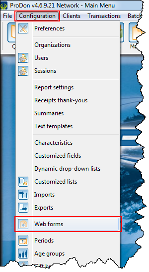
To do so, go to "Web form management".
|
Click on the "Configuration" menu, then select |
 |
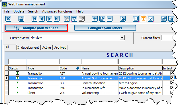 |
Configuration Tab
This tab allows you to customize the appearance of the home page, as well as a few options of the website. It is possible to choose the colours and writing fonts, to choose the colour of the background and margins, to add a logo and personalized notes, etc.
"Preview" Tab
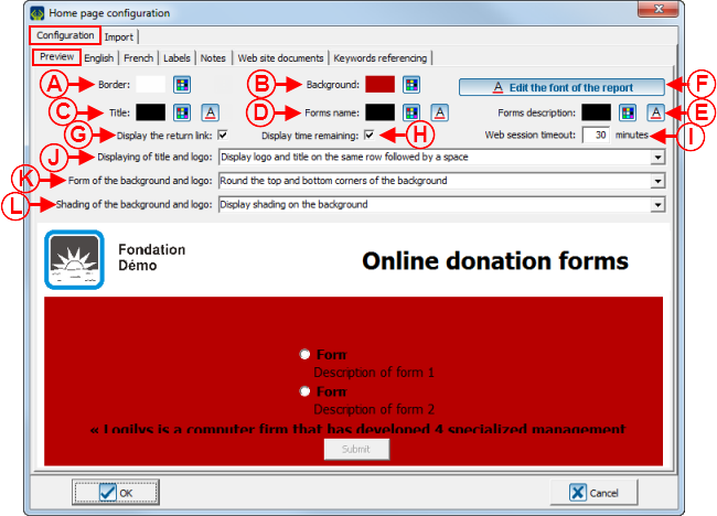
This tab allows you to customize the appearance of the home page, as well as a few general options of the Web forms.
|
After clicking on the | |
 | |
|
A: The |
B: The |
|
C: The |
D: The |
|
E: The |
F: The |
|
G: Displays a back link to the home page in the form. To view an example of back link to the home page, see point A of the "Web Form Example 1" section of the "Creating a Web Form" document. |
H: Displays the time remaining in the session at the bottom of the form. To view an example of time remaining in the session, see point A of the "Web Form Example 2" section of the "Creating a Web Form" document. NOTE: The session time is always limited. |
|
I: Determines the duration of the session. NOTE: Usually, the duration is set between 15 and 30 minutes to allow people to fill in the form rigorously. |
J: This drop-down menu allows you to choose the positioning of the title and logo on the home page. To view an example of title and logo positioning, see point F of the "Home page Example" section. It is also possible to insert a banner in the header of the Web form or of the home page rather than inserting a title and a logo. To do so, select the option "Display only the logo followed by a space" or "Display only the logo without a space". To view an example of banner, see point M of the "Web Form Example 3" section. NOTE: To learn how to modify the logo of the home page, see the "Web site documents" Tab" section. |
|
K: Allows to round the corners of the background. To view an example of background, see point B of the "Home Page Example" section. |
L: Allows you to add shading in the bottom right part of the background. To view an example of background, see point B of the "Home Page Example" section. |
"French" and "English" Tabs
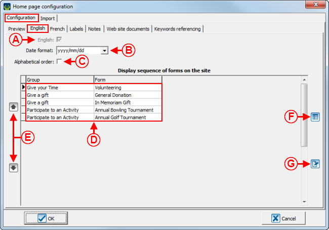
These tabs allow you to group forms.
NOTE: The "French" and "English" tabs are configured in the same way. The "English" tab allows you to configure English form groups and the "French" tab allows you to configure French form groups.
|
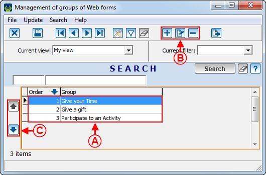
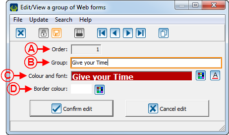
After clicking on the | |
 | |
|
A: This field indicates the order of the form on the home page. |
B: This field allows you to name the form group. |
|
C: The |
D: The |
"Labels" Tab
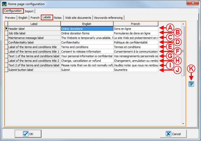
This tab allows you to modify different labels of the home page, the terms and conditions page and the website maintenance page.
 | |
|
A: To view an example of header label, see point I of the "Home Page Example" section. |
B: To view an example of title label, see point C of the "Home Page Example" section. |
|
C: To view an example of maintenance message label, see point A of the "Website Maintenance Page Example" section. |
D: To view an example of confidentiality label, see point J of the "Home Page Example" section. |
|
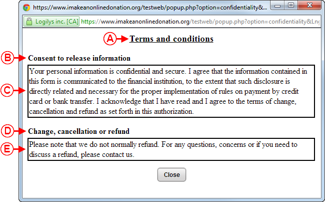
E: To view an example of terms and conditions title label, see point A of the "Terms and Conditions Page Example" section. |
F: To view an example of terms and conditions title 1 label, see point B of the "Terms and Conditions Page Example" section. |
|
G: To view an example of terms and conditions text 1 label, see point C of the "Terms and Conditions Page Example" section. |
H: To view an example of terms and conditions title 2 label, see point D of the "Terms and Conditions Page Example" section. |
|
I: To view an example of terms and conditions text 2 label, see point E of the "Terms and Conditions Page Example" section. |
J: To view an example of submit button label, see point K of the "Home Page Example" section. |
|
K: Allows you to modify labels. To do so, select the label to modify, then click on NOTE: It is also possible to modify labels by double-clicking on the label to modify. | |
"Notes" Tab
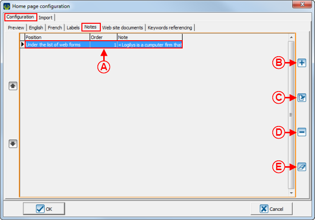
This tab allows you to add notes to the home page.
 | |
|
A: It is the list of notes that are on the home page. To view an example of note, see point L of the "Home Page Example" section. |
B: The |
|
C: The |
D: The |
|
E: The |
|
|
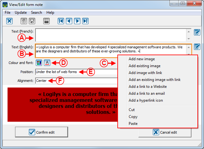
After clicking on the | |
 | |
|
A: Enter the French label of the note in this field. |
B: Enter the English label of the note in this field. |
|
C: This menu appears by right-clicking in the field at A or B. It allows you to insert images or hyperlinks in the note. It is also possible to type an html code directly in the field, if desired. CAUTION: However, Logilys does not offer technical support related to the use of html codes. |
D: The |
|
E: Choose, using the drop-down list, the positioning of the note on the home page. |
F: Choose, using the drop-down list, the alignment of the note on the home page. |
|
NOTE: To view an example of note, see point L of the "Home Page Example" section. | |
"Web site documents" Tab
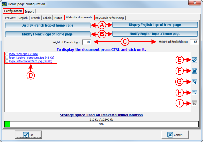
This tab allows you to add and view the logos and images that are found on the forms.
"Import" Tab
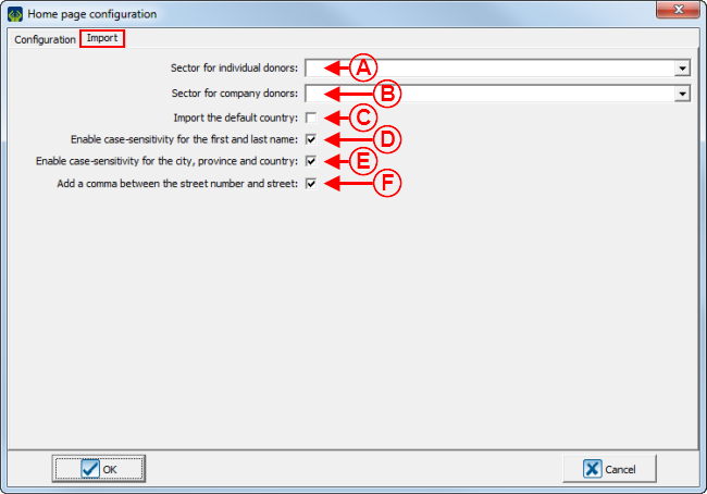
This tab allows you to configure the form of certain fields in order to have some sort of uniformity throughout the database.
 | |
|
A: This field allows you to associate the same sector to each individual who completes online forms. NOTE: When importing the donation, if a client already exists in the database and a sector is specified in the client file, his or her sector will be replaced with this one. |
B: This field allows you to associate the same sector to each company that completes online forms. NOTE: When importing the donation, if a client already exists in the database and a sector is specified in the client file, his or her sector will be replaced with this one. |
|
C: If this checkbox is checked, the country specified by the donor in the form will always be imported in the import. If the checkbox is unchecked, all the countries will be imported, except if the country specified is the default one in ProDon. For instance, if the checkbox in unchecked, and the default country in ProDon is Canada and the donor has specified that his or her country is Canada, the country will not be imported into the database.On the other hand, if the checkbox is unchecked, and the default country in ProDon is Canada and the donor has specified that his or her country is England, the country will be imported into the database. |
D: If this checkbox is checked, the format of the first and last names will be modified in the import so that only the first letter is capitalized. For instance, if a donor enters his or her name with capital letters only, ProDon will modify the form so that only the first letter is capitalized and that all the others are lowercase letters. CAUTION: ProDon recognizes hyphenated names, such as Mary-Ann, and will perform the import correctly by keeping the capital after the hyphen, however it does not recognize names such as McGregor, this would be imported as follows: Mcgregor. |
|
E: If this checkbox is checked, the formats of the city, the province and the country will be modified in the import so that only the first letter is capitalized. For instance, if a donor enters his or her city without capitalizing the first letter, ProDon modifies the form so that the first letter of the city name is a capital and the others are lowercase letters. |
F: If this checkbox is checked, a comma is inserted between the street number and the street name in the import (only applicable in French). |
Sending the Information to the Website
When modifications are made to the home page, you must send them to the IMakeAnOnlineDonation website.
IMakeAnOnlineDonation has two interfaces, a test one and a production one.
The test interface is only available through ProDon and is used to validate the modifications made to the website before making it public.
The production interface is accessible to all Internet users on the IMakeAnOnlineDonation website.
Sending the Home Page in Test
|
To send the configurations of the home page in test, click on the |

|
Sending the Home Page in Production
Viewing the Test Home Page
|
To display the test home page, click on the |

|
Viewing the Production Home Page
|
To display the production home page, click on the |

|
Home page and Website Configuration Examples
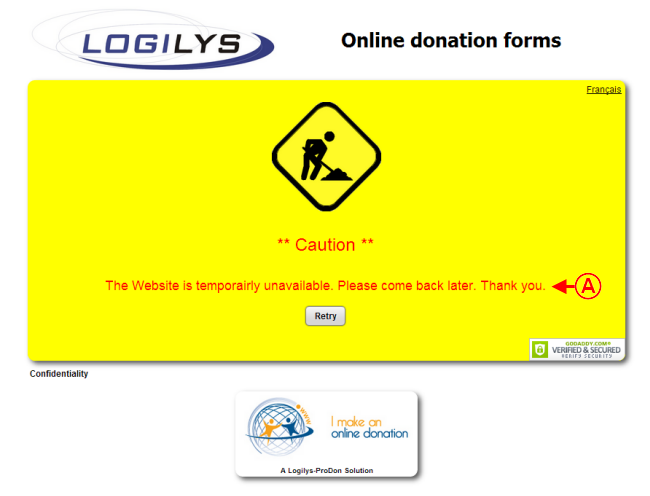
Website Maintenance Page Example
|
This page appears when the website is in maintenance. |
 |
|
A: Maintenance message label. |
Home Page Example
 | |
|
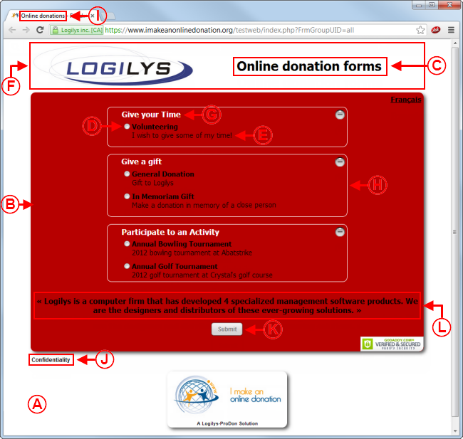
A: The margin is situated around the background. In this example, the margin is white. |
B: In this example, the background is red, has rounded corners and shading. |
|
C: The title is situated above the form list, in the top margin. |
D: The name of the form is situated below the form group to which it was assigned. |
|
E: The description of the form is just below the form name. |
F: The logo and the title are always situated in the top margin. In this example, the logo and the title have been placed on the same line. |
|
G: The names of the form groups are situated on the background, below the logo and the title. |
H: In this example, the borders around the form groups are white. |
|
I: Header label. This label is the one that will be used on the Web navigator tab. |
J: Confidentiality label. This link leads to the terms and conditions page. |
|
K: Submit button label. |
L: Example of note. In this example, the note is positioned below the form list and aligned in the centre. |
Terms and Conditions Page Example
Document name: ProDon:Home Page and Website Configuration
Version : 4.6.9.6
