|
|
| Line 1,138: |
Line 1,138: |
| | === "Display" Tab<br> === | | === "Display" Tab<br> === |
| | | | |
| − | Cet onglet permet de personnaliser l'apparence du formulaire.
| + | This tab allows you to customize the appearance of the form.. |
| | | | |
| | ==== "Options" Tab ==== | | ==== "Options" Tab ==== |
| Line 1,144: |
Line 1,144: |
| | {| width="200" cellspacing="1" cellpadding="1" border="1" class="wikitable" | | {| width="200" cellspacing="1" cellpadding="1" border="1" class="wikitable" |
| | |- | | |- |
| − | | colspan="2" | [[Image:Creating_a_Web_Form_029.png]] | + | | colspan="2" | [[Image:Creating a Web Form 029.png]] |
| | |- | | |- |
| | | width="50%" | | | | width="50%" | |
| Line 1,207: |
Line 1,207: |
| | |} | | |} |
| | | | |
| − | <br> | + | <br> |
| | | | |
| | ===== "Label" Tab ===== | | ===== "Label" Tab ===== |
| Line 1,213: |
Line 1,213: |
| | {| width="200" cellspacing="1" cellpadding="1" border="1" class="wikitable" | | {| width="200" cellspacing="1" cellpadding="1" border="1" class="wikitable" |
| | |- | | |- |
| − | | colspan="2" | [[Image:ProDon Création formulaire Web 031.png]][[Image:Creating_a_Web_Form_031.png]]<br> | + | | colspan="2" | [[Image:ProDon Création formulaire Web 031.png]][[Image:Creating a Web Form 031.png]]<br> |
| | |- | | |- |
| | | width="50%" | | | | width="50%" | |
| Line 1,236: |
Line 1,236: |
| | {| width="200" cellspacing="1" cellpadding="1" border="1" class="wikitable" | | {| width="200" cellspacing="1" cellpadding="1" border="1" class="wikitable" |
| | |- | | |- |
| − | | colspan="2" | [[Image:Creating_a_Web_Form_032.png]] | + | | colspan="2" | [[Image:Creating a Web Form 032.png]] |
| | |- | | |- |
| | | width="50%" | | | | width="50%" | |
Revision as of 16:24, 23 July 2013
Template:Header ProDon
Introduction
The Online Donations Module allows the donors to make donations directly through the Web.
In order for the donors to be able to make donations, a website must first be created and configured. The creation of online donations website includes the configuration of the home page and the website, as well as the creation of different Web forms. Each Web form is attached to a donation occasion, this ensures that Internet users are able to register online to the fundraising activities of the organization, or make a donation directly online.
Moreover, when an Internet user make a donation or register to an activity through a Web form, ProDon automatically adds him or her to the database when importing the donations.
Creating a Web Form
If it is not already done, it is better to configure the home page and the website prior to creating Web forms.
To learn how to configure the home page and the website, consult this procedure.
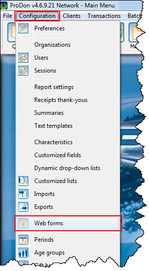
To create a Web form, go to "Web form management".
|
To do so, click on the "Configuration" menu, then select " Web forms". Web forms".
|

|
|
After clicking on " Web forms", this window opens. Web forms", this window opens.
|

|
|
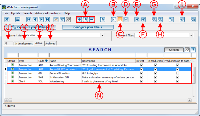
A: The  , ,  and and  buttons allow you to add, modify or delete a form, select the right form at N. To modify or delete a form, select the right form at N, then click on buttons allow you to add, modify or delete a form, select the right form at N. To modify or delete a form, select the right form at N, then click on  or on or on  . .
NOTE: It is highly inadvisable to delete a form, it is better to archive it. View point D to learn how to archive a Web form.
|
B: If the  button is orange, this means that the form selected at N is "In development". A form that is "In development" is being created and cannot be viewed on the test website or on the production website. When creating a form, it is "In develpoment" by default. To view the list of forms "In development", go to the tab at K. button is orange, this means that the form selected at N is "In development". A form that is "In development" is being created and cannot be viewed on the test website or on the production website. When creating a form, it is "In develpoment" by default. To view the list of forms "In development", go to the tab at K.
|
|
C: If the  button is orange, this means that the form selected at N is "In test" or "In production". A form "In test" means that the form is almost completely created and can be viewed on a website provided for this purpose for internal testing. Once there is no more correction necessary, the form has to become "In production", in order to make it accessible to all Internet users. To voew the list of form "In test" or "In production", go to the "Active" tab, at L. button is orange, this means that the form selected at N is "In test" or "In production". A form "In test" means that the form is almost completely created and can be viewed on a website provided for this purpose for internal testing. Once there is no more correction necessary, the form has to become "In production", in order to make it accessible to all Internet users. To voew the list of form "In test" or "In production", go to the "Active" tab, at L.
NOTE: See points E, F, G and H to learn how to publish a form in test or in production.
|
D: If the  button is orange, this means that the form selected at N is "Archived". An "Archived" form is an inactive form, which means that this form is not used for the moment or will no longer be used. To archive a form, select the form to archive at N, then click on the button is orange, this means that the form selected at N is "Archived". An "Archived" form is an inactive form, which means that this form is not used for the moment or will no longer be used. To archive a form, select the form to archive at N, then click on the  button. To view the list of archived forms, go to the tab at M. button. To view the list of archived forms, go to the tab at M.
|
|
E: The  button allows you to publish the form selected at N on the test website, i order to view and test it before putting it online. button allows you to publish the form selected at N on the test website, i order to view and test it before putting it online.
NOTE: After clicking on this button, 3 options become available, select the appropriate option.
CAUTION: You must publish the form on the test website each time edits are made.
|
F: The  button allows you to publish the form selected at N. button allows you to publish the form selected at N.
NOTE: After clicking on this button, 3 options become available, select the appropriate option.
CAUTION: You must publish the form on the test website AND on the production website each time that edits are made.
CAUTION: If the  button is not activated during the modification, ProDon will demand that you activate it before making the modifications. For more information concerning maintenance, see point I. button is not activated during the modification, ProDon will demand that you activate it before making the modifications. For more information concerning maintenance, see point I.
|
|
G: The  button allows you to view the home page of the forms or theform selected at N on the test website. A test form can be viewed on a website provided for the purpose of internal testing. button allows you to view the home page of the forms or theform selected at N on the test website. A test form can be viewed on a website provided for the purpose of internal testing.
NOTE: After clicking on this button, 3 options become available, select the appropriate option.
CAUTION: So that the last modifications become visible on the form, you have to publish it on the test website before viweing it. To learn how to publish a form in test, see point E.
|
H: The  button allows you to view the home page of the forms or the form selected at N on the production website. The forms published on the production website are visible and can be completed by any Internet users. button allows you to view the home page of the forms or the form selected at N on the production website. The forms published on the production website are visible and can be completed by any Internet users.
NOTE: After clicking on this button, 3 options become available, select the appropriate option.
CAUTION: So that the last modifications become visible on the form, you have to publish it on the test website AND on the production website before viewing it. To learn how to publish a form in production, see point F.
|
|
I: If the  button is orange, this means that the website is in maintenance. To view an example of website in maintenance, click here. button is orange, this means that the website is in maintenance. To view an example of website in maintenance, click here.
NOTE: It is required to activate the maintenance button to be able to send a form or the modificatiosn made to the home page on the production website.
CAUTION: When the wbsite is in maintenance, none of the forms can be completed by Internet users and nobody can view the home page. Therefore, it is important to deactivate the maintenance after sending the form or the home page on the production website.
|
J: The "All" tab contains all types of forms ("In development" forms, "In test" forms, "In production" forms and archived forms) available in the "Form management".
|
|
K: The "In development" tab contains only the forms that are being created; that is, the forms that have not yet been published on the test website nor on the production website. For more information concerning forms "In development, see point B.
|
L: The "Active" tab contains only the forms that have been published on the teste website or on the production website. For more information concerning Forms "In test" or "In production", see point C.
|
|
M: The "Archived" tab contains the forms that have been deactivated; that is, the form is not used for the moment or might never be used again. For more information concerning archived forms, see point D.
|
N: It is the list of forms available in the selected tab.
|
|
After clicking on the  button or on the button or on the  button, this window opens. button, this window opens.
|

|
|
A: It is the form code.
NOTE: It is important to give a precise code so that the search becomes more effective.
|
B: Allows you to determine whether the form should be created in French only, English only, or in both languages.
|
|
C: These are the French and English names of the form. To view an example of name, see point D of the "Home Page Example" section of the "Home Page and Website Configuration" document.
NOTE: It is important to give a precise name so that the search becomes more effective.
CAUTION: If the "English" checkbox at B is deactivated, the field for the English name is not available.
|
D: These are the French and English descriptions of the form. To view an example of description, see point E of the "home Page Example" section of the "Home Page and Website Configuration" document.
CAUTION: If the "English" checkbox at B is deactivated, the field for the English description is not available.
|
"Form Options" Tab
This tab allows you to configure the general appearance of the form.

|
|
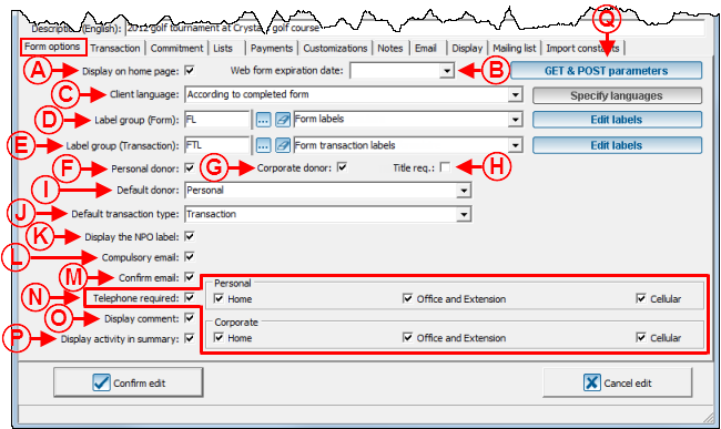
A: The "Display on the home page" checkbox allows you to display or not the form on the home page.
|
B: The "Expiration date of the form" field allows you to specify an expiration date for the form. This field is used mostly for a registration form for an event, when there is a deadline to register. From the expiration date , a message saying that the form is expired will be displayed when opening ProDon.
CAUTION: Even if an expiration date is specified, you will ahve to manually deactivate the form on the day of the expiration date. If the form is not manually deactivated, it will remain available for Internet users.
|
|
C: When the option "According to the filled out form" is selected, if the client fills out the form in English, he or she will be added as an English speaker in ProDon during the import.
If the option "Ask the client" is selected , you will have to specify the languages by clicking on the  button, then a field allowing you choose the language will be added to the form. For instance, if the donor fills out the English form, but he or she specifies that his or her language is French, he or she will be added as a French speaker in ProDon during the import. To view an example of field allowing you to choose the language, see point H of the "Web Form Example1" section. button, then a field allowing you choose the language will be added to the form. For instance, if the donor fills out the English form, but he or she specifies that his or her language is French, he or she will be added as a French speaker in ProDon during the import. To view an example of field allowing you to choose the language, see point H of the "Web Form Example1" section.
|
D: The  button allows you to modify the names of all the fields of the form, except for the "Transaction" section. It is possible to create groups of labels in order to reuse them in all the forms. For more information concerning label groups, see this document. button allows you to modify the names of all the fields of the form, except for the "Transaction" section. It is possible to create groups of labels in order to reuse them in all the forms. For more information concerning label groups, see this document.
|
|
E: The  button allows you to modify the names of the fields in the "Transaction" section of the form. It is possible to create label groups in order to be able to resuse them in all the forms. To learn more about labels, consult this document. button allows you to modify the names of the fields in the "Transaction" section of the form. It is possible to create label groups in order to be able to resuse them in all the forms. To learn more about labels, consult this document.
|
F: The "Personal donor" checkbox allows individuals to make donations.
NOTE: Check the checkbox at G to enable companies to make donations.
|
|
G: The "Corporate donor" checkbox allows companies to make donations.
NOTE: Check the checkbox at F to enable individuals to make donations.
|
H: The "Job title required" checkbox requires the donor to enter his or her job title, if he or she is a corporate donor.
|
|
I: Choose among the options in the drop-down menu. By selecting the "Personal" option, the "Personal" type of donor will appear by default on the form. By selecting the "Corporate" option, the "Corporate" type of donor will appear by default on the form. By selecting the "ask before form entry" option, a window opens prior to the opening of the form, asking you to choose either options. By selecting "None", the "Donor type" section will blink when opening the form, until a donor type is specified.
|
J: Decide whether the default transaction is a regular transaction or a commitment transaction. In order for the two options to be available, you must activate them in the "Transaction" and "Commitment" tabs.
NOTE: It is possible to create a form with only transactions, only commitments or a form allowing both transactions and commitments.
CAUTION: To be able to activate commitments in a Web form, the "Prospecting and Commitments" module must be activated in ProDon.
|
|
K: If this checkbox is checked, the registration number of the organization will appear at the bottom of the form. To view an example of NPO label, see point E of the "Web Form Example 2" section.
|
L: If this checkbox is checked, the donor is required to specify his or her email address in the form.
|
|
M: If this checkbox is checked, the donor is required to enter hie or her email address a second time.
|
N: When the "Phone number required" checkbox is checked, you can also decide if you want to require the phone number. For instance, the checkboxes "Home", "Office and extension" and "Mobile" are checked plus the "Phone number required" option, the donor will have to enter at least one of the three, but will be able to choose which one he or she wants to give. On the other hand, if the "Home" and "Phone number required" are checked, the donor will have to his or her home phone number and will be able to enter others if he or she wishes to.
NOTE: The "Personal" section allows you to choose which number individuals will have to provide and the "Corporate" section allows you to choose which number companies will have to provide. For instance, if in the "Corporate" section, only the "Office and extension" checkbox is checked, companies will be required to enter an office phone number to make transactions.
|
|
O: If the "Display the comment" checkbox is checked, a "Comment" field will appear at the bottom of the form. To view an example of "Comment" field, see point F of the "Web Form Example 2" section.
|
P: If this checkbox is checked, the activity for which the donor has made a donation will be displayed in the payment confirmation.
NOTE: If the payment information is displayed in a table, this option is unavailable.
|
|
Q: By clicking on this button, the following window opens.
|
|
|
After clicking on the  button, this window opens. button, this window opens.
|

|
|
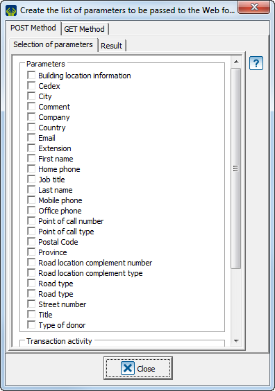
Changing for the parameter mode, allows you to send prefilled information to a Web form from another Web platform or from an HTML email.
This is an advanced feature is meant for Web developers who wish to change parameters with the GET or POST method.
Logilys does not offer training nor direct support on the usage, except to Web programmers who already have the reuired qualifications to handle this function.
NOTE: To learn more about the GET and POST parameters of the Web forms, consult this document.
|
|
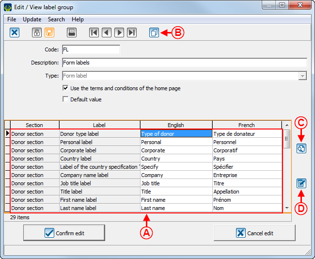
After clicking on the  button, this window opens. button, this window opens.
|

|
|
A: It is the list of the form labels.
|
B: By clicking on the  button, it is possible to duplicate anoter label group. For more information concerning label groups, consult this document. button, it is possible to duplicate anoter label group. For more information concerning label groups, consult this document.
|
|
C: The  button displays the search bar. button displays the search bar.
|
D: The  button allows you to modify a label in the list at A. To do so, select the label to modify at A, then click on the button allows you to modify a label in the list at A. To do so, select the label to modify at A, then click on the  button. button.
|
"Transaction" Tab
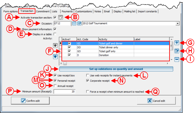
This tab allows you to configure the "Transaction" section of the form.

|
|
A: If this checkbox has been activated, the "Transaction" section will be available on the form.
|
B: The  button allows you to duplicate transactional information from another form. button allows you to duplicate transactional information from another form.
|
|
C: Select the donation occasion for which the transactions will be made.
|
D: This checkbox displays or not the payment information on the form. If this checkbox is unchecked, it is possible to make $0 transactions. For instance, it is possible to create a form to register to a free event, make a scholarship request or for financing. During the import, a $0 pending transaction will be then imported in ProDon.
NOTE: It is required to use a "Pending" payment method.
|
|
E: This checkbox displays the payment information in a chart, see point B of the "Web Form Example 2" section. To view an example of payment that is not in the chart, see point B of the "Web Form Example 1" section.
NOTE: Donors can select more than one activity only if the payment information is displayed in a chart.
|
F: These are the activities for which the donor can make a donation or register. To add, modify or delete activities, see points G, H and I.
|
|
G: The  button allows you to add activities at F. button allows you to add activities at F.
NOTE: The activity must have previously been created in the "Donation occasion management".
|
H: The  button allows you to modify an activity in the list at F. To modify an activity, select the activity to modify, then click on the button allows you to modify an activity in the list at F. To modify an activity, select the activity to modify, then click on the  button. button.
|
|
I: The  button allows you to delete an activity at F. To delete an activity, select the activity to delete, then click on the button allows you to delete an activity at F. To delete an activity, select the activity to delete, then click on the  button. button.
NOTE: If an activity is deleted from here, it will only be removed from the formand will always exist in the "Donation occasion management".
|
J: This button allows you to determine a minimum and maximum amount or quantity for donations. The minimum and maximum determined here will be applied to all the activities of the form.
NOTE: It is also possible to set a different minimum or maximum amount or quantity for each activity.
|
|
K: When the "Use the receipt checkbox" checkbox is checked, the donor has the choice to get or not a receipt. Moreover, the checkbox is always checked by default, except if a minimum amount is specified at P and that the amount of the donation is less than the minimum amount. To view an example of receipt checkbox, see point D of the "Web Form Example 2" section.
NOTE: It is highly recommended to always check this checkbox so that all the donors can receive a receipt if they wish to.
CAUTION: If the activity for which the form is assigned is configured not to issue receipts, the checkbox will not appear on the form, even if the one above is checked.
|
L: When an Internet user makes an instant payment, that he or she wants to get receipt and that this checkbox is checked, a link allowing you to print its receipt will be added to the payment confirmation email, which keeps the organization from issuing the receipt, since the donor would have already received it in an email.
|
|
M: The "Personal receipt" checkbox allows you to issue receipts to individuals. For instance, if the "Personal receipt" checkbox is not checked, none of the individuals will receive receipts, even if the checkbox at K is checked. However, if the "Personal receipt" checkbox is checked and that the checkbox at K is checked, individuals will have the choice to get a receipt or not.
NOTE: To enable the issuance of receipts to companies, see point N.
|
N: The "Corporate receipt" checkbox allows you to issue receipts to companies. For instance, if the "Corporate receipt" checkbox is not checked, none of the companies will get a receipt, even if the checkbox at K is checked. However, is the "Corporate receipt" checkbox and the checkbox at K are checked, companies will have the choice to get or a receipt or not.
NOTE: To enable the issuance of receipts to individuals, see point M.
|
|
O: If this checkbox is checked, only one receipt will be issued annually. For more details concerning the issuance of annual receipts, see the "Processing of Receipts to be Issued" procedure.
|
P: This field allows you to determine a minimum amount to issue a defalut receipt. For instance, if an amount of $20.00 is entered in this field and that a donation of $15.00 is made, the checkbox at K will not be checked by default on the form. However, if the checkbox at K has not been checked in the window above and that the amount of the donation is lower than the minimum amount, the client will not be able to get the receipt, even if he or she wishes to get one.
|
|
Q: This checkbox allows you to issue receipts for all the donations for which the amount is higher than the minimum amount. If this checkbox is checked and that the one at K is not checked, clients will not have the choice to get or not the receipt (donations for which the amount is less than the minimum amountwill not get receipts and the donations for which the amount is more then the minimum amount will get a receipt). If this checkbox is checked and that the one at K is also checked, donors who have given less than the minimum amount will have the choice to get a recipt or not, and donors who had given more than the minimum amount will get a receipt.
|
|
|
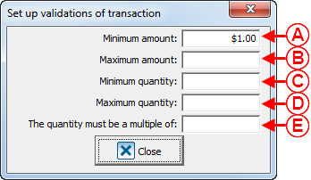
After clicking on the "Configure validations on quantity and amount" button, this window opens.
|

|
|
A: Allows you to enter a minimum amount a donor can give.
|
B: Allows you to enter a maximum amount a donor can give.
|
|
C: Allows you to enter a minimum number of tickets a donor can buy.
|
D: Allows you to enter a maximum number of tickets a donor can buy.
|
|
E: This field allows you to sell tickets in multiples. For instance, if you enter 2 in the box, donors will be able to buy even numbers of tickets.
|
|
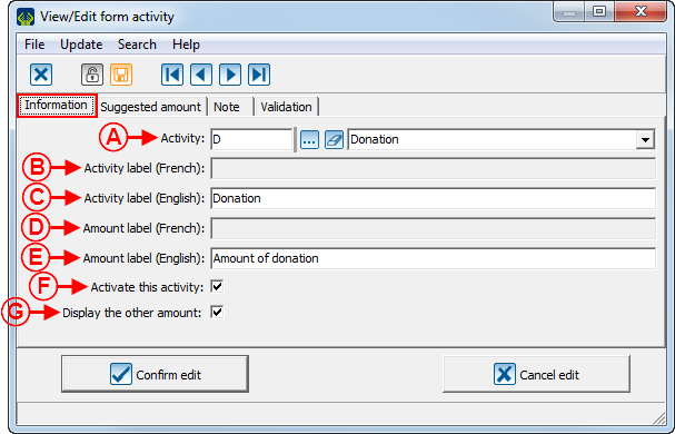
After clicking on the  button or the button or the  button, this window opens. button, this window opens.
|

|
|
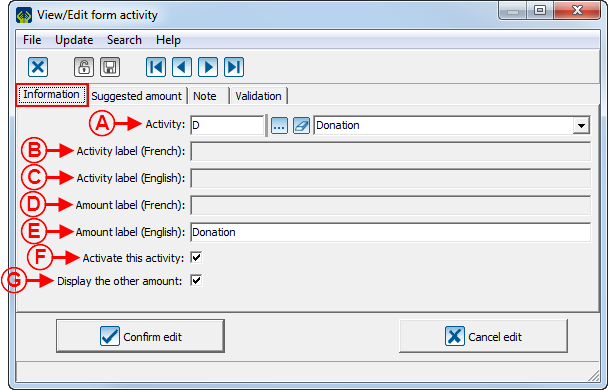
A: The drop-down list allows you to choose the activity that has to be modified or added.
NOTE: The activity must have previously been created in the "Donation occasion management".
|
B: This field allows you to give a French label to an activity.
|
|
C: This field allows you to give an English label to an activity.
|
D: This field allows you to create a French label for the number of tickets sold or the amount of the donation.
|
|
E: This field allows you to create an English label for the number of tickets sold or the amount of the donation.
|
F: This checkbox alows you to display the activity selected at A on the form.
|
|
G: This option displays an "Other amount" field on the form when there are suggested amounts. To view an example of "Other amount" field, see point C of the "Web Form Example 1" section.
|

|
|
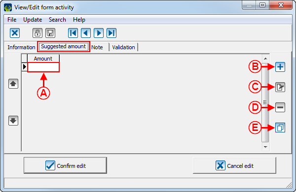
A: To suggest donation amounts on the form, enter them here. To view an example of a form with suggested amounts, see point D of the "Web Form Example 1" section.
|
B: The  button allows you to add suggested amounts to the list at A. button allows you to add suggested amounts to the list at A.
|
|
C: The  button allows you to modify an amount in the list at A. To do so, select the amount to modify at A, then click on the button allows you to modify an amount in the list at A. To do so, select the amount to modify at A, then click on the  button. button.
|
D: The  button allows you to remove an amount from the list at A. To do so, select the amount to remove at A, then click on the button allows you to remove an amount from the list at A. To do so, select the amount to remove at A, then click on the  button. button.
|
|
E: The  allows you to duplicate the suggested amounts from another activity of the form to enter them at dupliquer les montants A. allows you to duplicate the suggested amounts from another activity of the form to enter them at dupliquer les montants A.
|

|
|
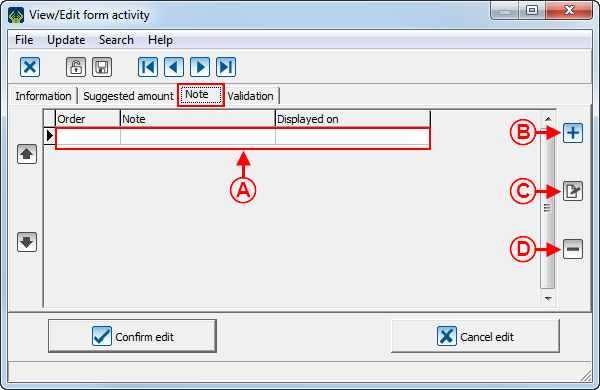
A: These are the notes that will be displayed under the activity on the form. To view an example of note below an activity in a chart, see point C of the "Web Form Example 2" section. To view an example of note that is not below a chart, see point E of the "Web Form Example 1". section.
|
B: The  button allows you to add a note to the list at A. button allows you to add a note to the list at A.
NOTE: To learn how to configure the "Add note to the form" window, see this section.
|
|
C: The  button allows you to modify the notes at A. To do so, select the note to modify at A, then click on the button allows you to modify the notes at A. To do so, select the note to modify at A, then click on the  button. button.
|
D: The  button allows you to delete a note at A. To do so, select the note to delete at A, then click on the button allows you to delete a note at A. To do so, select the note to delete at A, then click on the  button. button.
|

|
|
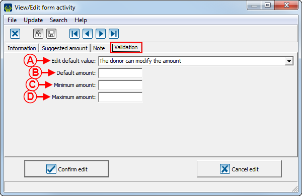
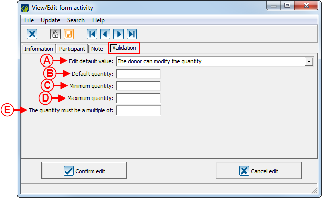
A: This field allows you to choose the value entered at B is fixed or it can be modified by the donor. If the option chosen here is "The donor cannot modify the amount", the value entered at B will be entered by default when opening the form and the donor will not be able to modify it. However, if the option chosen here is "The donor may modify the amount", the value entered at B will be entered by default when opening the form, and the donor will be able to modify it.
|
B: This field allows you to specify a default amount or quantity. This amount will be displayed by default when opening the form.
NOTE: When the activity is an event and that it is a ticket sale, this field will be named "Default quantity". In this case, it is possible to specify a quantity that will be displayed by default when opening the form.
|
|
C: This field allows you to assign a minimum amount or quantity to make a transaction through the form.
NOTE: When the activity is an event and that it is a ticket sale, the field will be named "Minimum quntity".
|
D: This field allows you to assign a maximum amount or quantity to make a transaction through a form.
NOTE: When the activity is an event and that it is a ticket sale, the field will be named "Maximum quantity".
|
|
E: This field allows you to sell tickets in multiples. For instance, donors will only be able to buy even numbers of tickets.
NOTE: This field is visible only if the activity is an event and that it is a ticket sale.
|
"Commitment" Tab
Allows you to configure the "Commitment" section of a Web form.
"Donation occasion and activities" Tab

|
|
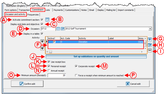
A: If this checkbox is activated, the "Commitment" section will become available in the form.
The  button allows you to duplicate commitment information from another form. button allows you to duplicate commitment information from another form.
|
B: The  button allows you to duplicate transactional information from another form. button allows you to duplicate transactional information from another form.
|
|
C: If this checkbox is checked, the end date and the objective will be specified in the form. To view an example of commitment with an end date and an objective, see point F of the "Web Form Example 1" section.
|
D: Select the donation occasion for which the commitments will be made.
|
|
E: This checkbox displays the commitments in a chart. To view an example of payment information in a chart, see point B of the "Web Form Example 2" section. To view an example of payment information that is not in a chart, see point B of the "Web Form Example 1" section.
NOTE: Donors will be able to select more than one activity only if the payment information is displayed in the table.
|
F: These are the activities for which the donor may commit to donating. To add, modify or delete activities, see points G, H and I.
|
|
G: The  button allows you to add activities at F. button allows you to add activities at F.
NOTE: The activity must have previously been created in the "Donation occasion management".
|
H: The  button allows you to modify an activity in the list at F. To do so, select the activity to modify, then click on the button allows you to modify an activity in the list at F. To do so, select the activity to modify, then click on the  button. button.
|
|
I: The  button allows you to remove an activity from the list at F. To do so, select the activity to remove, then click on the button allows you to remove an activity from the list at F. To do so, select the activity to remove, then click on the  button. button.
NOTE: If an activity is deleted from here, it will only be removed from the form and will always exist in the "Donation occasion management".
|
J: This button allows you to determine a minimum and a maximum amount per instalment. The minimum or maximum determined here will be applied to all the activities of the form.
NOTE: It is also possible to assign a different minimum and maximum amount for each activity.
|
|
K: When the "Use the receipt box" checkbox is checked, the donor has the choice to get or not a receipt. Moreover, this checkbox is always checked by default in the form, except when a minimum amount is specified at O and that the amount of the donation is lower than the minimum amount. To view an example of receipt, see point D of the "Web Form Example 2" section
NOTE: It is also possible to assign a different minimum and maximum amount or quantity for each activity.
|
L: The "Personal receipt" allows you to issue receipts to individuals. For instance, if the "Personal receipt" checkbox is not checked, none of the individuals will get a receipt, even if the checkbox at K is checked. However, if the "Personal receipt" checkbox is checked and that the checkbox at K is checked, individuals will have the choice to get or not a receipt.
NOTE: To enable the issuance of receipts to companies, see point M.
|
|
M: The "Corporate receipt" checkbox allows you to issue a receipt to companies. For instance, if the "Corporate receipt" checkbox is not checked, none of the companies will get receipts, even if the checkbox at K is checked. However, if the "Corporate receipt" checkbox is checked and that the checkbox at K is checked, companies will have the choice to get or not receipts.
NOTE: To enable the issuance of receipts to individuals, see point L.
|
N: If this checkbox is checked, only one receipt will be issued annually. To learn more about annual receipts, see the "Processing of Receipts to be Issued" procedure.
|
|
O: This field allows you to determine a minimum amount for the issuance of a receipt by default. For instance, if an amount of $20.00 is entered in this field and that a $15.00 donation is made, the checkbox atK will not be checked by default in the form. However, if the checkbox at K was not checked in the window above and that the amount of the donation is lower than the minimum amount, the client will not get a receipt, even if he or she wishes to get one.
|
P: This checkbox allows you to issue receipts for all donations for which the amount is higher than the minimum amount. If this checkbox is checked and that the checkbox at K is not checked, clients will not have the choice to get or not a receipt (donations for which the amount is lower than the minimum amount will not get receipts and the donations for which the amount is higher than the minimum amount will get receipts). If this checkbox is checked and that the checkbox at K is also checked, donors who will have given less than the minimum amount will have the choice to get or not receipts, and donors who will have given more than the minimum amount will get receipts.
|
|
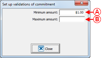
After clicking on the "Set up validation on quantity and amount" button, this window opens.
|
|

|
|
A: Allows you to enter a minimum amount the donor can donate.
|
B: Allows you to enter a maximum amount the donor can donate.
|
|
After clicking on the  button or the button or the  button, this window opens. button, this window opens.
|

|
|
A: The drop-down list allows you to select the activity to add or to modify.
NOTE: The activity must have previously been created in the "Donation occasion management".
|
B: This field allows you to assigne a French label to the activity.
|
|
C: This field allows you to assign an English label to the activity.
|
D: This field allows you to create a French label for the amount of the donation.
|
|
E: This field allows you to create an English label for the amount of the donation.
|
F: This checkbox displays in the form, the activity selected at A.
|
|
G: This option displays the "Other amount" field in the form when there are suggested amounts. To vies an example "Other amount" field, see point C of the "Web Form Example 1" section.
|

|
|
A: To suggest donation amounts in the form, enter them here. To view an example of form with suggested amounts, see point D of the "Web Form Example 1" section.
|
B: The  button allows you to add suggested amounts to the list at A. button allows you to add suggested amounts to the list at A.
|
|
C: The  button allows you to modify an amount in the list at A. To do so, select the amount to modify at A, then click on the button allows you to modify an amount in the list at A. To do so, select the amount to modify at A, then click on the  button. button.
|
D: The  button allows you to remove an amount from the list at A. To do so, select the amount to delete at A, then click on the button allows you to remove an amount from the list at A. To do so, select the amount to delete at A, then click on the  button. button.
|
|
E: The  button allows you to duplicate the suggested amounts of another activity of the form to enter them at A. button allows you to duplicate the suggested amounts of another activity of the form to enter them at A.
|

|
|
A: These are the notes that will be displayed below the activity in the form. To view an example of note below an activity in a table, seepoint C of the "Web Form Example 2" section. To view an example of note below an activity that is not in a table, see point E of the "Web Form Example 1" section.
|
B: The  button allows you to add a note to the list at A. button allows you to add a note to the list at A.
NOTE: To learn how to configure the "Add form note" window, see this section.
|
|
C: The  button allows you to modify the notes at A. To do so, select the note to modify at A, then click on the button allows you to modify the notes at A. To do so, select the note to modify at A, then click on the  button. button.
|
D: The  button allows you to delete a note at A. To do so, select the note to delete at A, then click on the button allows you to delete a note at A. To do so, select the note to delete at A, then click on the  button. button.
|
File:ProDon Création formulaire Web 019.png
|
|
A: This field allows you to decide if the value entered at B is fixed or if it may be modified by the donor. If the option selected here is "The donor cannot modify the amount", the value entered at B will be entered by default when opening the form and the donor will not be able to modify it. However, if the option selected here is "The donor can modify the amount", the value entered at B will be entered by default when opening the form, but it may be modified by the donor.
|
B: This field allows you to specify a default amount. This amount will be displayed by default wneh opening the form.
|
|
C: This field allows you to assign a minimum amount to make a transaction via the form.
|
D: This field allows you to assign a maximum to make a transaction via the form.
|
"Frequencies" Tab

|
|
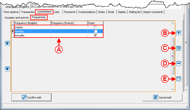
A: These are the frequencies that the donor can choose for his or her commitment.
|
B: The  button allows you to add frequencies to the list at A. button allows you to add frequencies to the list at A.
|
|
C: The  button allows you to modify the frequencies in the list at A. To do so, select the frequency to modify at A, then click on the button allows you to modify the frequencies in the list at A. To do so, select the frequency to modify at A, then click on the  button. button.
|
D: The  button allows you to delete a frequency from the list at A. To do so, select the frequency to delete at A, then click on the button allows you to delete a frequency from the list at A. To do so, select the frequency to delete at A, then click on the  button. button.
|
|
E: The  button allows you to duplicate the frequencies from another activity in the form. button allows you to duplicate the frequencies from another activity in the form.
|
|
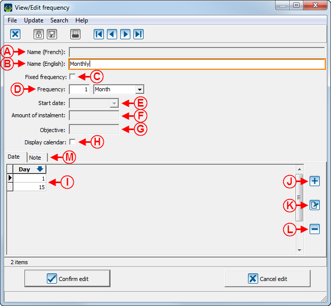
After clicking on the  button or the button or the  button, this window opens. button, this window opens.
|

|
|
A: Allows you to give a French name to the frequency.
|
B: Allows you to give an English name to the frequency.
|
|
C: If this checkbox is checked, the frequency (at D), the start date (at E), teh amount of the instalment (atF) and the objective (at G) will be entered by default when opening the form and will not be modifiable.
|
D: Allows you to determine the frequency. In this example, a payment must be made once a month.
|
|
E: Allows you to determine the date of the first payment.
NOTE: This field is available only if the checkbox at C is checked. Otherwise, the donor can start his or her commitment on the date of his or her choice or will have to choose dates suggested at I.
|
F: Allows you to specify the amount of the instalments.
NOTE: This field is available only if the checkbox at C is checked. Otherwise, the donor can choose the amount that he or she wants.
|
|
G: Allows you to specify the amount of the objective.
NOTE: This field is available only if the checkbox at C is checked. Otherwise, the donor can choose the amount that he or she wants.
|
H: If this checkbox is checked, a calendar will be available on the form, next to the field at E to select the desired start date.
|
|
I: Allows you to specify choices for the field at E. In this example, the donor will start his or her commitment only on the 1st day of the month and on the 15th day of the month.
|
J: The  button allows you to add a new choice of day at I. button allows you to add a new choice of day at I.
|
|
K: The  button allows you to modify the choices of day at I. To do so, select the day to modify at I, then click on the button allows you to modify the choices of day at I. To do so, select the day to modify at I, then click on the  button. button.
|
L: The  button allows you to delete the day choices at I. To do so, select the day to delete at I, then click on the button allows you to delete the day choices at I. To do so, select the day to delete at I, then click on the  button. button.
|
|
M: The "Note" tab allows you to add a note below the frequency when it is chosen in the form. To view an example of note below the frequency, see point G of the "Web Form Example 1" section.
NOTE: To learn how to configure the "Add note to the form" window, see this section.
|
"Lists" Tab
This tab allows you to configure the lists of predefined choices of the form.

|
|
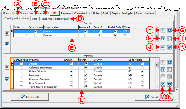
A: The "Country and provinces" tab allows you to modify the country and province selections that are available when a donor makes a donation.
|
B: The "Titles" tab allows you to modify the title options that will be available when a donor completes the form.
|
|
C: The "Road type" tab allows you to modify the road type options (e.g. street, avenue, place, etc.) that will be available when a donor completes the form.
|
D: The "Point of call" tab allows you to modify the point of call options (e.g. appartment, room, suite, etc.) that will be available when a donor completes the form.
|
|
E: This is the list of countries the donor can choose from when he or she completes the form.
|
F: The  button allows you to a coubtry to the list at E. button allows you to a coubtry to the list at E.
|
|
G: The  button allows you to add to the list at E all the existing conutries in ProDon. button allows you to add to the list at E all the existing conutries in ProDon.
|
H: The  button allows you to modify a country of the list at E. To do so, select the country to modify, then click on the button allows you to modify a country of the list at E. To do so, select the country to modify, then click on the  button. button.
|
|
I: The  button allows you to duplicate countries from another form to add them at E. button allows you to duplicate countries from another form to add them at E.
|
J: The  button allows you to remove a country from the list at E. To do so, select the country to remove , then click on the button allows you to remove a country from the list at E. To do so, select the country to remove , then click on the  button. button.
|
|
K: The  button allows you to delete all the countries in the list at E. button allows you to delete all the countries in the list at E.
|
L: This is the list of provinces the donor will be able to choose from when he or she completes the form.
NOTE: Even if the form is in English only, the French names of the provinces are added automatically. However, when an Internet user completes the English form online, only the provinces checked as "English" will be available.
|
|
M: The  button allows you to display or not theprovince on the form. button allows you to display or not theprovince on the form.
|
N: The  button allows you to modify the default province specified in the list at L. button allows you to modify the default province specified in the list at L.
|
Adding a Country
|
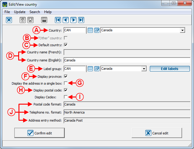
After clicking on the  button or double-clicking on a country in the list at E of this window, this window opens. button or double-clicking on a country in the list at E of this window, this window opens.
|

|
|
A: Select the country to add to the list at E of this window.
|
B: This option is only available if no instant payment method is used in the form or if it is a client form. If an instant payment method is used, the country must inevitably specified.
|
|
C: Allows you to indicate that the country at A will be the default country to appear on the Web form.
|
D: Allows you to indicate the English and French labels for the countries.
|
|
E: The  button allows you to configure the country labels at A. For more information about labels, see the "Label Configuration" document. button allows you to configure the country labels at A. For more information about labels, see the "Label Configuration" document.
|
F: Allows you to display or not the "Province" field on the Web form.
|
|
G: Allows you to display the address in a single box or in separate boxes, for instance, a box for the street number, another for the street name, etc.
|
H: Allows you to display or not the "Postal code" field on the Web form.
|
|
I: Allows you to display or not the "Cedex" field on the Web form (this option is mainly used in Europe).
|
J: These options are automatically entered by selecting a country at A. These are the country setups.
|
"Payment" Tab
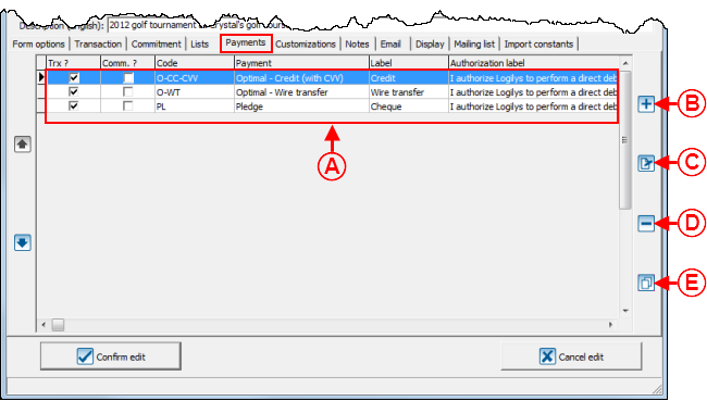
This tab allows you to choose the payment methods donors may use.

|
|
A: These are the payment methods available to donors to make a donation.
|
B: The  button allows you to add new payment methods to the list at A. button allows you to add new payment methods to the list at A.
NOTE: To be able to add a payment method here, the payment method must have previously been created in the "Payment method management".
|
|
C: The  button allows you to modify a payment method in the list at A. To do so, select the payment method to modify at A, then click on the button allows you to modify a payment method in the list at A. To do so, select the payment method to modify at A, then click on the  button. button.
|
D: The  button allows you to delete a payment method in the list at A. To do so, select the payment method to modify at A, then click on the button allows you to delete a payment method in the list at A. To do so, select the payment method to modify at A, then click on the  button. button.
|
|
E: The  button allows you to duplicate all the payment methods from another Web form to add them at A. button allows you to duplicate all the payment methods from another Web form to add them at A.
|
|
|
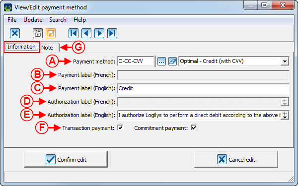
After clicking on the  button or the button or the  button, this window opens. button, this window opens.
|

|
|
A: The drop-down list allows you to choose a payment method donors can use to make a donation. If the desired payment method does not exist in the options, it is possible to create it in the "Payment method management".
|
B: This field allows you to enter a label for the French name of the payment method.
|
|
C: This field allows you to enter a label for the English name of the payment method.
|
D: This field allows you to enter a French authorisation message. To view an example of authorisation message, see point G of the "Web Form Example 2" section.
|
|
E: This field allows you to enter an English authorisation message.
|
F: These checkboxes allow you to decide whether it is a payment method for a regular transaction, for a commitment transaction or for both types of transactions.
|
|
G: The "Note" tab allows you to insert a note below the payment in the form. To learn how to configure the "Add note to form" window, see this section. To view an example of note below the payment, see point C of the "Web Form Example 3" section.
|
NOTE: Use a "Pending" payment method, so that clients can pay with a cheque. During the import, the payment will go into the "To receive" tab of the "Transaction management" and can be cashed upon receipt of the cheque. Also add a note at G, requesting to label the cheque with the address of the foundation. For more details concerning "Pending" payment methods, see the "Payment Method Management" document.
|
"Customizations" Tab
This tab allows you to create the characteristics that will be added to the donors' files in ProDon during the import.
To learn how to configure the customizations of a Web form, see this document.
"Notes" Tab
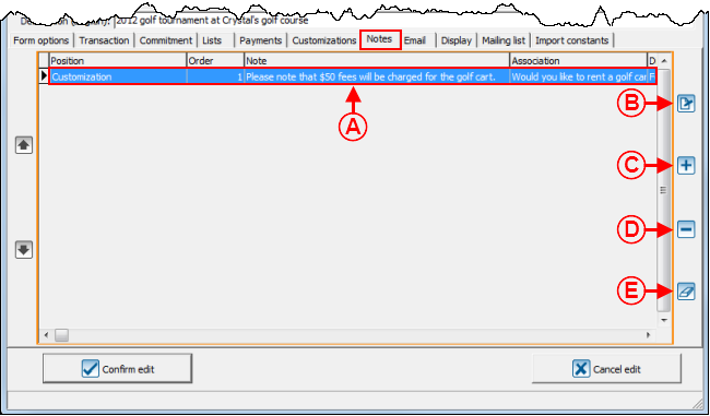
This tab allows you to insert notes into the form.

|
|
A: These are all the notes that have been added to the form.
|
B: The  button allows you to add a new note to the form. button allows you to add a new note to the form.
|
|
C: The  button allows you to modify a note in the list at A. To do so, select the note to modify at A, then click on the button allows you to modify a note in the list at A. To do so, select the note to modify at A, then click on the  button. button.
|
D: The  button allows you to delete a note in the list at A. To do so, select the note to modify at A, then click on the button allows you to delete a note in the list at A. To do so, select the note to modify at A, then click on the  button. button.
|
|
E: The  allows you to delete all the notes of the form. allows you to delete all the notes of the form.
|
NOTE: The notes that have been created from different tabs of the Web form management appear here too.
|
|
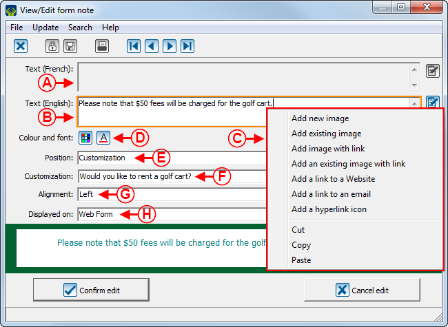
After clicking on the  button or the button or the  button, this window opens. button, this window opens.
|

|
|
A: This field allows you to write the French text in the note.
|
B: This field allows you to write the English text in the note.
|
|
C: This menu appears by right-clicking in a field at A or at B. It allows you to insert images or hyperlinks into the note.
|
D: The  button allows you to modify the font colour of the note. The button allows you to modify the font colour of the note. The  button allows you to modify the font of the note. button allows you to modify the font of the note.
|
|
E: The "Position" field allows you to decide in which section of the form the note will be inserted. The header and the footer are available, as well as a few sections of the form.
|
F: This field depends on the choice made at E. In this example, the note will be inserted below the question "Would you like to rent a golf cart?".
|
|
G: This field allows you to choose the alignment of the note.
|
H: This field allows you to decide whether the note should appear only on the Web form, or only on the summary or on both.
|
"Email" Tab
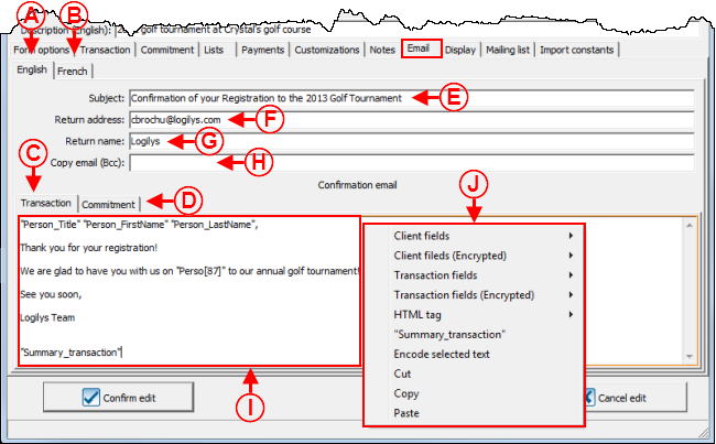
This tab allows you to write the emails that will automatically be sent to donors once their donations will be made.
It is possible to write French and English emails for single donation transactions and for commitment transactions.

|
|
A: The "English" tab allows you to write English emails for transactions and commitments.
|
B: The "French" tab allows you to write French emails for transactions and commitments.
|
|
C: The "Transaction" tab allows you to write the email that will be sent to donors who have made a regular transaction.
|
D: The "Commitment" tab allows you to write the email that will be sent to donors who have made a commitment transaction.
|
|
E: This field allows you to enter the subject of the email.
|
F: This field allows you to enter the address to which donors can reply.
|
|
G: This field allows you to specify the name of the personne or the company to whom the email can be returned.
|
H: This field allows you to enter the address that will receive all the thank-you emails in blind courtesy copies.
|
|
I: This is the thank-you email for a regular transaction.
|
J: This menu appears by right-clicking in the field at I. It allows you to insert fields, images and hyperlinks in the email.
|
"Display" Tab
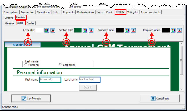
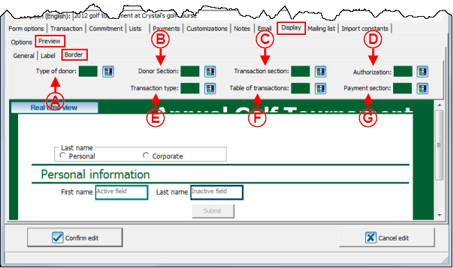
This tab allows you to customize the appearance of the form..
"Options" Tab

|
|
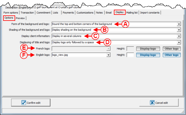
A : Permet de choisir de mettre les coins supérieurs ronds ou carrés. Pour un exemple de coins carrés, voir la lettre D de la section « Exemple 3 de formulaire Web ». Pour un exemple de coins ronds, voir la lettre I de la section « Exemple 1 de formulaire Web ».
|
B : Permet de choisir d'afficher un ombrage sur l'arrière-plan. Pour un exemple d'arrière-plan avec un ombrage, voir la lettre B de la section « Exemple de page d'accueil » du document « Configuration de la page d'accueil et du site Web ».
|
|
C : Permet d'afficher les informations des donateurs sur une ou plusieurs colonnes. Pour un exemple d'informations affichées sur plusieurs colonnes, voir la lettre J de la section « Exemple 1 de formulaire Web ». Pour un exemple d'informations affichées sur une colonne, voir la lettre J de la section « Exemple 2 de formulaire Web ».
|
D : Permet de choisir comment afficher le logo et le titre dans le haut du formulaire.
NOTE : Il est également possible d'insérer un bandeau dans l'en-tête du formulaire Web ou de la page d'accueil plutôt que d'insérer un titre et un logo. Pour ce faire, sélectionner l'option « Afficher seulement le logo suivi d'un espace » ou « Afficher seulement le logo sans espace », puis choisir l'image du bandeau en D. Pour un exemple de bandeau, voir la lettre M de la section « Exemple 3 de formulaire Web ».
|
|
E : Permet d'insérer le logo français qui se trouvera dans l'en-tête du formulaire.
Le bouton File:Bouton afficher le logo.png permet de visualiser le logo qui se trouve dans le haut du formulaire français.
Le bouton File:Bouton autre logo.png permet de modifier le logo qui se trouve dans le haut du formulaire français.
|
F : Permet d'insérer le logo anglais qui se trouvera dans l'en-tête du formulaire.
Le bouton File:Bouton afficher le logo.png permet de visualiser le logo qui se trouve dans le haut du formulaire anglais.
Le bouton File:Bouton autre logo.png permet de modifier le logo qui se trouve dans le haut du formulaire anglais.
|
|
NOTE : Un bandeau doit être enregistré avec 820 pixels de large avant d'être inséré pour qu'il ait la même largeur que le formulaire Web ou que la page d'accueil. Pour un logo, la dimension n'a pas d'importance à l'enregistrement, puisqu'elle peut être ajustée en D et en E. La hauteur recommandée est 68 pixels.
|
"Overview" Tab
"General" Tab
"Label" Tab
"Border" Tab
"Distribution list" Tab
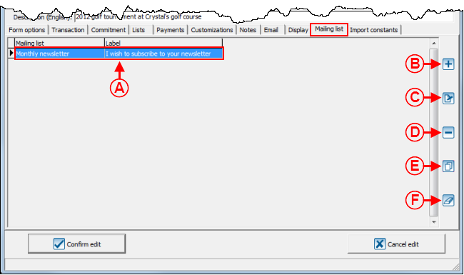
Cet onglet permet d'ajouter des cases à cocher au formulaire pour que les donateurs puissent s'inscrire à différentes listes de distribution.
Si un donateur coche une case d'inscription à une liste de distribution dans le formulaire Web, il sera automatiquement inscrit à la liste de distribution dans ProDon lors de l'importation.
NOTE : Cet onglet est visible seulement si le module PubliCourriel est activé dans ProDon.

|
|
A : Il s'agit des listes de distribution auxquelles les donateurs pourront s'inscrire en complétant le formulaire.
|
B : Le bouton  permet d'ajouter une liste de distribution en A. permet d'ajouter une liste de distribution en A.
NOTE : Pour ajouter une liste de distribution, il faut qu'elle soit préalablement crée dans la « Gestion des listes de distribution ».
|
|
C : Le bouton File:Bouton Modifier.png permet de modifier une liste de distribution en A. Pour ce faire, sélectionner la liste de distribution à modifier, puis cliquer sur le bouton File:Bouton Modifier.png.
|
D : Le bouton File:Petit Bouton Dupliquer.png permet de dupliquer les listes de distributions d'un autre formulaire.
|
|
E : Le bouton  permet de supprimer une liste de distribution en A. Pour ce faire, sélectionner la liste de distribution à supprimer, puis cliquer sur le bouton File:Bouton Modifier.png. permet de supprimer une liste de distribution en A. Pour ce faire, sélectionner la liste de distribution à supprimer, puis cliquer sur le bouton File:Bouton Modifier.png.
|
F : Le bouton  permet de supprimer toutes les listes de distribution en A. permet de supprimer toutes les listes de distribution en A.
|
|
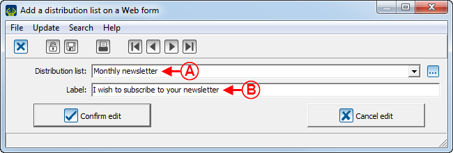
Après avoir cliqué sur le bouton  ou sur le bouton File:Bouton Modifier.png, la fenêtre suivante s'ouvre. ou sur le bouton File:Bouton Modifier.png, la fenêtre suivante s'ouvre.
|

|
|
A : Choisir une liste de distribution parmi celles disponibles dans ProDon.
|
B : Inscrire le libellé qui apparaîtra sur le formulaire. Pour un exemple de libellé d'inscription à une liste de distribution, voir la lettre E de la section « Exemple 3 de formulaire Web ».
|
"Import constants" Tab
Cet onglet permet d'ajouter des caractéristiques ou des champs personnalisés aux fiches des donateurs lors de l'importation.

|
|
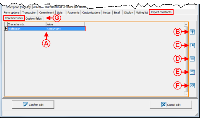
A : Il s'agit de la liste des caractéristiques qui seront ajoutées à la fiche des donateurs qui rempliront le formulaire. Dans cet exemple, la profession « Comptable » sera spécifiée dans la fiche de chaque donateur qui remplira le formulaire.
|
B : Le bouton  permet d'ajouter une nouvelle caractéristique à la liste en A. permet d'ajouter une nouvelle caractéristique à la liste en A.
|
|
C : Le bouton File:Bouton Modifier.png permet de modifier une caractéristique de la liste en A. Pour ce faire, sélectionner la caractéristique à modifier, puis cliquer sur le bouton File:Bouton Modifier.png.
|
D : Le bouton  permet de supprimer une caractéristique de la liste en A. Pour ce faire, sélectionner la caractéristique à supprimer, puis cliquer sur le bouton permet de supprimer une caractéristique de la liste en A. Pour ce faire, sélectionner la caractéristique à supprimer, puis cliquer sur le bouton  . .
|
|
E : Le bouton File:Petit Bouton Dupliquer.png permet de dupliquer les caractéristiques d'un autre formulaire pour les ajouter à la liste en A.
|
F : Le bouton  permet de supprimer toutes les caractéristiques de la liste en A. permet de supprimer toutes les caractéristiques de la liste en A.
|
|
Après avoir cliqué sur le bouton  ou sur le bouton File:Bouton Modifier.png, la fenêtre suivante s'ouvre. ou sur le bouton File:Bouton Modifier.png, la fenêtre suivante s'ouvre.
|

|
|
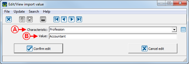
A : Choisir à l'aide de la liste déroulante la caractéristique qui doit être ajoutée à la fiche des donateurs.
|
B : Inscrire la valeur qui sera inscrite dans la fiche de chaque donateur.
NOTE : Pour ajouter une caractéristique, il faut qu'elle soit préalablement crée dans la « Gestion des caractéristiques ».
|
Web Form Examples
Web Form Example 1

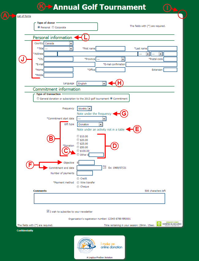
|
|
A : Lien de retour vers la page d'accueil.
|
B : Informations de paiement qui ne sont pas dans un tableau.
|
|
C : Champ « Autre montant ».
|
D : Formulaire avec montants suggérés.
|
|
E : Note sous l'activité qui n'est pas dans un tableau.
|
F : Engagement avec date de fin et objectif.
|
|
G : Note sous la fréquence.
|
H : Champ permettant de choisir la langue.
|
|
I : Coin supérieur rond.
|
J : Informations du donateurs sur plusieurs colonnes.
|
|
K : Titre du formulaire.
|
L : Titre de section.
|
Web Form Example 2

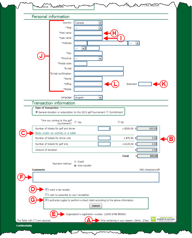
|
|
A : Temps de session Web restant.
|
B : Informations de paiement dans un tableau.
|
|
C : Note sous l'activité dans un tableau.
|
D : Case permettant au donateur de choisir s'il désire recevoir ou non un reçu.
|
|
E : Libellé de l'OBNL.
|
F : Champ « Commentaire ».
|
|
G : Message d'autorisation.
|
H : Contour de la boîte active.
|
|
I : Contour d'une boîte inactive.
|
J : Informations du donateur sur une seule colonne.
|
|
K : Champ standard.
|
L : Champ obligatoire.
|
Web Form Example 3

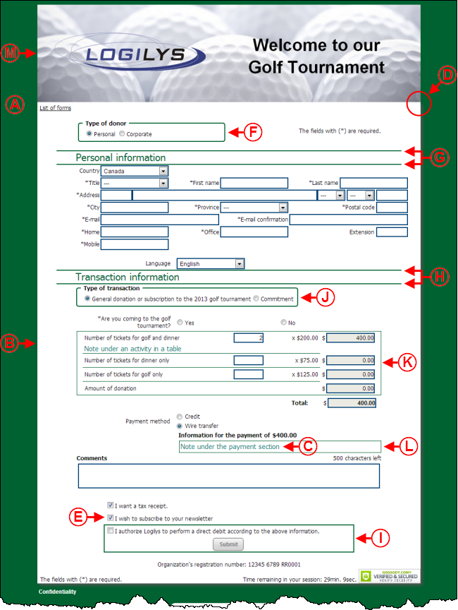
|
|
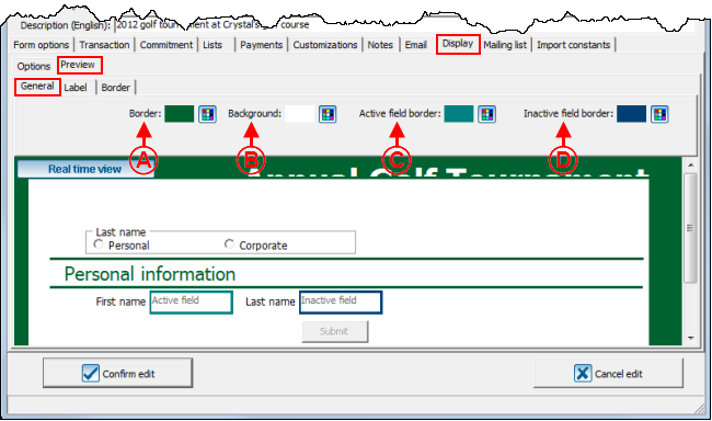
A : Dans cet exemple, la marge est verte.
|
B : Dans cet exemple, l'arrière-plan est blanc.
|
|
C : Note sous la section paiement.
|
D : Coins supérieurs carrés.
|
|
E : Case à cocher pour s'inscrire à une liste de distribution.
|
F : Bordures de la section type de donateur.
|
|
G : Bordures de la section donateur.
|
H : Bordures de la section transaction.
|
|
I : Bordures de la section autorisation.
|
J : Bordures de la section type de transaction.
|
|
K : Bordures du tableau des transactions.
|
L : Bordures de la section paiement.
|
|
M : Bandeau dans l'en-tête du formulaire.
|
|
Document name: ProDon:Creating a Web Form
